Hi! everyone,
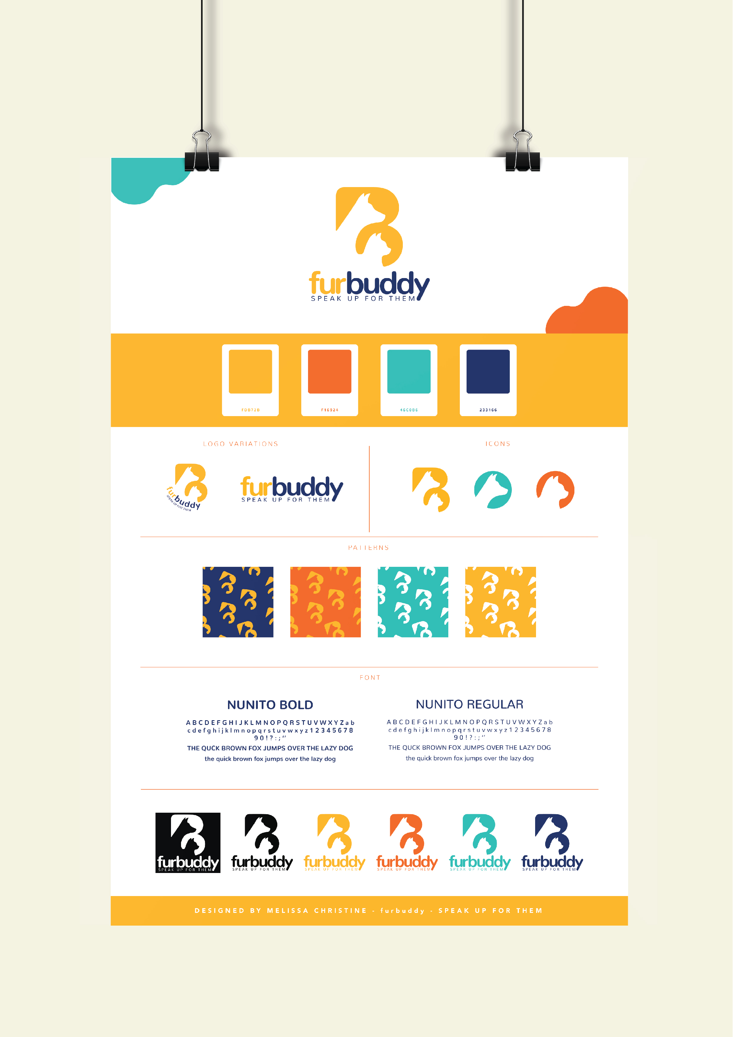
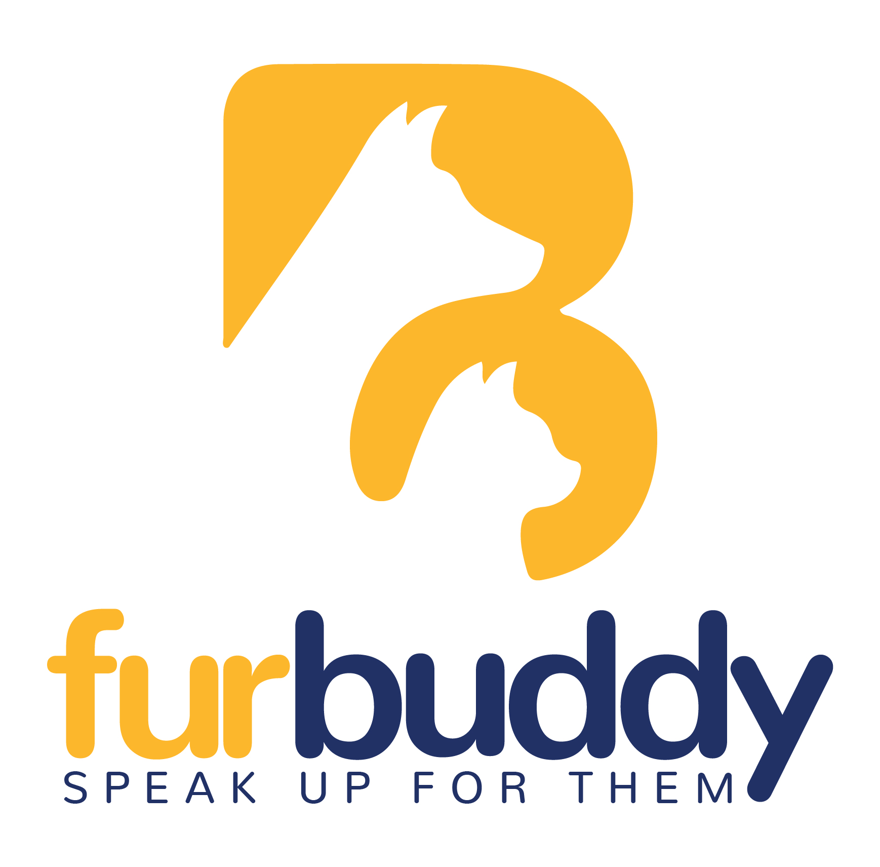
I would like to introduce the logo is for animal shelter, and the company called furbuddy.
I’m looking for feedback or any thoughts after saw my Logo design please feel free to comment, see the attached pic and let me know what you think?
Any comment and feedback would be appreciated!
Sincerely,
Melissa Christine
Melissa, this is really nice work. I like the logo design. The color palette is playful and approachable which works well for the subject matter. The type is friendly. It looks like a knock off of Helvetica Rounded. I might have been inclined to go with the real thing. With the logo, the icons, color palette, and patterns, you’ve given them something to build and grow from.
The only thing I’m not crazy about is the type bending around the brand mark on the logo variation. If you’re wanting to give them a more compact version, what about reducing the size of the brand mark and putting it in line with the horizontal type?
furbuddy right away reads FB/fb to me. Is there a rationale for just B, other than sucking up to one of our members?
1 Like
The two animals sort of make an F at a 45° angle.
I dig it.
Not so much into the poster board/binder clip template. Have a look around at how brand standards are presented.
I’m not entirely sold unless I try very hard stretching my imagination, but, okay …
Oh, it’s a stretch.
But it’s Friday and I’m starting to see things anyway.
1 Like
Mcdesignjpeg, this is really very nice.
I agree with Steve about the version with the type wrapping around the mark. I’m also not quite sure what’s going on with the white on black version. I’m assuming you’re just showing how it would look reversed, but it feels a bit cramped within the box it’s in.
I’d also likely add a little more space between the u and the r in furbuddy.
Very good job, though. I love it.
Hello Melissa,
It looks great and it’s fine to use for branding. But you should try another concept focusing on Shelter.
Preeti
Sr. Logo Designer
animationvisarts
Explain why?
The concept appears to be to speak for the animals.
“Shelter” is already implied by placing them within the shape.