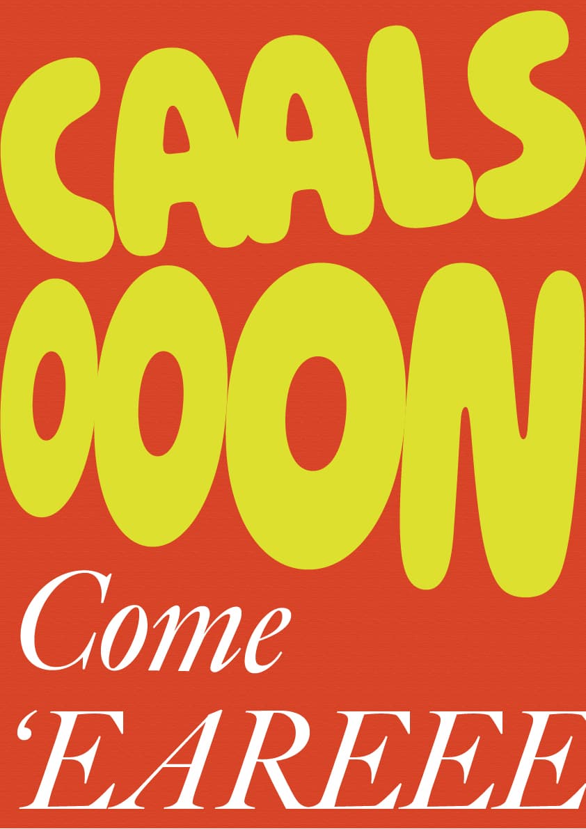
For context: One of my Graphic Design professor misspelled the font Caslon as Calson in one of our briefs and to me it sounded like the name of a British boy. The first thing that to came to mind was “Calson come 'ere”-- so, I made a poster out of it. It’s supposed to be silly willy willy but it also needs to look good and most importantly it needs to help me improve my skills. Would appreciate any and all feedback ![]()
Sorry to say, you don’t have anything here. If I look at it as a standalone piece with no background, I have no idea what I am looking at. If I look at it as an experimental piece given the background information you supplied, it seems a bit lazy. I say that because I don’t get the feeling that you really invested any time in this. I think you can do better.
Your sense of humor might be a little misplaced. I don’t think Calson is a very common British boy’s name. I doubt most people (even in your class) would get the joke. Maybe I’m wrong.
Appreciate the feedback! Do you have suggestions that would help me make a better poster or even design?
No, you’re not wrong. After some digging I found out that calson is the name of a medicinal product and most people in my class didn’t get the joke until I explained it to them. I still wanted to share it with people so I could feedback on design so I could understand in what direction I needed to put effort in to improve.
Lessons Learned:
First, identify your target market. If they don’t get the joke, the message is lost.
Second, have a coherent message. (Calls Oon, Come Ear eee?)
If you have to explain it, it is ineffective.
2 Likes
If we set aside the issue of readability, this poster lacks contrast, in my opinion. Color, fonts, sizes, layout - everything is on the same note, and just very “screaming in your face”.
I do not think you should fix this one tbh, I think you should move on to other poster idea and try to find where design can rest, and where to be busy. Play more with sizes.
This topic was automatically closed 365 days after the last reply. New replies are no longer allowed.