These are very rough preliminary sketches, but of the three, I too like the coloured one best. However, the devil is in the details, so what you with the sketch is what matters. Can you see beyond the sketch, all the way to the final piece?
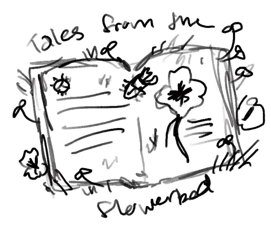
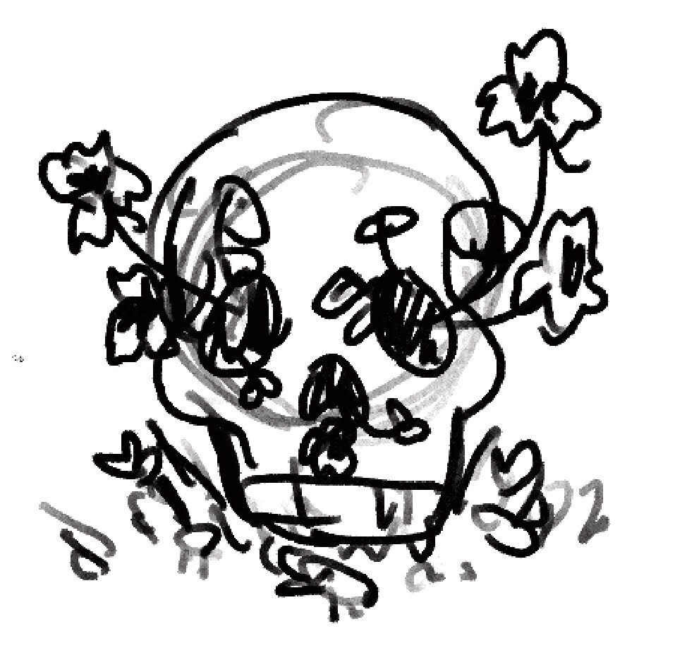
Yes, I can see where I’m going with the first and third designs but not so much the second one. I think I’d keep the same colours for them maybe changing them a bit as the reddish orange represents the nasturtium flower.
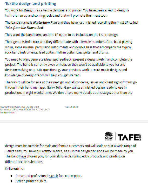
With the book id add “Nasturtium Rule” and 'Tales from the flowerbed" on the pages of the book, but I’m not sure yet where I’d put the words with the skull thumbnail.
Thank you again I will eliminate the second thumbnail and work on developing the last two until I choose which is best for the design brief.
I think it’s hysterical that the description of the band fits the indie steampunk band Abney Park to a T (pun intended.)
This is supposed to appeal to all genders? And describes a rock band? With a boringly literal book and/or flower bed?
Do some mind mapping or something and get away from the obvious.
And your instructor is lazy. They should be playing the part of the client and you should have to defend your ideas to them in order to move forward. At least that’s what I’d make you do…