Feedback needed for my graphic design assignment

Hi Everyone,

Super nervous to share my work but for my latest graphic design assignment I need to gather feedback on these two contrasting sets of posters. They are for Monotype (the font library) and celebrate the student community.

I’d love to know which set of posters are better? Red, white, and black, or the earthy tones?

Any feedback is much appreciated and will help me choose a direction to move forward with for further development of the ideas :slight_smile:

Thanks!


In every single one of those, the distortion of your relevant text totally negates the message. Your job is to communicate the message, not hide it in crazy type gymnastics, or faded out over imagery. What is your focus? Hands or text?

What is your call to action? If it is anywhere in that block of tiny text, you have failed to convey it. See that guy walking the dog behind the top right, white poster? You have that much time for someone to read all your text as they pass by. That’s it. If you can’t read it in under 15 seconds there is too much text.

I couldn’t figure out what was bugging me about the bottom left image. It’s two right hands, not a left and right. It is enough to distract from any message. Lopped off hands can be disconcertingly creepy sometimes to and draw focus.

As to red/black or earthy? Are those mockups you show in situ? What is your intent in the space? To contrast harshly or to blend while enhancing the ambiance of the space? Are you supposed to be working within the branding standards of the school, or is this like most assignments, only a single focus on the typography and to heck with everything else that’s important?

Seriously? Is is really necessary to hyphenate a word when there is enough room for the whole word?

If you’re simply asking when of the two sets is better, it’s the top one.

Black and red are strong color combinations. Beige and peach colors, not so much

However, a flat monochromatic black looks lifeless and shallow. Adding some red (or other spots of colors) into the layout could help.

I also like the messaging on the top examples better than the bottom. However, it’s not immediately obvious what those messages or calls to action might be. The earbuds, scissors, and pencil reinforcing the headlines are nice touches. If anything, I’d make those things more obvious.

As PrintDriver said, don’t distort the typography. In graphic design, the layout might be what catches one’s attention, but the goal of the work (in this case posters) usually depends on the text that’s read after passersby notice the posters. In other words, make the text as legible and readable as possible. Besides, distorted text is just sort of, well, bad-looking.

And as Eriskay said, don’t ever break words in headlines with hyphens.

Taken on board. The brief is that they should be typography-led posters and for this specific question they must contrast and conform to typical visuals of Monotype. The brief is very open and only asks you to celebrate the positive aspects of a community so I’ve chosen the hard work students put in the first image and that they are future leaders in the second.

Totally get your point on the hands, I did the middle one with the holding hands first and I liked how it looked, so I quickly did two more and think they look a bit menacing actually :sweat_smile:

The colours are just to conform and contrast with the brand and I’m not very keen on the earth tones as they blends into the background, I imagine the posters would be displayed around a campus and so they should be bright colours to stand out.

This assignment is a bit of a weird one it’s just one question in much larger module and so a bit of a rush job sadly. Hopefully your comments will help me push these in a much better direction.

Noted, a bit stressed + lack of sleep = crazy decisions :joy:

Great shout on the spots of colour, could be a nice idea going forward. I’m going to get rid of the distortion (and hyphens :see_no_evil:), I think I just panicked it would be dull without anything done to the headline and I was clearly overthinking!

Hello again,

Thank you all for your earlier feedback, I’ve taken it on board and amended my poster design. My tutor also wanted me to experiment with different layouts that integrate image and text for some more creative approaches. I’ve tried to keep it varied and the amount of text down to a minimum. I’ve also removed colour for the time being to focus on the layouts. I would love to know your thoughts and what might improve them?

Thanks!

This is difficult to critique because I don’t know what your tutor had in mind. He/she might have a specific purpose in asking you to be more creative with typography. However, that’s probably not the direction I would have suggested you pursue. Instead, I would have suggested something quite different, which might not be what your tutor had in mind.

Sometimes, the lesson’s objective isn’t to create something extraordinary. Sometimes the aim is to explore a specific area. Sometimes a good instructor will make an assignment where he’s certain almost everyone will make many less-than-ideal decisions. These exercises aim to get students to push boundaries and become perplexed in ways that make them more receptive to suggestions.

In this case, your instructor is the client, and you’re the designer. Your payment is whatever grade or praise you get or, more importantly, what you learn.

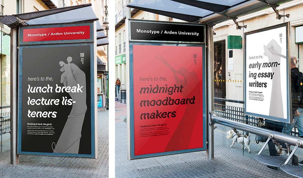
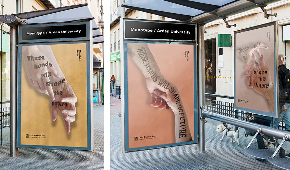
Now, suppose you want my opinion (which isn’t necessarily your tutor’s). In that case, I think you should be paying more attention to your target audience, the message, and whether or not your posters effectively communicate that message to someone walking by them at, for example, a bus stop.

In addition, I can’t entirely agree with the notion of being more creative with type when that means distorting it and doing things with it that make it less legible. There’s a place for experimenting with type and doing unusual things with it, but that time typically is not when doing so interferes with the communication of the message.

Finally, I’d pay more attention to negative shapes and their relationship to the positive space. You’re doing this to a degree, so I know you’re aware of what I’m saying. In several of the layouts, though, the negative space comes across more like a white background onto which you’ve placed graphics and less as a carefully considered component in the overall design.

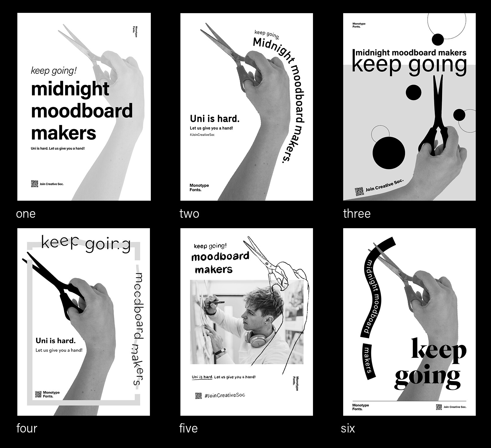
If you want to know how I’d rate them (from best to not best

Three — I like the circles juxtaposed with the rectangular shape in which they sit. The relationship between the circles is nice too (asymmetrical but balanced), I like the outlined circles because they repeat the shapes while still complimenting them. The dark, sharp pointy scissors are nice too since they contrast with the dark circles and provide of a bit of tension. I’m not too fond of the extended ascender on the k or the typography crawling of the wrist.

One — The type is straightforward and legible. It’s nicely positioned too. The hand, wrist, and forearm look a bit awkward, which is a problem on the others with similar cropping.

Two — The visual hierarchy is lacking. The typography is too small. I dislike the type awkwardly flowing around the hand.

Six — Why does the arm cut off some of the letters? There’s no apparent reason for this, and it draws attention to itself. I do like the simplicity, though. I also like that you decided to use serif type on at least one of the layouts.

Four — There’s too much going on. I get the idea of snipping and clipping, but it’s a bit gimmicky and cluttered.

Five — I don’t like the hand outline superimposed over the photo (they clash). I don’t like your choice of type.

One last thing that applies to all of them. I don’t have hardly a clue what scissors have to do with anything? I suppose it’s about clipping things from magazines or wherever, but maybe it makes more sense in the context of your class or your instructor.