Need feedback really fast before I send it tomorrow to my teacher.
Doing a mock brief on an album cover for a lo-fi indie brand. Cover needs a brain, colour, flowers, brand name and oragnic shapes/typography.
Teacher told me to not use any webiste elements, gotta do all by hand or digital.
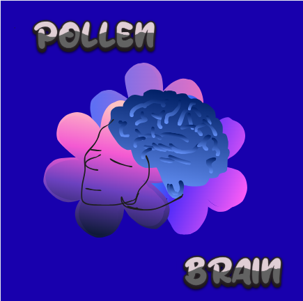
In my own opinion, the purple is too flashy, the other colors seem to be fine, but the letters in black and “Pollen Brain” check other bands’ albums and see what the band name looks like. Anyway, is this the band’s name or is it the title of the album ?
It’s the band name. I didn’t choose it, my teacher did. So that I can’t change.
What colour do you think the flowers should be if not purple?
What colour do you think the letters should be, if not black?
Also, I need to send something bro
Put the name on the top (Pollen Brain) and later the other stuff. The background of the album can be dark purple (not so flashy!), and the letters can be white to create contrast. If you need to create a combination of the colours, then you can use Adobe Colour Wheel. Here is the address: Color Palette Generator – Color Wheel Tool | Adobe Express
For music bands, maybe you can look for a band name like “Deep Purple” and see their albums as an example. By the way, the problem is not the flowers; it is the background. Try to make it darker.
Ok I will try doing that
Just understand guys, I can’t change the name “Pollen Brain”. It was part of the brief my teacher created. Yknow what, I’ll send it to you guys so it makes more sense:
You work as a junior intern graphic designer for a small design firm. A lo-fi Indie band ‘Pollen Brain’ have asked you to design a vinyl album cover for their self-titled debut album release. The group have suggested some of the following, but feel free to add your own interpretation: • colour! Loads of it! • flowers • A brain • band name • organic shapes and lettering The target audience are indie music lovers between the age of 12 – 30.
If you need to add some organic shapes, why don’t you add something like a brain (cauliflower) and then you combine it with a pollen flower ?, just catch the idea and combine both of them.
Caps, NO YELLOW. not enough contrast.
Your brain almost has a face in the squiggles. Do it, or don’t.
Just a side note, if this is the band’s first release, the name of the band should likely be treated as a ‘logo’ that will be perpetuated as a theme for all future use. It doesn’t say so in your brief but take the initiative.
Do they always want to be known for the childish scrawl and horrible colorscheme?
Just my 2 cents but I feel like your designs are more about checking the box. What I mean is it is as if you said, “Ok, I’ve included a quickly drawn brain, thrown in some bright colors, quickly drew some flower shapes added the brand name and used an “organic” font or hand drew the band name. Check, check, check, etc. Done.”
Did you sketch out ideas, literal pencil on paper? Did you think about adding any other elements? Did you review the genre? Did you look at other album covers?
And while you can’t use things you find online, personally I would have put together a mini mood board of items or ideas for inspiration, especially for any illustration or drawing.
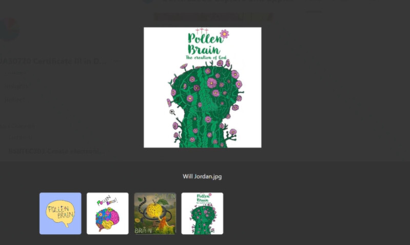
I made a few thumbnails, as was part of my activity and also some concept sketches. I thought the concept sketches was the final step but the teacher told me choose one of them and make it your own way - but only using my hand/apple pencil (i.e no elements from any graphic design platforms, as I did with my concept sketches)
So I made a final, which I shared with you guys. My concept sketches were sorta overload with elements and since I have to do the final by hand, I actually coudn’t draw all of these complex elements. That’s why its so plain.
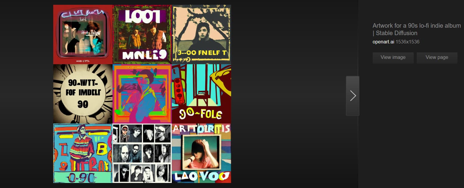
I searched up lo-fi indie but these were the sort of examples I found (and these examples are all AI generated):
Seriously, you asked AI to draw you some indie album covers?
That’s an obvious failure. AI works on algorithms, not brain cells.
CraigB’s simple internet search showed you that.
What is to stop you from drawing from reference materials and personalizing them for this project? Heck, take pictures with your own phone and use those as reference materials.
It still looks like you just checked off adding the necessary elements. It feels like the bare minimum.
At the moment there is no cohesion between your elements. I’m not saying it is perfect, but even looking at the samples from other students, you can see that the green and purple used a pretty minimal color scheme and all the elements are in the same art style. They even added an album title to make it more realistic and unique. The more painterly one plays with shapes, light and dark, shadows, movement of the vines, etc.
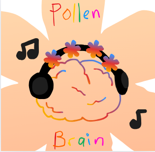
Your latest version the headphones and music notes are chunky and flat with a big black brush. The four flowers all re on the same axis and with the same gradient, looking like it was just copied and pasted. The handwritten band name looks like an afterthought and rushed. The brain is a single width line, with rainbow gradients and squiggles that look like it took about 20 seconds to draw. The background flower shape is generally fairly smooth outlined except for some squiggly outlines in the bottom right. Nothing feels cohesive.
Each one of those elements feels disconnected from the others. Design elements need to work together as one piece.
I’m not trying to be harsh, but at the moment it doesn’t feel like you’re trying to push yourself as much as you’re just trying to meet the requirements of the project.
Next time your teacher talks about “a music band” and “organic material,” I think you should look around for examples to get ideas. When you get something cool, then make it with pen and paper to draw your idea and after go for the digital version.
Thank you for your feedback, everyone, even tho I couldn’t apply all your ideas on the album cover. You all spent your time giving ideas and thoughts thank you Next time I’ll try to keep all your suggestions in mind.