Hi, I am a graphic design student and not yet half way through the course and very much still learning.
My current assignment is to create a logo for IKEA that is simple, clean and minimal, I have stayed with the brand colours as this is already a strong identity.
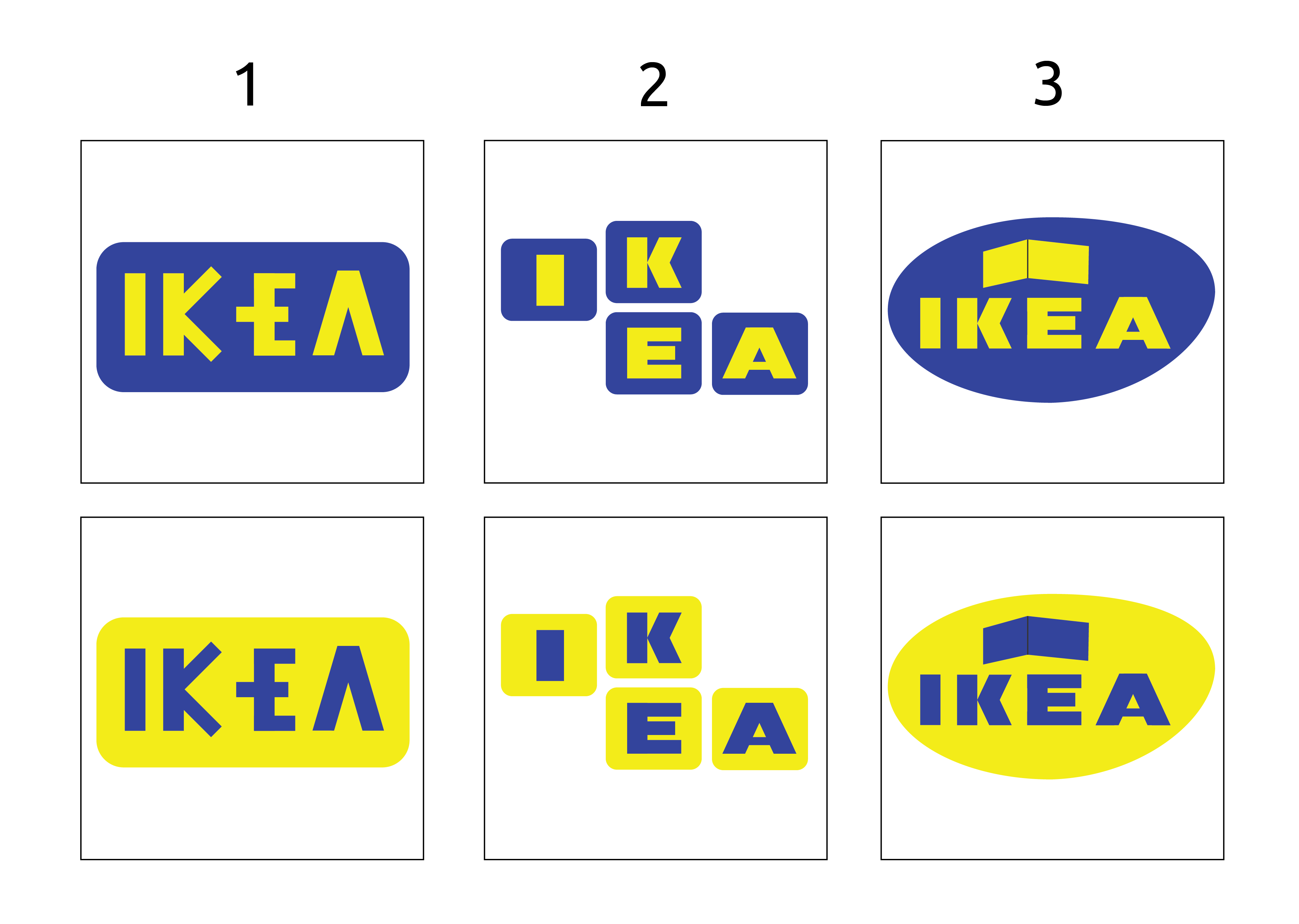
I have completed the sketches phase and have narrowed it down to three designs that require feedback, and the assignment requires I ask the following questions. Sorry, it is a bit of a list, thank you in advance for your help.
What does the logo represent to you?
Is it legible? Is it easy to read and understand?
What is the core product/service undertaken by the business?
What do you think about the company when you see this? For example modern, international, value.
Does it stand out and catch your eye?
Does it feel genuine?
Are there any technical, legal or budgetary issues that need to be considered?
Please forgive me in advance. I understand you’re a student, but I don’t think you’ve managed to provide solid answers to these questions in your work.
This is all not to say some of these logos have potential. If you could refine the graphic in the oval logo to represent the company’s line of work more clearly, that would get one more of the questions answered.
I also like the multiple block logos, Perhaps you could add an additional block into the mix that has a symbol or graphic?
Somewhat, but you’ve jumbled up everything with awkward letter spacing and oddly stacked letters. For example, you’ve made IKEA read as IK E A.
They sells stylish but cheap furniture. I suppose what you’re asking, however, is whether or not your logos suggest cheap, stylish furniture. Probably not, but then again logos become associated with their parent companies over time — it’s not always necessary for a logo to suggest through the imagery what the core service/business might be. Sometimes, logos just need to set the right emotional tone.
Honestly, it’s student work and that’s what I would think if I saw it without actually knowing it was student work. Your questions seem more like what your instructor has asked you to consider when designing the logos. Did you consider them? Personally, I’ve never liked IKEA’s branding. The colors are from the Swedish flag, but they’re garish and look like something out of the 1950s. If it were me, I would have headed off in a very different direction that suggested both stylish and inexpensive.
Yeah, I suppose so, but not necessarily for reasons that would draw me into the stores.
Genuine in what way. Does it look like a genuine IKEA logo? Does it look genuine in the sense that it reflects the personality of IKEA’s business? Assuming the latter, probably not, but as I’ve already implied, I don’t think their existing visual branding does either. In my opinion, you’ve retained the worst aspects of their existing brand and mostly just rearranged them. Brand redos are difficult since they always involve some sacrifice of the existing brand’s equity. The objective here should have, in my opinion, been to identify those critical features of the visual brand that could be carried over into a more modern and stylish personality that better reflect both the personality and emotional qualities associated with their merchandise — cool, modern-looking, trendy and totally affordable furniture.
IKEA is a Swedish company, so maybe take into a account that Sweden is fast becoming an ultra politically correct country.
The upshot being that such entities tend to develop a utter loathing for their own culture, history heritage etc.
So your rebrand sporting virtually the same two Swedens flag colours might not last too long ..
I take on board the use of colours and that I should be suggesting something new. I do like how some brands have provided a logo in two colours but with different colour combinations. This could possibly be useful when using in brochures and the different colour themes of products.
For the first design the spacing is different as I wanted to create a house shape within the letters. I would normally create equal spacing
A little late to the game here, but as an avid fan of IKEA, I’ve gotta say that I love design #2 in yellow with the blue writing. I feel like it captures the “build-it-yourself” nature of the store by using the building block image to evoke that feeling. I prefer the yellow background to the blue because it catches my attention more and the dark letters make it easier to read. It feels like it really could be a logo that IKEA would use!
As for the other ones, I’m not a huge fan of the font on #1 and I don’t feel like it does a great job of showing what IKEA does. Design #3 does a much better job of showing IKEA’s purpose, but it also reminded me of just a regular furniture store logo, rather than a furniture store that is known for being different from its competitors.
Again, LOVED #2! Hope any of this can help!