Hi @RubyRose 
Getting started with a career in user experience design is really exciting, and congrats on taking the first step in seeking education. With little to be thrilled about in 2020, your drive to learn and get feedback should be an inspiration to us all.
As @Just-B hinted, UX design is a complicated field that encompasses an area slightly outside of UI Design. The two are very closely related and generally overlap some within Human Computer Interaction (HCI), but UI design finds its roots more in traditional Graphic Design, whereas UX tends to be more closely associated with research, product management, and business analysis.
Design in all forms tends to follow the maxim “everything happens for a reason”, but you could think of UX as the “why” behind the choice of functional elements of the screens we’re looking at, as in:
- why this choice of filtering options?
- why this placement of the email sign-up form?
- why this order of content shown?
Notice that the above questions are not really visual in nature. There is a little overlap between the two, but an easy rule of thumb is this: if you’re being critiqued on how something looks, it’s probably more UI than UX.
Why am I going on about this?
-
Because the UX/UI label is too often thought to be one thing when in fact it is two separate things—a common pothole we’ve all rolled an ankle or two in at some point.
-
In most typical cases, new students don’t and usually shouldn’t start out focusing on both. Even if you can, as a young designer (of any age), it’s easier to market yourself if you have little depth in one first.
-
Lastly and more pointedly, I don’t want you to take a course thinking you are learning UX when in fact it’s a UI course or, even more likely as a beginner, a software course (that’s what Adobe sells, after all). It’s not helpful or fair to you when educators don’t make this clear and, because I’ve been exactly where you are, I really, really want you to succeed.
And a huge part of success is having the tools and information you need to make a clear decision about which path to pursue, in a way that aligns with how the industry actually works.
This is going to be particularly important when putting together your portfolio, as this is where you make clear for potential employers what kind of designer you are: do you offer UX design? UI design? Something niche, like e-commerce, as you have shown above? And so on… Too many designers fall into the all-too-common mistake of calling themselves one thing and demonstrating something slightly different.
Either can be a great career path, but it’ll be much less rocky and more enjoyable if you know which one you’ve chosen (and why) at the start.
So.
Here’s what I can offer you as far as feedback goes, albeit from a mostly UI design perspective, with a few interaction/form design best practices thrown in:
-
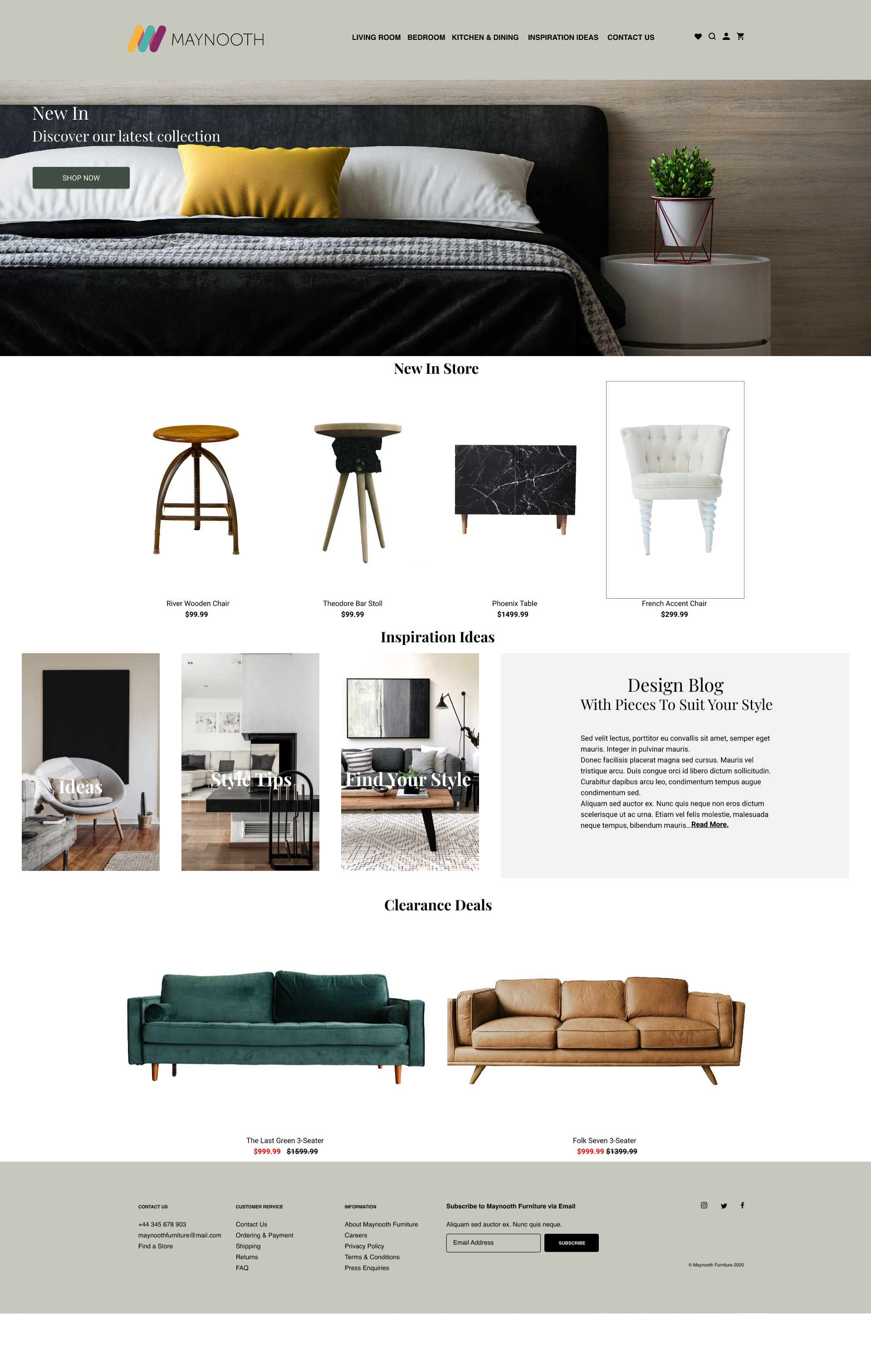
Let me start by saying: I can tell from these designs you’re not brand new to design—they look good and I think these types of sites are a great way to practice the fundamentals of layout. Nice work. A couple adjustments (below) will go a long way, but I suggest making a copy of what you have first so you can compare and judge for yourself after.
-
Starting on the homepage feature, your call-to-action is getting lost. Text over photos is a common challenge, but I have two tips for you. First, since text eyes are drawn to contrast: try to place the text and button in a place that will stand out and be clearly readable: for instance, a bigger bolder white text-block and button in a relatively dark area (with a catchy headline!). Second, consider an image with more diagonals or a bigger “dead area”. The issue in yours: both your text and your background image run pretty horizontal (notice the lines created by the pillows and headboard and sheets). This has a tendency to camouflage your messaging.
-
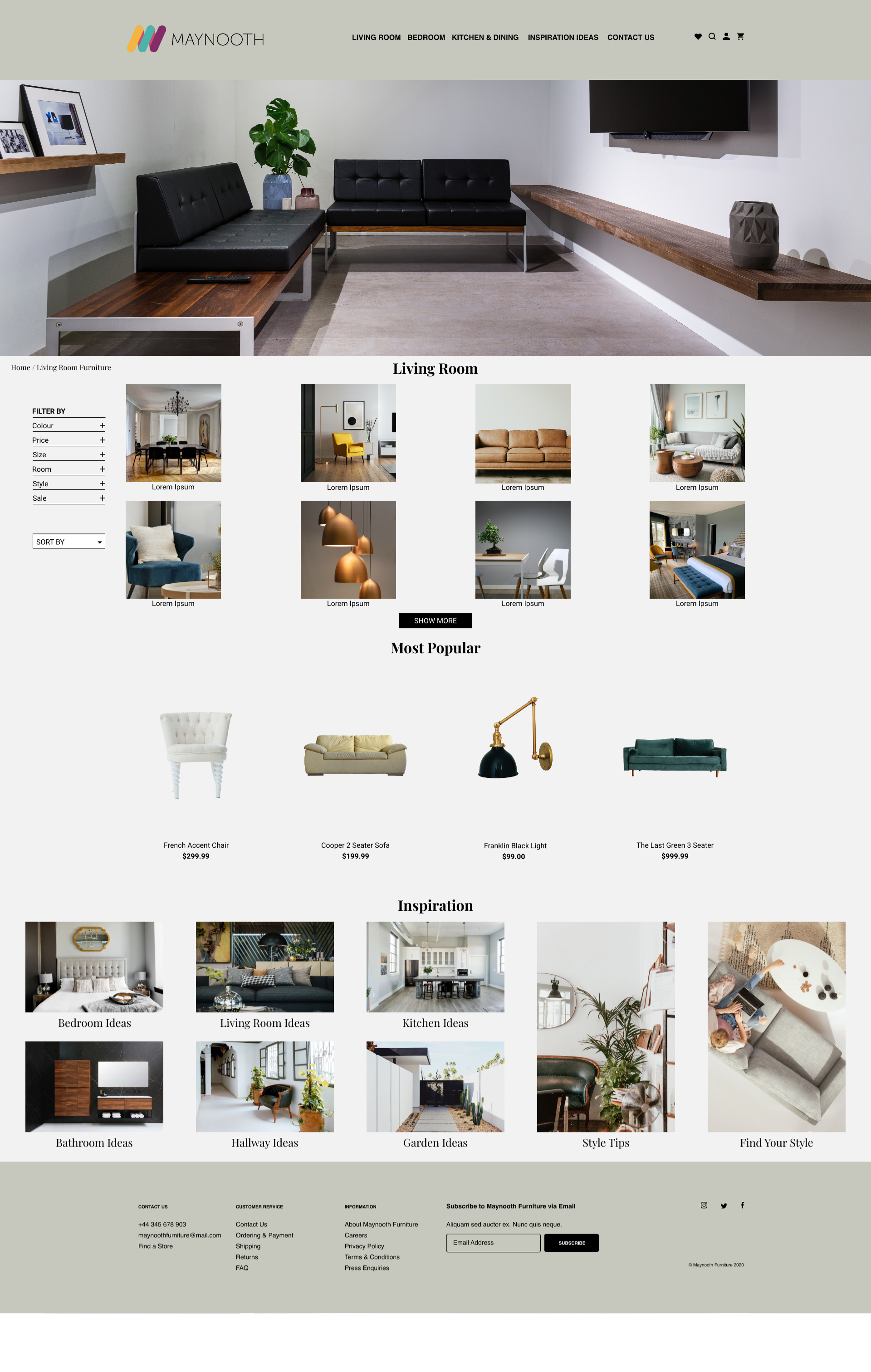
Watch your margin and your padding. Generally speaking there should be more space between big sections (like “Living Room” and “Most Popular”), and relatively less space between the items in a section. This is most apparent on the homepage, where the labels and prices of your New In Store items are butting up against Inspiration Ideas. If you put a lot of whitespace between these, it will further enhance the luxury aesthetic you appear to be going for—from a brand perspective, few things are less luxurious-looking than trying to cram all of the products in your store into a page (take a look at Amazon or Walmart as examples of anti-luxury). Things closer together attract, things further from one another repel. This is the essence of visual grouping.
-
It’s hard to tell how big your text is, but these days on the web I rarely see much text I like below 14pt/px size. And I still have relatively good vision, Whomever-be-praised  . Check your text and consider bumping everything up a little if it’s below 14, and respect the hierarchy. Sometimes I’ll drop text to 12pt if it’s the least important, smallest thing on the page or if I’m trying to make everything fit into a small space. But you seem like you’ve got the room here.
-
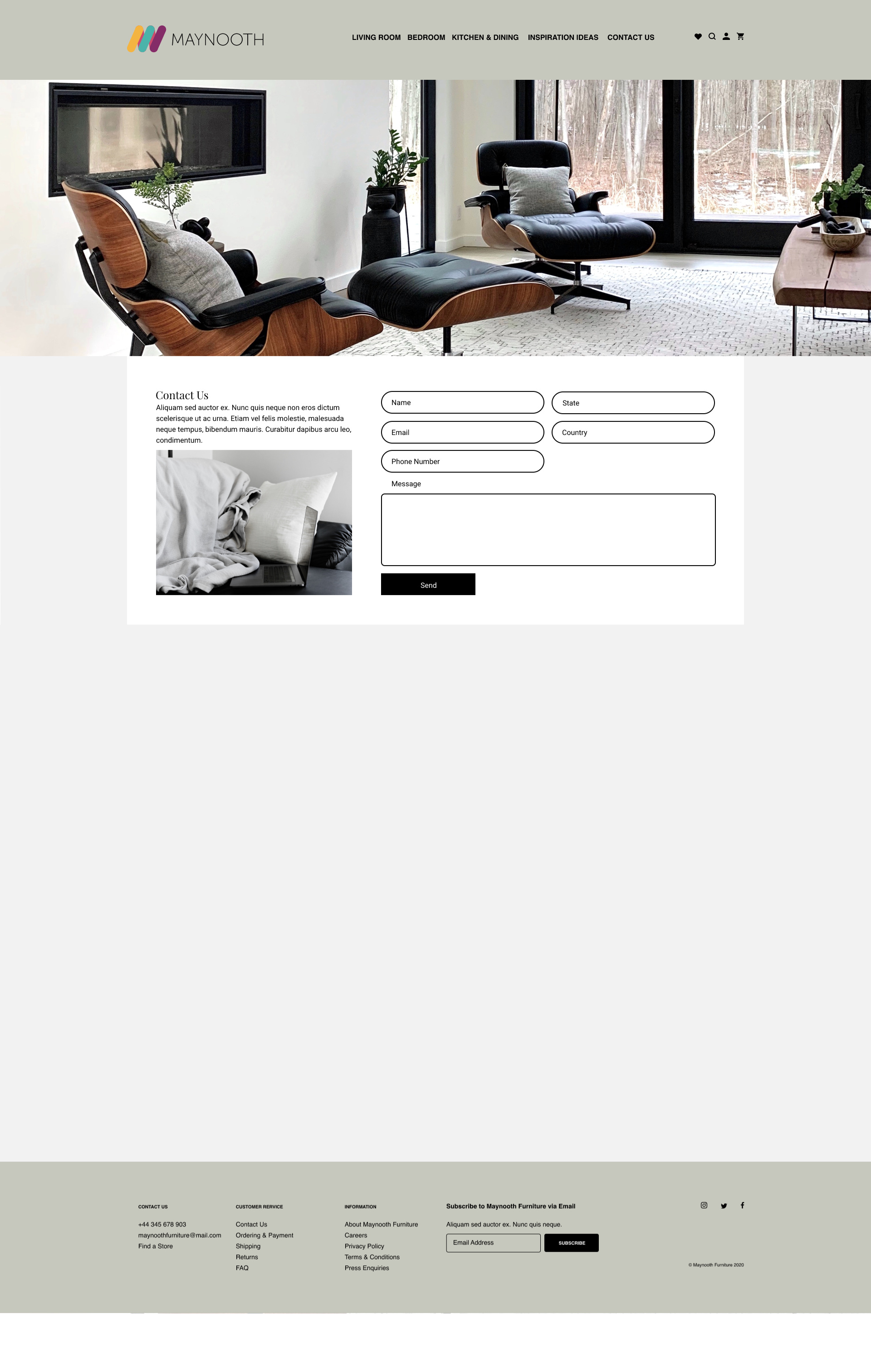
On your contact form, the pill-shaped fields are a tad strange to my eye—this shape is put to better use when as a single field (like a search box at the top of a long boring table of data or something). When stacked together, they create a lot of visual noise between them (blame the circle-shaped parts). Better to keep it simple. Just make all your fields the same amount of roundness (somewhere between 0 and 6px border-radius is fine—unless you really want to make a statement).
-
Also on the contact form, pay close attention to which fields are grouped together, and which you actually need. I’ve found in testing that people have more trouble with two-column forms, as it forces them to scan vertically and horizontally. Asking for more than a name, email, and phone number on a “contact us” form seems like asking for more info than you really ever need, which most of us jaded old internetters are allergic to these days.
-
I don’t think the white box around your contact form is contributing much, as your background is already pretty light. I’d consider removing it, to simplify.
-
Seemingly minor, but I always try to put as many real words in as I can when I make screens, rather than rely too much on lorem ipsum. People need language to better understand what they’re looking at. Plus it makes your portfolio pieces feel more real to fellow students, teachers, or potential employers, and shows that you put care into your work in a subtle way—and subtlety is always undervalued when starting out. In your case, and in order of priority, I’d start with headlines and product labels first, then worry (but not too much) about body copy, if you have time left. It doesn’t have to be brilliant copy, just clear and helpful.
I hope the above is helpful, and good luck out there.