I’m excited to join this community. I’ve authored two books for the Christian publisher Wipf and Stock. While their design team usually handles the covers, one of my photos was used for a cover, with their team managing the text placement and coloring.
Currently, I’m working on a children’s book series based on religion and mythology. The series was accepted by a publisher, but I didn’t agree with their approach, so I’m back to square one, seeking an agent for the first time, which is a bit nerve-wracking.
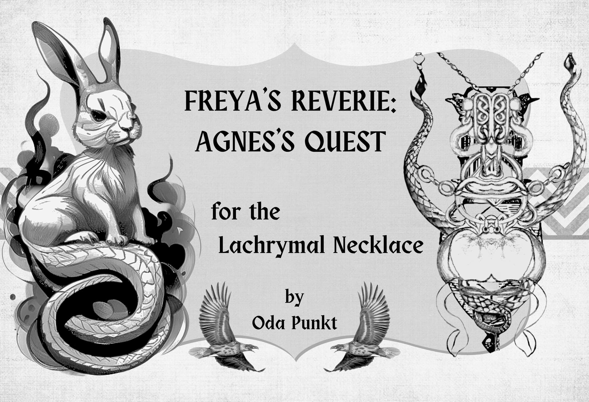
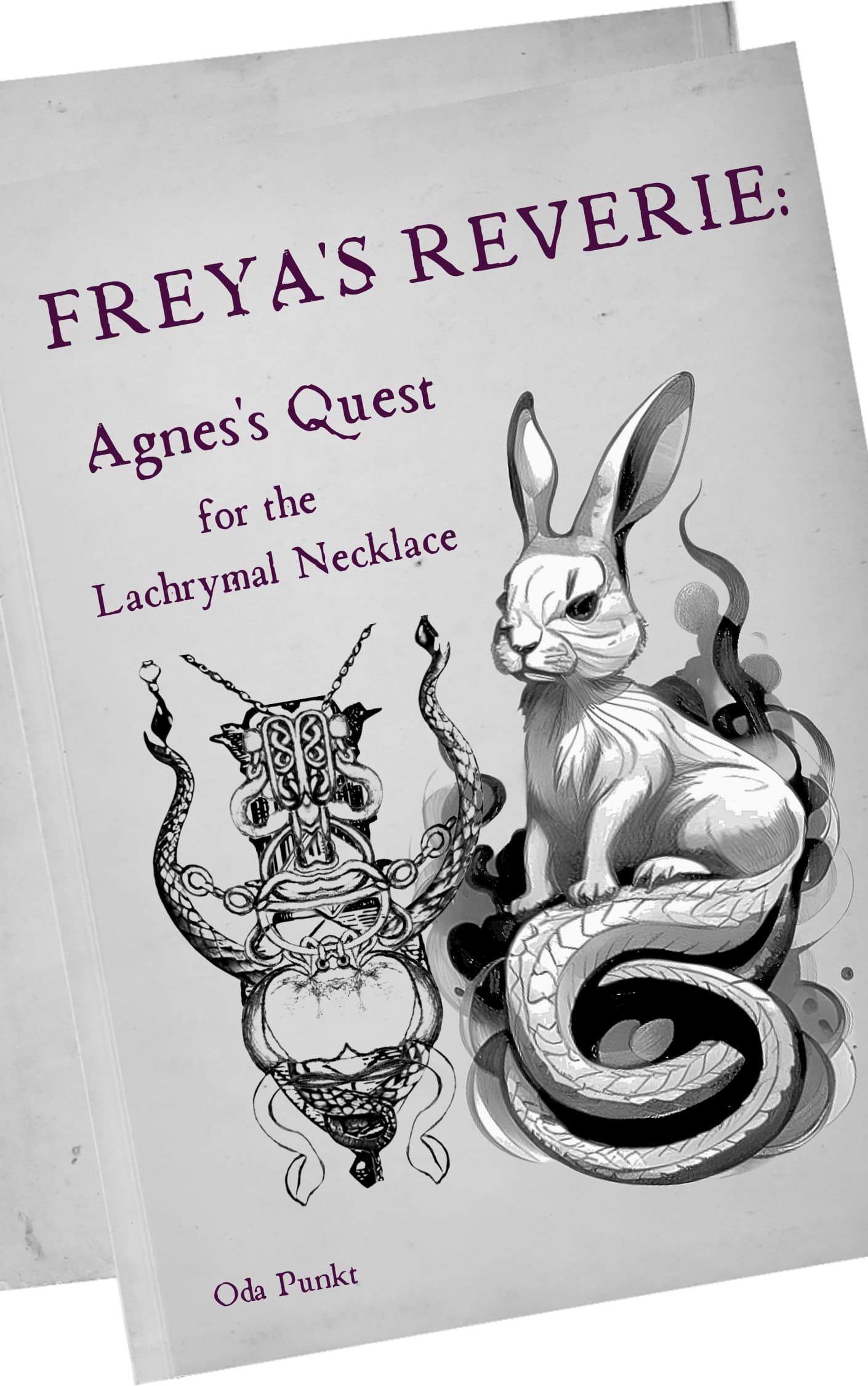
Along with sending a sample of the first book to selected agents, I’ll include a link to the illustrations for the illustrated version. I’ve also created mockups for both the illustrated and regular versions of the book covers, and I’m really happy with how they turned out. I’d love to hear your thoughts and feedback on them. I don’t use social media, so I’m relying on your input. Thank you so much!
Also BTW I have no idea why a century old photo of me popped up as a profile pic here and I did not understand how to remove it. Its apparently a bathroom selfie I took when my lifestyle was very different.
It’s not totally clear to me what I’m looking at. What is the difference between the illustrated version and the regular version? Why is one horizontal and one vertical? Aside from the confusion — which could just be on my part — I’d make a couple of comments.
First, I think your typography could use some work — especially on the vertical version. Watch your kerning. You’re using foot marks instead of proper apostrophes on the vertical version. On the vertical version, the apostrophe (or foot mark as it is) in Agnes’s is way too high. Use baseline shift to bring it down. Your leading really breaks up the title. If you want to put more emphasis on certain words, that’s fine; but I think you can do that and still make the type a cohesive whole — which I don’t think it is right now.
Second, I am guessing the rabbit is Agnes and the necklace shown is the lachrynal necklace. If so, I understand your impetus to include them both on the cover. My problem is that they rake up roughly the same visual weight, so they end up visually competing with each other. I’d look at options that use just one illustration or, if you’re dead set on having both on the cover, look at options to scale one back so it becomes a secondary item.
Click on your image on the upper right and click the person icon then Preferences. Scroll down to “Profile Picture”. You can upload a new image from there
That’s what the forum is set up to do if you choose the “Gravatar” option when filling out your profile. It will grab the image associated with the email you are using. There is no way for us to disable that little feature