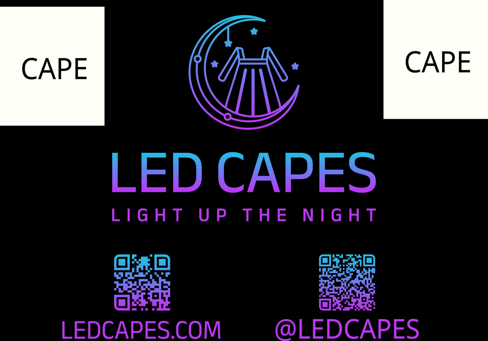
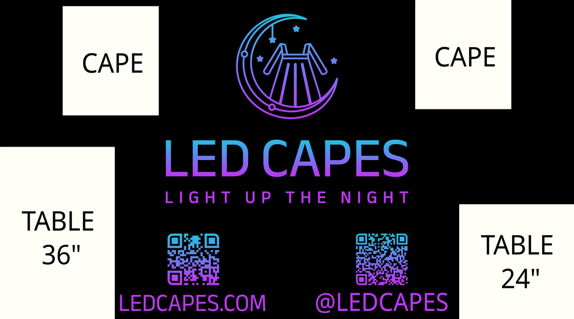
We started a small business, which at times involves us having a 10x10 feet pop up tent at outdoor markets. This design is an 8’ x 10’ vinyl outdoor poster which hangs as the back wall on the tent. We make LED light up capes so the “white” blocks you see will be two actual capes hanging (not part of the graphic).
Also there will be a 2’ wide table on the right and the left of the booth possibly obstructing the poster so I’ve put those in as white blocks also (not part of the graphic). We don’t know how high the tables will be, but it’ll be between 24" and 36" so one side shows the minimum and the other the maximum.
Overall, any suggestions?
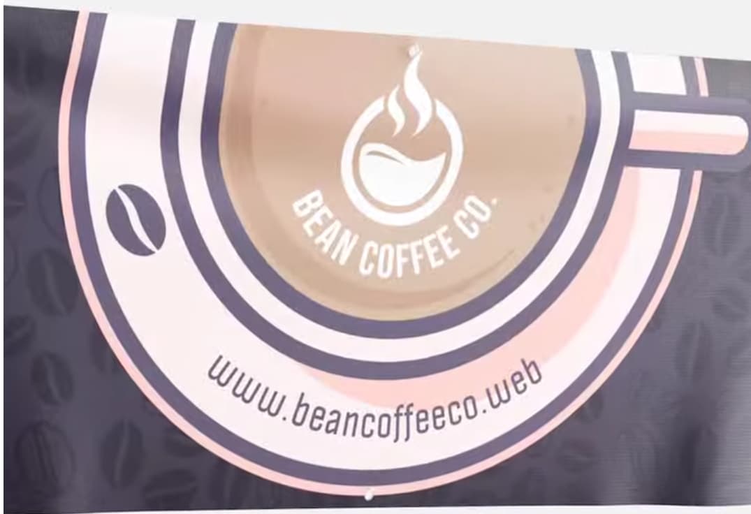
I feel like the background just being black is kind of flat and lacks movement. For instance on this coffee banner example it has these dark beans (see bottom pic attached) which are so much nicer than a flat black background. I’m trying to think of something like that but wanted to see if you all have an ideas.
We haven’t finalized the company colors, although what you see is the current working set. Maybe the purple hue should be more pink to make it even brighter? The issue is it needs to also be presented at times on white backgrounds so it’s kind of a compromise.
IMO, the QRs are too close to the ground. That’s below knee level. And you’ll have people entering the booth and standing in front of the QRs too. They will be difficult to scan. I think you want to get those closer to eye level.
I’d take them off the wall and put them on a tabletop display, and include a call to action for each one… explain to passersby why they should scan the codes.
Mojo’s point about the QR codes was the first thing that struck me too. People and product will obscure them.
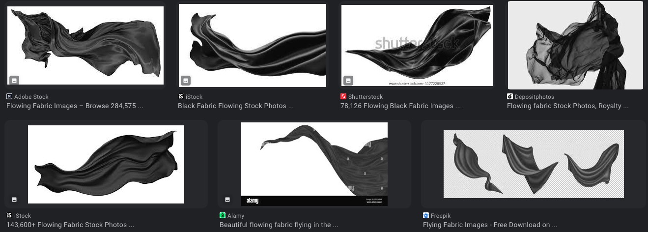
If you feel the background is boring, you could maybe incorporate the look of fabric, the folds of a cape. Just make sure you don’t make the detail so small your backdrop looks wrinkled.
You’re neither thinking through the practical problems nor considering any exciting possibilities. You’re simply spacing things out in a symmetrical arrangement on a black background while using a generic typeface set in caps. In other words, you’ve designed the perfect lackluster backdrop for people to ignore while walking by to the next booth that looks a little more exciting and entertaining.
What kind of look and personality is appropriate? Fun? Spooky? Cosplay? Urban? Woodsy? What personality would best appeal to your target audience?
What kind of tablecloth will you be using? Will you have any pop-up banners? All these extras should have a similar look and contribute to the personality and emotional qualities that might best appeal to your target audience. You don’t need to cram everything onto the backdrop. Distribute it around on the tablecloth, pop-up banners, giveaways, etc.
Why are you draping the capes over the background like a limp, damp towel over a shower door? The capes are meant to be worn, aren’t they? Show them off in a dynamic way. Have someone in the booth wearing one.
Don’t place any critical information on the backdrop where it will be obscured by the table and the people sitting at the table. I’m not sure why this isn’t obvious. Think it through!
There are thousands of possible images to use on the background, yet you’ve chosen a dull, boring, flat black. For example, here are some images: Dark Night Scenes.
You’ve explored none of the innumerable options and possibilities and seemingly just typed out and arranged the information. What you’ve shown looks like you’ve built it all in Word using the default font.
What you’ve shown us isn’t good. Failure to evoke emotions or pique people’s interests will hurt your sales. Start over and think through what I and others have mentioned.
Thanks for the replies. They helped me avoid making a variety of mistakes with what we were about to do. We’re more or less throwing this away, thinking more critically about how we want to present this brand visually not just on the banner.