Feedback on first web design?

Hello everyone!

I’ve been working like crazy on this website. I’ve done everything from taking the pictures, making the logo, choosing the font, etc. It’s been launched, however, I feel like something is missing? Or maybe I’m just stuck in the 90’s? I just need some help on this. What am I missing? I am a relatively new designer…I always feel like my work is lacking SOMETHING!! But I just don’t know WHAT the beep it is and it drives me CRAZY!! LOL. I am somewhat knowledgeable in marketing but no where near a lot of people. Anyway, someone HELP! PLEASE! What am I doing wrong?? What am I missing? What can I add? What can I work on? How can this be better? Your advice, your support, your critique is much appreciated! Thank you!

www.luckyfoxtea.com

1 Like

I’m not really a fan of drag-and-drop websites built in Wix, but it looks pretty good to me. Nice product, looks good, easy to navigate, easy to buy, fun-looking — what’s not to like? I haven’t studied the site in any kind of detail, but maybe you’re overthinking things to the point you’ve lost some perspective on what you’re seeing. Sometimes letting something sit for a week or two without looking at it or thinking about it provides a fresh perspective. For what it’s worth, from my fresh perspective, it’s very nice (despite Wix :wink: ).

1 Like

Seconding Just-B - your website looks pretty darn good. If I were to guess, I’d guess you’re falling in the common trap for designers with an art background in just being in the wrong headspace as a viewer. I sometimes have to pull myself out of the trap of wanting a strong focal point on everything, and I think that’s at least part of what’s bugging you here. You have lovely white space, and a pretty easy flow of information, but you’re probably subconsciously looking for something to “pop,” even though you don’t need it and something like that would detract from the rest of your design. They’re on your turf, now, so you don’t need to catch their attention from the crowd - you need to show them around and help them find what they’re looking for. No more need to shout!

I poked around a bit, and there were a few small quality of life improvements and things that could be polished or tweaked, but honestly? It’s pretty darn solid. If I were to say you were “missing” anything, it’d maybe be some kind of organization or divider on the landing page content - it felt just a little bit like I was getting lost, but my head’s been a lil off the last couple days, so take that with a grain of salt.

In a metaphor: Your outfit is lovely and well composed. Maybe try adjusting the angle of your bow, but I wouldn’t try adding any new accessories.

Woah, this was very helpful. Thank you very much. The weight has come off my shoulders. phew. I will take this information and use it on this and any other project I may come across. :slight_smile: thank you.

Ya, I was never a fan of WIX myself. However, I am still learning HTML and I wanted to speed up the process. I know how to edit lines of code but building an entire site from code seemed daunting.

Looks nice, the only feedback I would suggest is that the logo should be one of the first things to load on the landing page. Not sure if this is an issue that is unique to me, but it currently didn’t load for me before the first slide disappeared.

It’s very feminine. I don’t see a single picture of a bloke.

And I’m a bloke - and I love tea. I love the Water Wind & Blossom Set!
Can I order to Ireland? Ah I see your shipping policy - US and Canada only - pitty!!!

I love this stuff.

It’s a nice site - add more pics of blokes enjoying tea. Widen your demographic and shipping policies.

There’s nothing I can say that a website analysis won’t give you.

I like the site. Wix is ok - but you should consider moving to WordPress or something similar for more control.

I am about to make myself unpopular (‘What, more than you already are?!’), but I am afraid, I find a few things not quite working for me. Don’t worry, I’m not about to assassinate it. It’s more than fine and I have seen a lot, lot worse.

However, if I am being nit-picky, for me the hierarchy needs improving. Apart from the main image which is strong and grounds you when you arrive, as soon as you start scrolling, your eye is drawn all over the place. I am not being guided. Too much. Too bitty. Lots of white space, which is great, but it’s not working for you as well as it could.

There also feels like an imbalance in type sizes. You can drop down to body text size if you are going into long tracts of text, but as your main text is split into small, separate, paragraphs (as I think you are right to do), then they need a little more punch. (I can’t believe I’m saying this, as I’d set all body text (for print) at 8.5pt, with everything above 11.5, punishable by five years of hard labour.)

Finally, the main logo, which I am assuming is the outline version that appears on one of the slideshow images, works really nicely – though, I’d simplify it a little more (I really am nit-picking today). It is suitably elegant and calm. However, the red illustrative fox peppered on the home page, I find distracting and almost jarring. It interrupts the feel of the site. Without it, the site has the requisite feel of calm. The red fox feels like an angry wasp at a picnic.

Again, these are tweaks. Overall it’s a fairly nice site. Typography is always the thing that makes or breaks any design job and it is always about the obsessive detailing.

Hope this helps.

I’d point out three things.

First, I completely agree @sprout about the red fox on the home page being distracting. I don’t think it needs to be there at all; it’s really just visual noise in my opinion.

Second, the overall tone of the site seems to be natural, organic, and healthy. Then you have the “sweet” slider on the home page that shows nothing but refined, processed sugars and carbohydrates. It really doesn’t fit with the rest of the site.

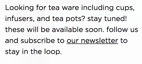
The third thing, and the biggest thing, is your type. In my opinion, you have too much going on. Here’s what I’m talking about.

You start off with a modern sans serif font with a single story lower case a.

And you switch to a different sans with a single story lower case a.

Then you switch to a third sans with a two story lower case a.

Screen Shot 2021-03-17 at 7.28.43 AM

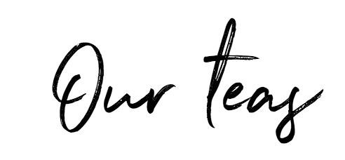
And you have what appears to be the script from your logo. This might be personal preference, but if you’re using a stylized script for your logo, I wouldn’t use it anywhere else. Imagine Coca Cola using their script for a headline or anything other than their logo.

Screen Shot 2021-03-17 at 7.27.23 AM

Throw in a different script for good measure.

Screen Shot 2021-03-17 at 7.29.35 AM

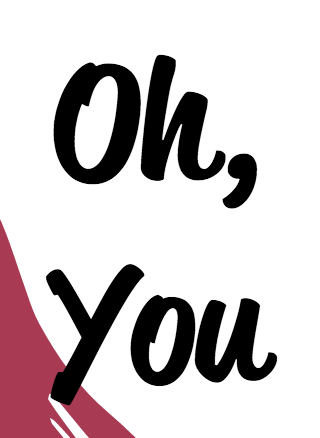
Then throw in a completely different feeling sans. Is that Meta or a Meta knock off?

Screen Shot 2021-03-17 at 7.29.53 AM

And a serif for good measure.

In your original post, you said you thought the site was lacking something. In my opinion, that something would be restraint in your type. I’d suggest you work to simplify the type and rebuild the site using no more than two font families. And make sure the two font families you choose contrast. Don’t choose two sans serif families.

I have just looked again on my desktop and although the type sizes are better than on an iPad, I have to agree with Steve_O, in that the type needs a fair bit of refinement. It all adds to that sense of too much, too bitty. .

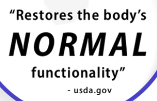
Also, the diagram on ‘how can tea help’ is a too bit-hard-nosed.

My initial critique still stands. I think it’s a good-looking and well-designed site that will work quite well.

However, now that we’ve moved past that and are drilling down on the details, I agree there are things to improve. I’m not sure how much control you have over this in Wix, but the mobile and tablet versions have some layout issues. For example, the typography on the left side of the third slide of the main front-page slideshow carousel gets cut in half on my tablet. There are other instances where things just don’t readjust themselves correctly for various screen resolutions, but now we’re getting into Wix-related issues, though, I think, which brings up the whole WYSIWYG drag-and-drop issue that lies at the heart of my dislike of Wix.

About the fox logo: it’s a nice looking mark, and I like it. It’s clean, simple and has an air of sophistication to it. However, further down the page you’ve used another kind of fox with a completely different personality — more crudely drawn and with drops of water (or something) spraying off its head. You’ve even placed equally crude type over that fox that doesn’t match any of the other typography on the site.

The further down the front page I go, the messier things seem to get. The footer has all kinds of random, superfluous stuff in it, for example. The testimonials, come across canned bits of stuff thrown in to meet somebody’s proclamation that testimonials boost sales. They do, of course, but not when they seem inauthentic or the result of some generic and ill-designed module that clashes with the rest of the site.

The infographic on the front page — how can tea help me section — is really sort of scattered and is a distraction. I don’t think it adds anything visually useful.

In addition to the comments already expressed about typography, I’m not a fan of letter spacing lower case, and I’d definitely use curly apostrophes in the headlines rather than the straight up-and-down variety.

Your blog pages definitely need improvement. You’ve inexplicably switched over to a serif typeface on them, which just plain inconsistent with everything else and really sort of jarring. I could mention lots more about what I’d do with other inside pages, but I have a hunch that you see these things as well because they come across as though you’ve put all your effort into the front page while neglecting them.

Again, though. I really like the overall initial feeling I get when I see the front page. It’s when we start into into the weeds of the site where things start to break down a bit.

The thing that I touched in in my first post about you possibly losing perspective, I think, might be at the heart of some of the clutter. I’m not so sure that you haven’t lost sight of the bigger picture in favor of concentrating too much on the individual pieces. The entire site needs to be unified and simplified in a way that’s consistent with that initial positive impression that, I still think, comes across very nicely.

Woah, alrighty…Trying to remind myself this is how I improve… LOL

Ok, I have many some major updates:
I’ve made my typography more consistent on each page
added categories on the homepage
added an element to create some separation
I have added more “gents” to the page :slight_smile:
Blog font cannot be change, not my preference just the program…I’ll look into it more but at this time, I am stuck.

Still making changes to the why tea. page.

1 Like

Hey, it’s a well designed site for sure. I noticed that your logo is on the hero image and then again in the footer but it’s not in your nav bar. Your logo should be visible at all times ideally or at least at the very top of the page in small. Not sure how you will go about this because obviously having it over the main image and in the nav bar is too much. Additionally, the right and left ends of your page doesn’t fit it my browser. I shouldn’t have to scroll right and left to see e/t. It may be a responsive thing. Wix isn’t great with that. I learned that the hard way.

1 Like

I added the logo to the top left. Ya, I’ve learned that Wix isn’t the best. However, I’m stuck with them for awhile.

The website seems not responsive. when I drag it to be smaller, some content missing.