Hello there! I’m new in this forum, so first - my name is Dana and I am planning on beginning freelance graphic designer career. ![]()
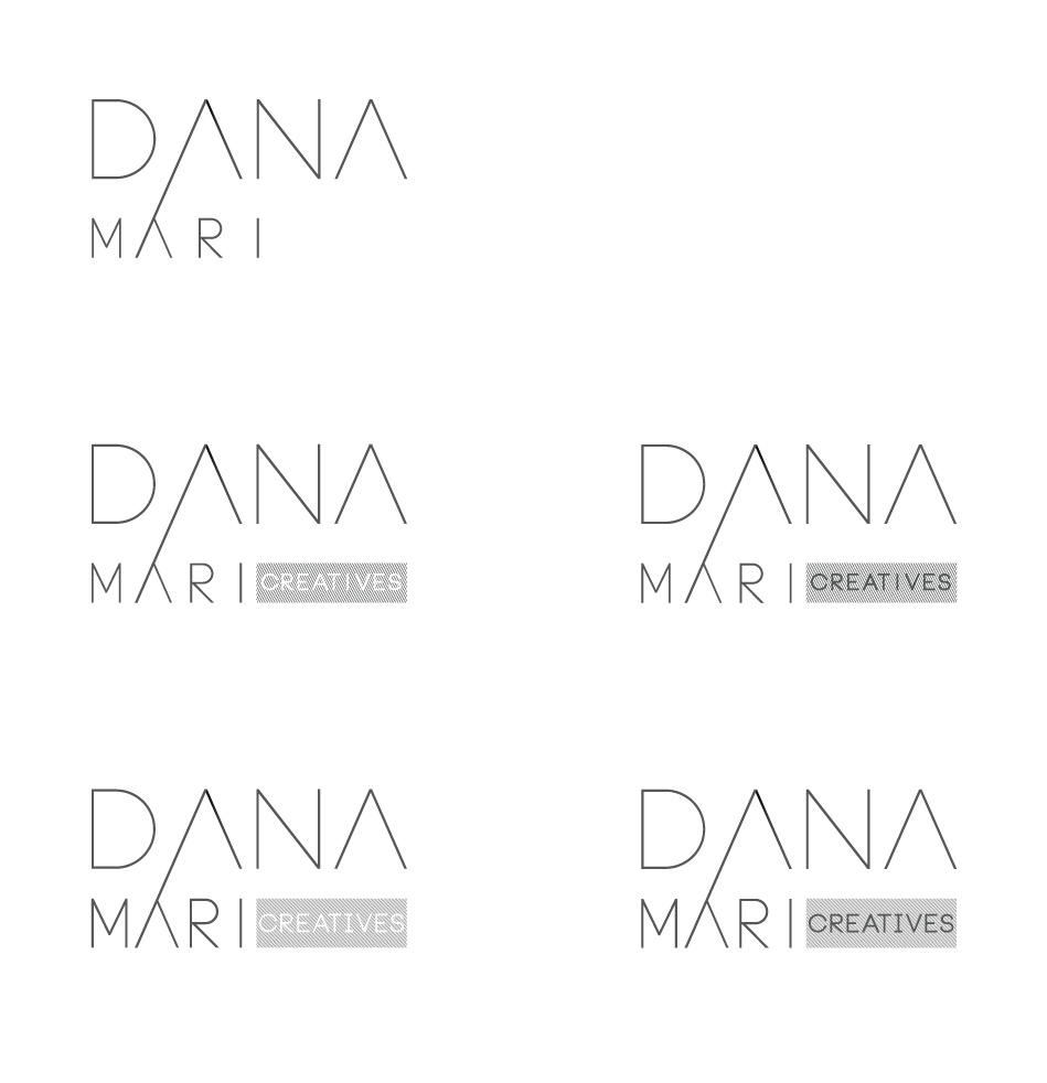
This logo is for myself and these are some variations I have come up to.
Would love to hear critics about all kinds of things, especially if the logo in any way represents (suits) freelance graphic design business.
Also, the line in the first letter A is like a symbol of growth and all such things. I have planned to include this note in my website in some way.
Thank you in advance!
There’s only one of you, right?
Creatives is plural.
Also, I’m a sign guy and really really despise skinny stroke letterforms. Someday you might ask me to put a 3D sign on your office wall and that logo is not gonna do that at anything less than, oh…maybe 12 feet wide. And don’t ask me to halo-light it…
1 Like
Your kerning is all over the place. To create what you envisioned, it became D ANA. Oh, to my eyes it looks like a drunk F.
2 Likes
I would also be very careful with scale. Once you get this smaller or reversed, it will essentially disappear.
2 Likes
First, don’t go that deep with symbols especially in branding, when you sell a product, people look at the quality of your work, reviews and that if your image looks overall to their liking.
Think about big brands, there’s some symbolism but not really something that needs a written justification.
Second, there’s something I like about the type, I totally love minimal stuff but…
Do you really need that connecting line, totally confusing?!
Have you considered the balance vs tension aspect?
One thing that caught my eye and may be a good way to work through this is the way the A’s create an isometric triangle shape. For fun, I’d make the A in your last name extend down so it’s the same size as the one above. That will enhance the optical illusion and might give you some ideas.
I think you might be falling into a trap with thin lines. Designers Rule of Thumb: You want your B&W logo to be legible at the size of a postage stamp. Those lines will not read when small.
For example, on a digital press, you don’t want any lines thinner than 0.35 pt’s thick because digital lays down dots. Go thinner and those dots make it ragged or even disappear.
Flexographic generally 0.25" pmts minimum.
Something about the connecting line that bugs. Not sure why. I guess maybe is seems incongruent in some way. Maybe if there were another long diagonal line going in the same direction.
The A does not symbolize grown and such, btw, and that being the case, why not abandon it and think of a symbol that does.
1 Like
Don’t think of it as an A.
Think of it as an Up Arrow. For growth.
1 Like
100% agreed on both points.
Thank you everyone for your feedbacks! Already found some great materials for learning typography, kerning and lerning and visual tension. Will work through them and go back to sketching, as I played with this design and couldn’t make anything that works for me and feels right! Also I finally saw that the line in the A looks off and reminds me of some retro item of my country, but I can’t remember the name of it. It’s great to hear other people’s thoughts!
Neverman, thank you for the specific information about the lines and sizes. Excatly what I was looking for!
Hello again! For some while now I have been working on this logo, made many sketches. I tried to make completely different concept, but in the end it’s still pretty much the same. The first picture - some of the sketches I recreated on computer.
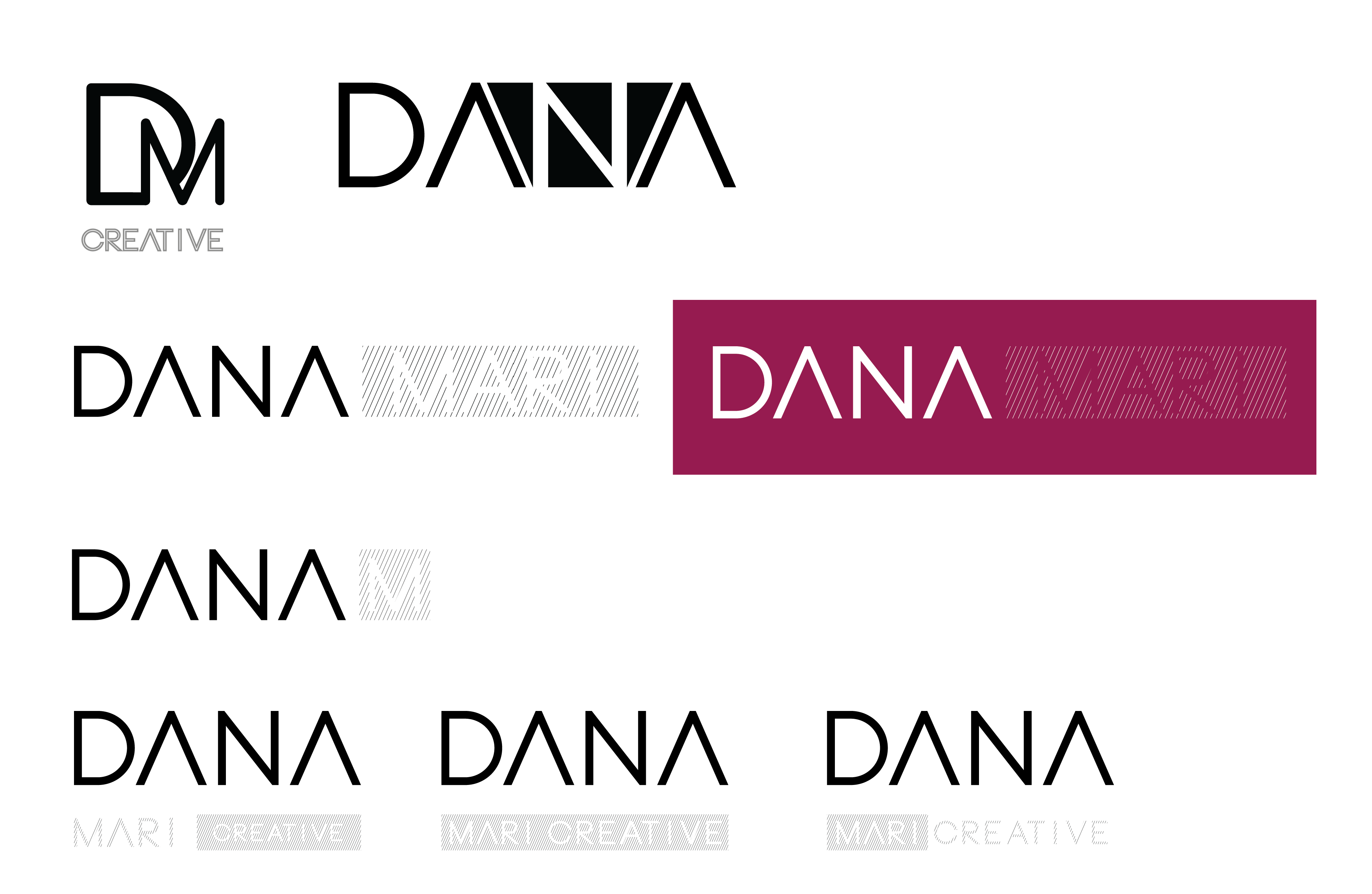
The second picture - the ideas I like most. Those with the ‘‘check’’ mark are the ones i think could work. I made the strokes thicker and now the name ‘‘DANA’’ is legible even in the size of a postmark. The ‘‘creative’’ although is very small in that size. ![]()
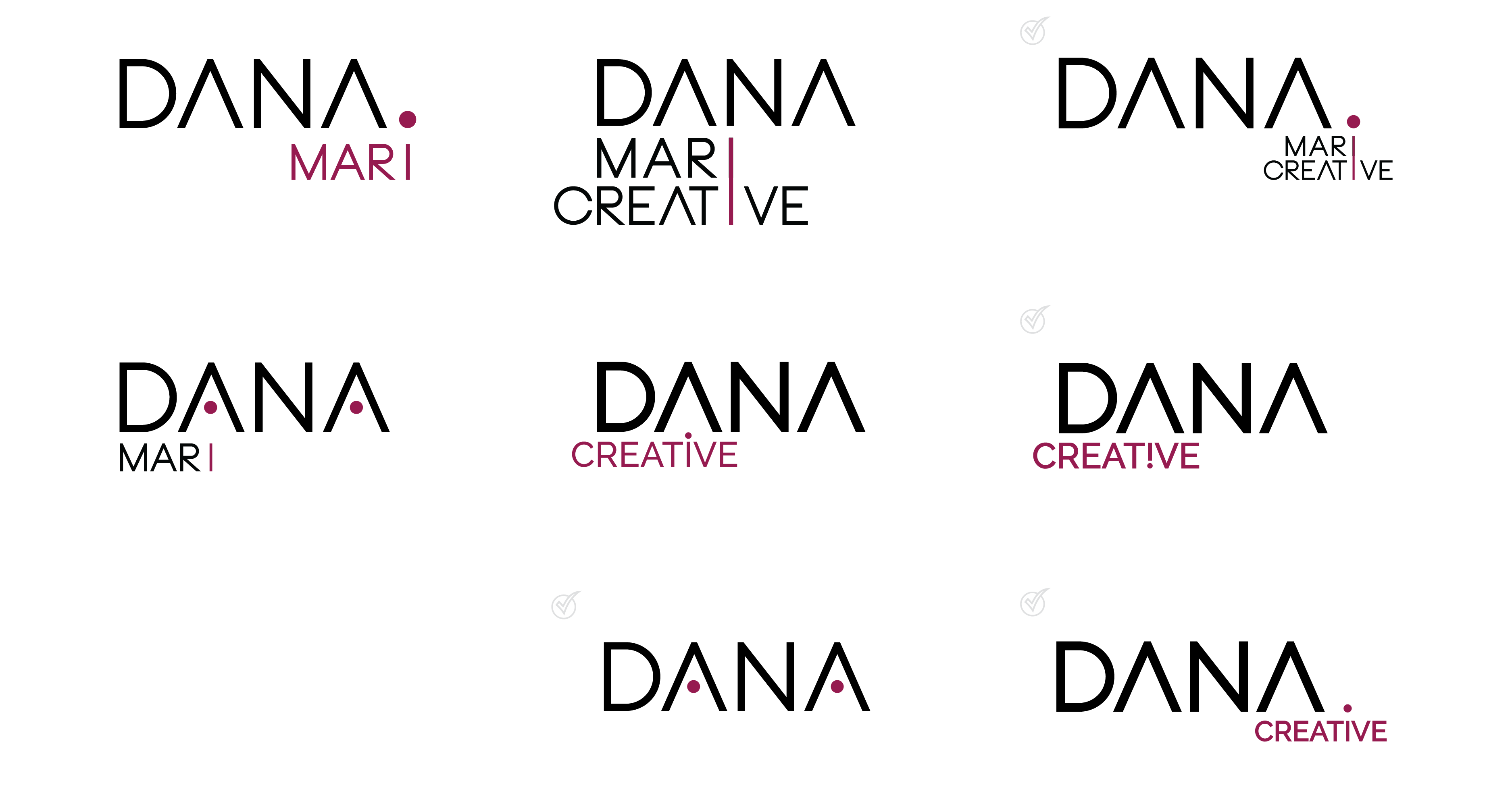
Would love to hear any thoughts and comments!
Overall it’s a big step forward.
The top left reads a little like PM though. Maybe make the D a solid shape (no hole) in the raspberry color with the M overlapping? Maybe not lol.
Careful with those light grays on white, and the lighter raspberry on the darker. Provide more contrast for legibility reasons.
Personally, I’m digging the 4th down left mixed with the one directly below it. I like those circles in the a’s (just preference though). I’d play with the full name on one line and Creative underneath. Because right now most of these say:
Dana
MARI CREATIVE.
But the message should be:
Dana Mari
CREATIVE
So be a little more cognizant of the order of information.
Audibly, my preference is for Dana Mari creative rather than Dana Creative. I like the idea of making the fist name the focal point in a way though because it makes it more personal. I can also see hw you’re attempting to use the dots as a point to the top of an “i” but it’s not reading that way yet because of the amount of space between the stem and dot.
An idea: 4th down from top left. Put the 2 dots in the a’s. Make MARI and the box around Creative the raspberry color. That should solve the order of info but also emphasize your first name and “what you do” (creative).
Personally I like 5 and 6. I feel the dots sort of don’t fit in since everything else is sharp and straight. But to each his own i guess
Thank you both for your replies! I think I won’t use the dots, because someone I showed the picture saw a house in the letter “A” with dots. And then I saw an outdoor toilet in there. When it’s seen, I can’t unsee it ![]()
Here is a picture of what i meant - https://www.dreamstime.com/stock-photo-image-outhouse-outdoor-toilet-coun-image26740410