There’s a lot here to digest and discuss, so I’m just going to limit my feedback to your home page.
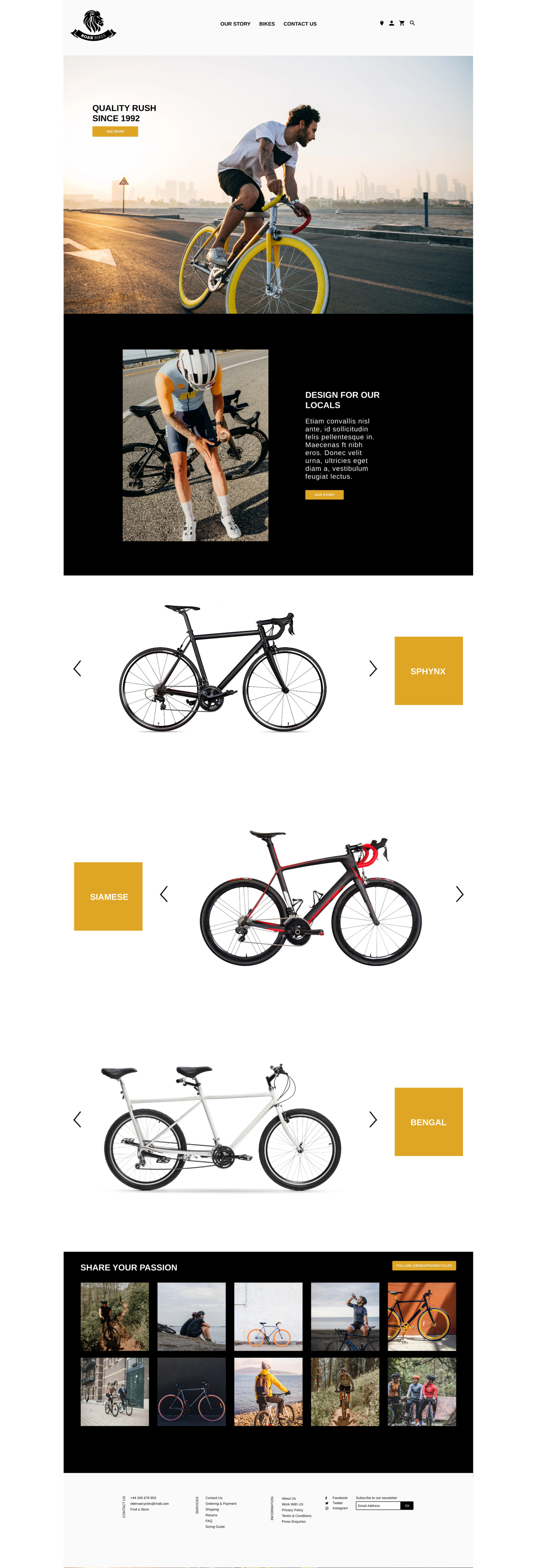
It looks to me that this is a business that sells bikes. I think you did an awesome job on the footer and “share your passion section”.
I think the main title bar feels a bit off. The balance is a bit all over the place because the navigation is in the centre and there is awkward gap between the icons and navigation links.
Regarding the main headline, I feel like this doesn’t really command the attention that it should relative to where it’s positioned, maybe due to its size or lack of text. Also you also totally need to get rid of that shadow and corner radius around the button below it (it doesn’t match the rest of the flat layout).
The “Design for Locals” is nice, however the negative space around the photo kinda becomes a “frame” around the image, whereas everything else is appears to be framless. I would expand this image to take up the whole left hand side.
One last thing I would add as an observation: Am a bit unsure what kinda bikes they sell. Is it hipster bikes, ebikes, mountain bikes or just bikes in general?