Hope you are all well. I have a huge favour to ask.. I am a graphic design student who is about to graduate! Yay! For my last assignment I have to create a portfolio of my work.
Would anyone be willing to please give me some feedback on one of my latest projects? Anything is much appreciated!
The Brief
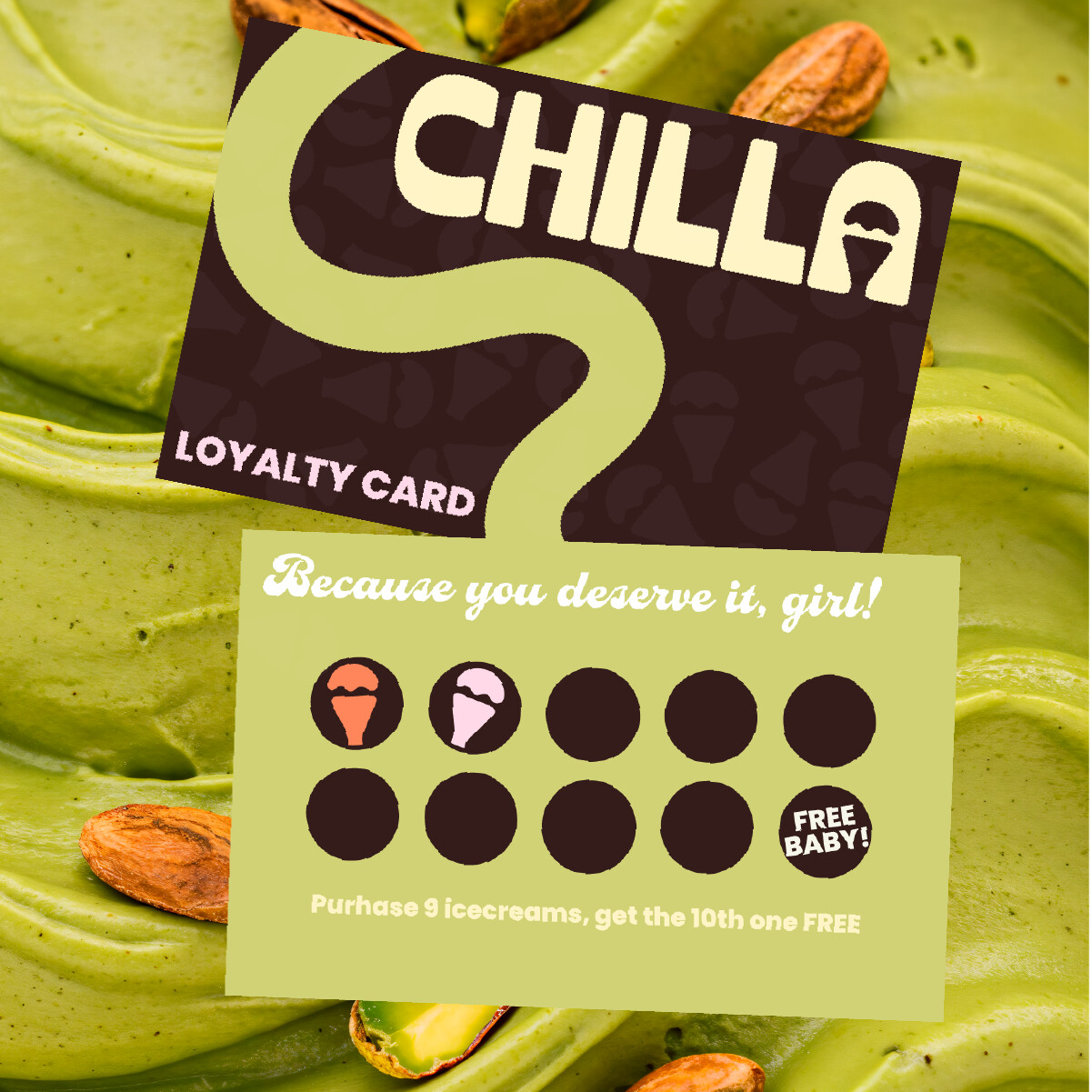
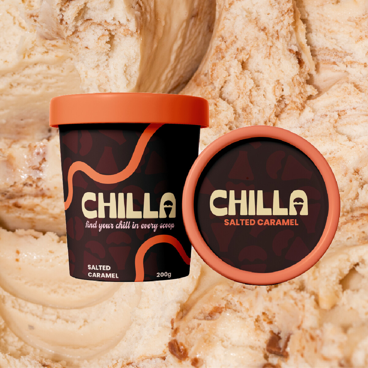
Say hello to Chilla - a cult ice cream brand made for hot days and hot people. Think drippy soft serves, nostalgic summer flavours, and bold branding with a laidback cool-girl twist. Confident, creative, and just a little retro - the kind of brand you’d spot across the beach and immediately want to be part of.
The Deliverables
Design a brand identity that’s fresh, fun, and full of flavour. Clean-but-creative logos, thoughtful mockups, and a visual world that makes people crave the product. Sunny, stylish, and undeniably cool.
Hi, Jordy. I think you’ve done a good job. I would buy that ice cream.
The only thing I’d be concerned about is how the wordmark gets a little lost due to the lack of contrast between the background photos (the girl and the cone). If it were me, I’d probably try to come up with a way to increase the contrast between the relative values or the colors.
By the way, I love the ice cream cone you’ve hidden in the counters of the letter A. Very nice!
It says “Because you deserve it girl!”. As a guy, that seems odd. Why call out “girl”. Is this somehow only for women?
It also says “Purchase 9 icecreams get the 10th one FREE”. First, “Ice cream” is two words. Also, saying purchase ice creams doesn’t make sense grammatically. At least in the US. I’m not sure where you are located. Do they just serve cones? Do they serve cups as wells? Should it just say “Make 9 purchases, get the 10th one free”? or “Purchase 9 ice cream cones, get the 10th one free”?
Also, how are the cones added to the loyalty card? Most businesses either use a stamp or a specialized punch to keep track. Stamping brightly colored ice cream cones on a dark circle probably won’t work. I like the colors, I suppose you could argue it uses small stickers, but at the end of the day, with all graphic design it needs to be functional. And IMO this is not functional.
Also, while modern trimming is much better, the logo being fairly close to the edge, as well as the loyalty card text on the front also being so near the edge … while you most likely wouldn’t run the risk of the trim cutting any of the text off, you might run the risk of it looking uneven. What I mean is if your space between the logo and the trim edge is 1/4", and it trims closer along the top then the right edge so that hypothetically the top edge ends up with only an 1/8" of spacing it can look “off”. It isn’t the end of the world, and I wouldn’t necessarily change it for your design, but it is something to be aware of.
And finally, that is awesome that I get a free baby after 9 purchases/cones. I wonder what the going market rate is for a baby.
Hey CraigB thanks for the feedback and glad to hear your perspective. The brief did also mention ‘laid-back cool girl twist’ (sorry that wasn’t included in the brief above) so I definitely was targeting girls more, but I’m glad you mentioned that.
Well it clearly states babies are free when you buy 9 ice creams, so the going rate must be pretty low.. Guess I have to change this as some countries don’t speak as relaxed as us Aussies do.
Of course, I know what you mean, but in Aus I don’t think many young females are going to think they are getting a FREE BABY with their ice cream purchase
@Jordy I was mainly joking about “free baby”. Even here in the US people would know what you meant and wouldn’t read it as meaning an actual “free” baby. Especially if the rest of the vibe, branding and design is more laid back and trendy. I wouldn’t change it.
I think the comma needs to be added. Since this is a senior portfolio project, the real audience for this is art directors / creative directors / agency owners who are going to be in a hiring position. The missing comma shows a lack of attention to detail … at least to me. If the job market in Australia is anything like it is in the U.S., you want your book to be flawless to stand out from the hundreds of other applicants.