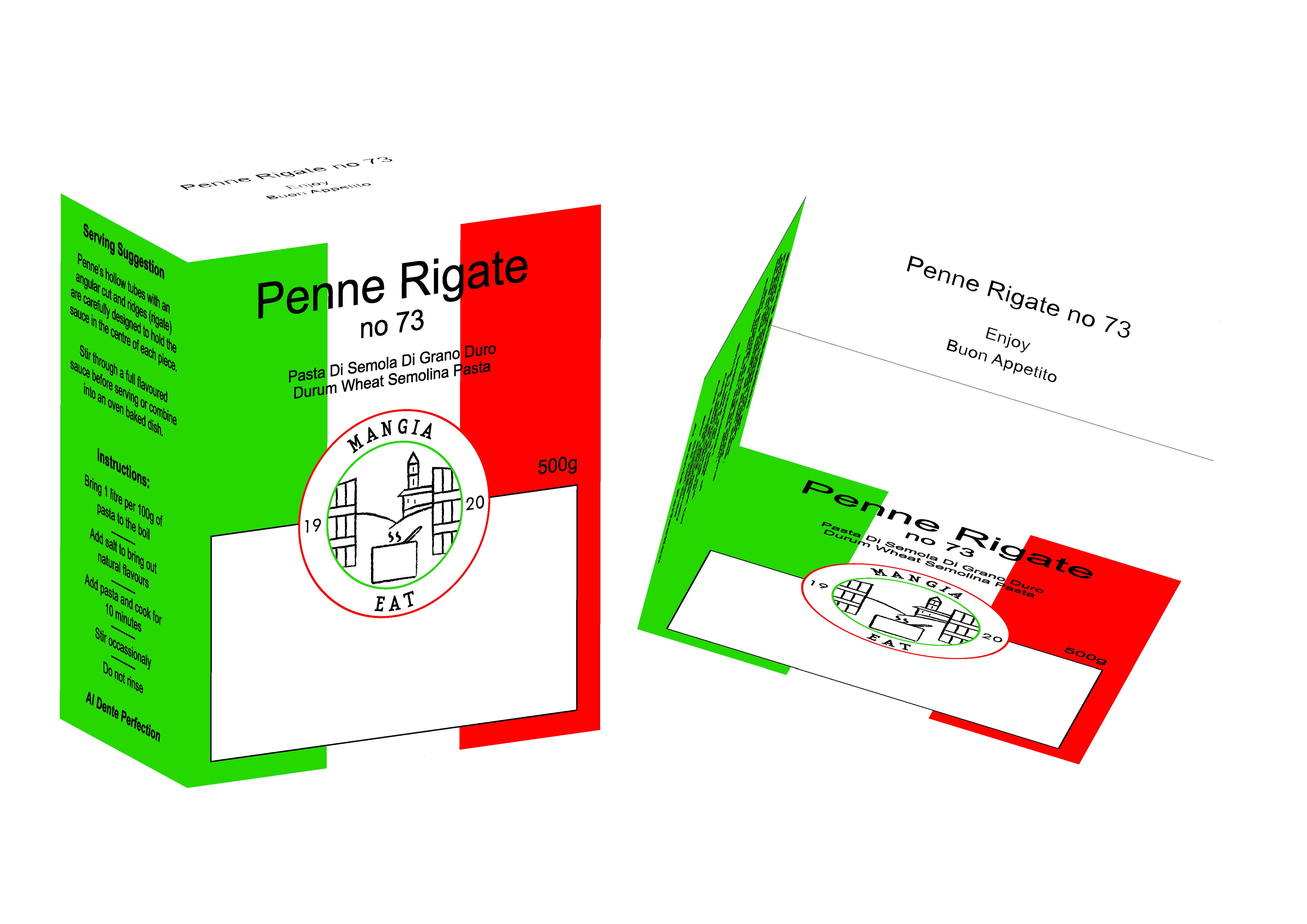
Does this even have a brand logo? What do “19” “20” mean? Do I ask the store help “Where can I find the Mangia pasta?” or “Where can I find the Eat pasta?”?
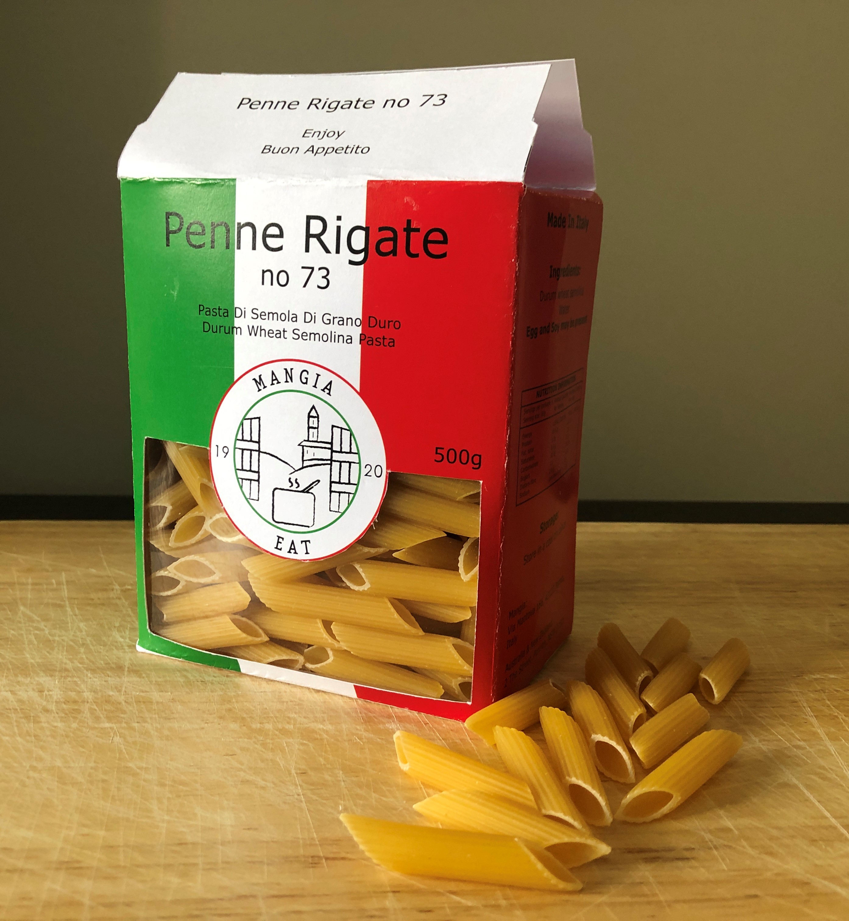
The window being so close to the box edge is going to cause problems scoring and folding, let alone die cutting. Do not expect die cutting around the circle to be spot on.
The time is coming, not too far away where gratuitous use of plastic in packaging is gonna go away (as in product-viewing windows.) At this point in time, always consider if throw-away plastic is needed at all.
What feeling do you get when you look at the product?
Low end Italian something. Italian with a capital “I.”
If you saw this product on the shelf would you buy it?
Absolutely not.
Give me one thing you like, and one thing you dislike about the product.
There is nothing to like.
The typography is boring and no attempt has been made to incorporate the type with the box colors. There’s something vaguely insulting to the whole presentation, not quite sure why. I think it’s the translation of very basic Italian words that really don’t need to be translated into English in this context.
The logo is a boring trendy medallion basically created with similar weight strokes, duplicated shapes and a simple standard brush. The serifed type seems out of place.
In the words of my Graphic Design professor: “Do Over.”
Without reading the other comments first, here’s what I came up with. They largely repeat what others have said.
What feeling do I get? Boring and a perception that I’m looking at something old-style, generic or made in a small, neighborhood pasta factory. Depending on the situation, generic, retro or neighborhood-made isn’t necessarily bad (and might be good), but the boring part suggests lower quality.
Would I buy it? Probably not unless I was already familiar with the brand. Most everything about it suggests generic and lower quality.
What do I like? Honestly, not much aesthetically, but the colors do suggest Italy, which is good. I also like that you’ve considered all six sides of the box instead of just the front.
What don’t I like? The typography is very dull, generic and uninspired, which suggests a product that is also dull, generic and uninspired. The die cut is large and too close to the folds, which will create stability problems. The die cut will never be precise enough to perfectly match up with the circular line you have drawn around the circular part of the die cut.
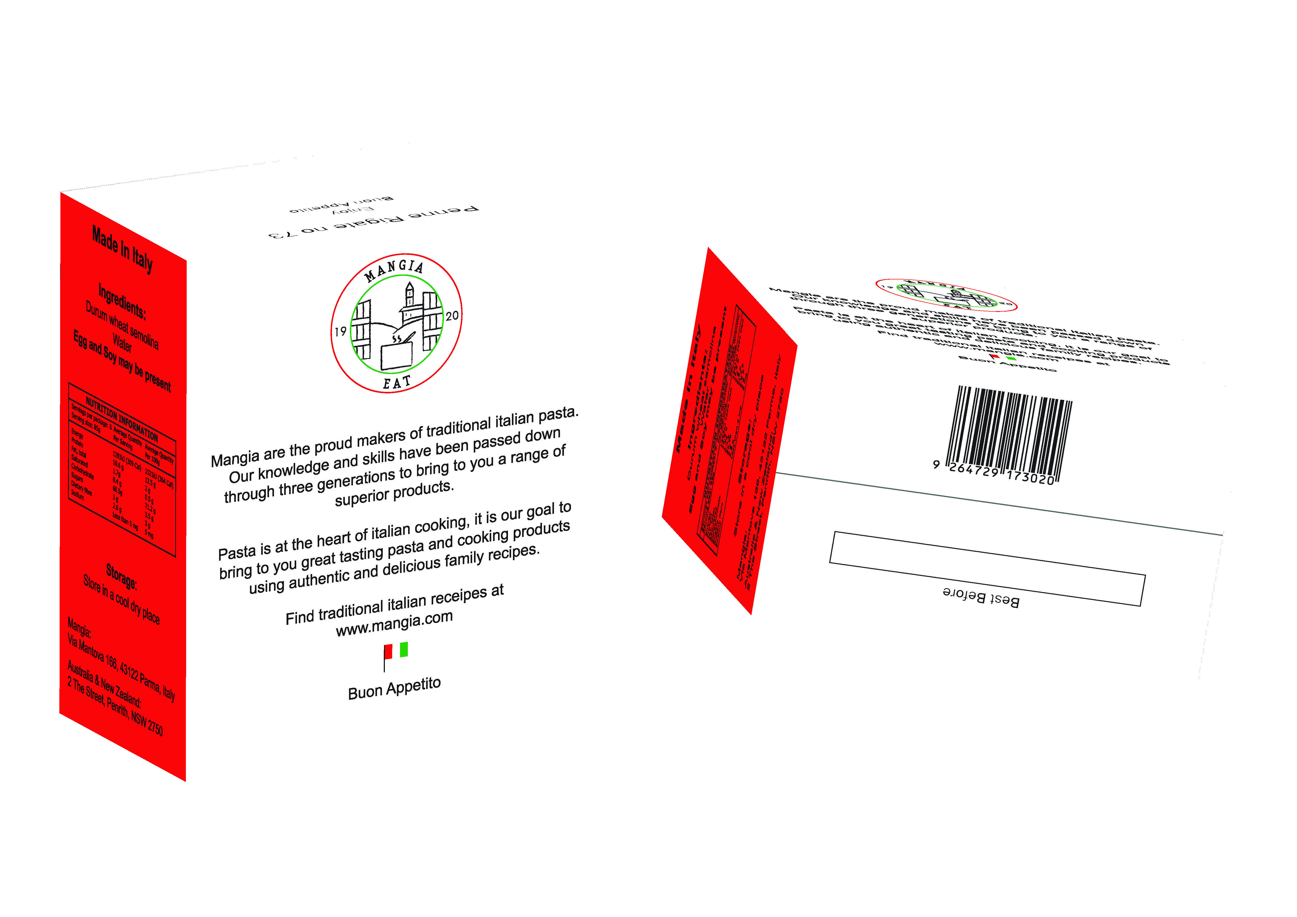
Hi, the logo is the Italian cooking landscape, 1920 is the year it was established, the packaging lists the website and also the distribution address, from research on shelf products this is consistent.
Noted on the width of the window edge, on the PDF print document the colours are extended into the window to assist with the die cutting process, I had checked with printers and they are able to produce the circle.
Noted about the typography. Also note the use of plastic in the future, however from shelf research competitors do display their product in a window, there are only a few competitors that use cardboard, most use full clear plastic wrapping. The Italian words came from visiting a range of stores, this idea came from finding pasta products featured both English and Italian. It was also part of the brief that it needed to be traditional Italian.
Yes, they can die cut the circle — that’s not the issue. What they won’t be able to consistently do is make the die cut exactly match the line that you have that borders the edge of that circle. A millimeter or two off in any direction (which will happen) and that line will be cut off on one side and extra thick on the other.
Not sure I would have gone with Verdana. A good face but it doesn’t scream 1920s. Nothing to do with being released in 1996, but some even newer faces might have been more appropriate.
It’s probably OK to use it for the small text but ‘Penne Regate’ deserves something distinctive.
I should add, the web search I did, I did using words on the box. Never saw the URL/distribution address. Was probably too focused on your backwards flag.
Extending the color into the opening isn’t the problem with your die cut. You are too close to your folds. You can see in your physical mock up that the window already bulges from not having enough meat there to hold the product in. This is a stability issue. And a glue up issue. Envision that box failing in the shopper’s grocery bag. They will hate you.
Did you research “traditional Italian?” Or did you just go with what you saw on the shelf as “traditional retail Italian?” Two very different things.
“Pasta di Semola di Grano Duro” is pretty darn self-explanatory as far as translation goes. And it’s a bit redundant. Italian pasta semolina is pretty much exclusively made from durum wheat.
I usually make my own when there’s time. That’s always the best.
Otherwise, it’s simple Prince or Barelli, whichever is on sale. Not gonna pay top price for something that’s just flour and egg. Not a lot you can do to that to make it “special.”