Hello everyone,
I’m looking for feedback on a few things… logo congruency and website look and feel.
I own 2 companies, a design firm, and a web design / digital agency. Yes, I know, why 2 companies you may ask. I feel that web design and digital marketing are a specialty in themselves and for SEO/ranking purposes, keeping the 2 separate allows me to be seen as a specialist.
Anyhow, please see the attached pic and please let me know what you think?
Sincerely,
John David
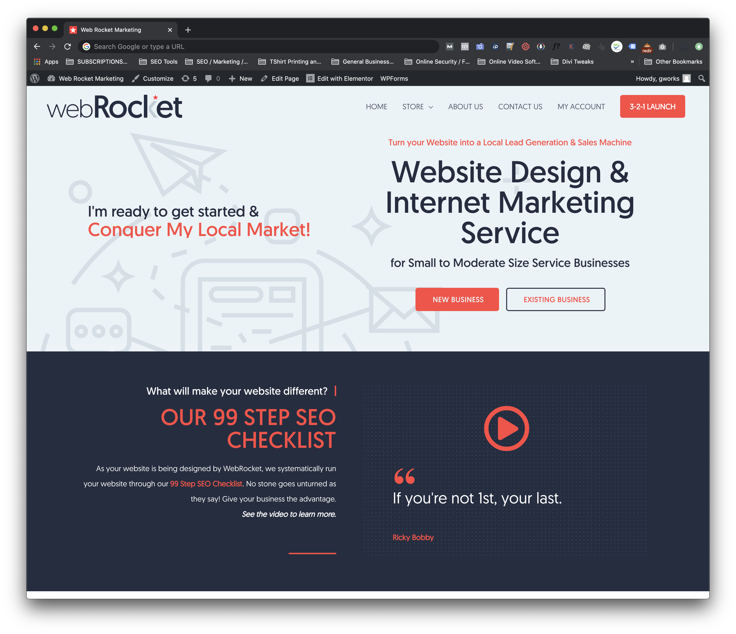
nothing here I see is professional
as for the graphics, I would avoid using gray in text due to printing problems.
the quotes are weak, as the text.
the art works does not grab me at all, the pics are random and do not mean anything, especially the text which is very unprofessional.
the content is what everyone else states and unprofessional, try to type words no one else promised and use full words.
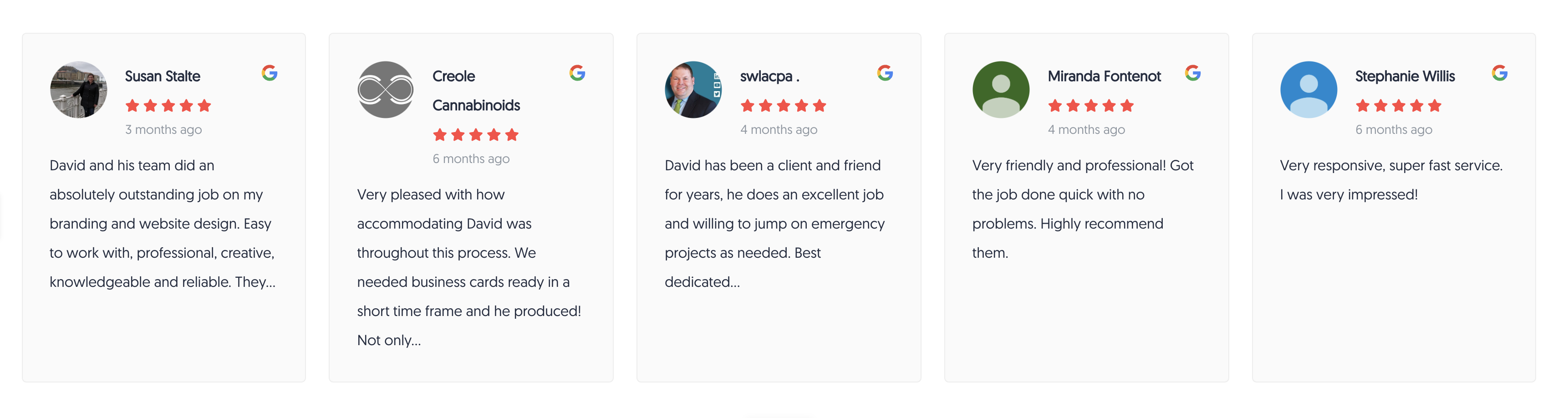
My next-door neighbor run a extremely successful web design company and i have helped him in the past, if you have clients, post their testimonials on the landing page or everyone else like me wll move on to another website.
Lol!! Ok, wow @EB_comix… Not one thing about it is ok or “professional”?
This is a website, so I will not be printing it, so I guess problem solved on the “Gray” situation. Although I have printed Gray a million times during my design career, I think it prints just fine.
As far as the artwork and copy goes… this is the “beginning” of the site and a lot of what you see there is all I could fit into the screenshot… the page does scroll down where more information as comes into view as you scroll, like most websites. Yes, the copy does need to be polished, again… just started on this site.
I’m not sure I’m following you on this?.. “the content is what everyone else states and unprofessional, try to type words no one else promised and use full words.”
Maybe it’s because that is what they do and myself as well… I build website for “Service Business” that rank high in Google Maps, which generates my clients leads, which then lead to sales and ultimately they get paid for the service, which is the point.
Yes, I have clients… and I also have 40, Five Star Google reviews, which will be on the site.
Thank you for your initial critique… maybe send my your neighbors URL and I’ll check out his website to see how a successful web design company is doing it!
Thank you.
John David
2 Likes
Over all I think it looks fine. Everything is neat and clean. I’m not sure I would think they are linked companies unless you told me though  I didn’t see the little star on Rocket until I looked again.
But, as I said overall it’s a nice aesthetic.
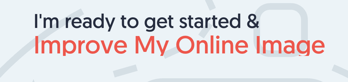
"I’m ready to get started & conquer my local market!’
does nothing to convince me to call you, i would leave the site reading that.
there were no facts or anything concrete that proves you are an established web designer.
you raised the flag, i just did not salute.
im sure other members will add their praise and critique once the sun rises on their part of the world.
good luck!
So, if a Plumber who relies on leads to make money and knows the importance of their website ranking high in search engines for those leads, reads “Conquer Your Local Market”, he may leave my site? Why? What would be the reason he leaves? Does he not want to be the No.1 guys in local search for his industry? Generating leads for say a Plumber, Electrician, Appliance Repairman, etc… is really competitive, not easy, and those companies that rank in the 3 Pack (Map Pack) do really well. Those who rank well pull in a lot of leads (sales/money). This is how I generate a lot of my leads. I landed 4 projects in the last 2 weeks simply from clients googling “graphic designer near me”, “website designer” etc…
Do I want to dominate the search engines for local search? Hell yes! I’m not sure why I wouldn’t or why a potential client wouldn’t either.
Like I stated previously… there’s more to the page than what you see in the screenshot…
The copy “get started & conquer my local market” rotates with other copy, there’s a little movement there. I also have a feed of my Google Reviews on the home page… again, you can’t see it you would have to scroll a little.
Thanks - JDE
I like the color scheme. This is the sort of professional look and language that, I think, would reassure most small business owners they were making a good choice hiring someone to do something they knew little about themselves.
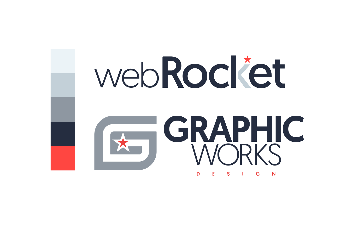
Are you attempting to establish a visual relationship between the two companies — color palette, typeface, red star? If so, why, given your intention to keep them separate? No criticism is implied; I’m just wondering.
The text on the example you provided needs a little work to fix a few typos. You mentioned still polishing it, but your should be you’re and there are several compound modifiers without the required hyphen, like 99-step and small- to moderate-sized. I’m also questioning the random capitalization of some words.
I’m impressed, though. Nice work. 
I like the color palette, and I like that you’ve unified the two companies with the palette. Grays can be tricky to print – especially when they’re printed as four color process. Slight shifts in one of the colors seems to be more pronounced when printing tones of gray. I also like the font you’ve chosen. What is the font? It looks close to Gotham, but I don’t think it is.
The logos hit a lot of marks: easy to reproduce, doesn’t rely on gradients, drop shadows, etc.
Given the color palette, the font, and the clean design, I want to like the logos more than I actually do, but I think they could use some additional work.
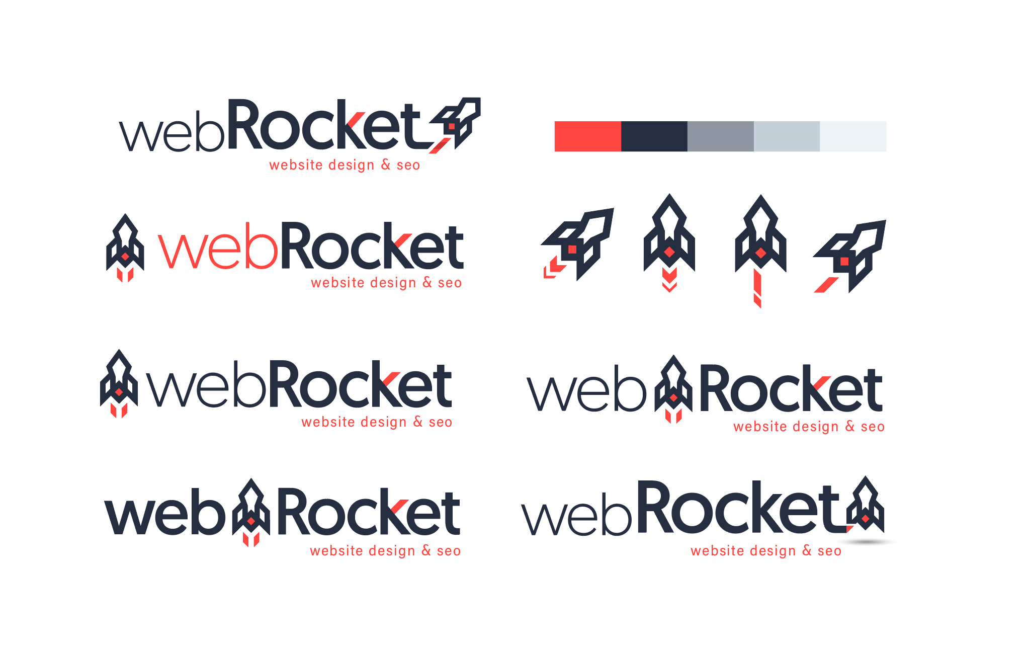
On webRocket, it looks a bit like “webRocl et.” The small portion of the k tends to disappear – especially on the website.
On GRAPHIC WORKS, the “DESIGN” is minuscule compared to the other type. It will most likely disappear or become illegible when the logo is reproduced at smaller sizes.
I like the idea of the red star uniting the two logos, but it looks a little tacked on – especially on the GRAPHIC WORKS.
What if you developed a common mark between the two companies that focuses on the red star and altered the logotype?
I really like the color palette applied to the website design. Personally, I don’t have any issues with the web design. Just a few suggestions and questions. What’s the STORE in the menu? Is that for physical goods? It seems a bit out of place, and I think you’d want to emphasize the services or about us in the menu before a store. The site looks like it will collapse nicely on a tablet or phone. What about adding quote marks to the I’m ready to get started & Conquer My Local Market!? That might help clarify that it’s in the site visitor’s voice.
i think everything is perfect loving the color that you used, I know we have a different preferences but i like to use a clean background if there’s a text on it and base on what i’m seeing your business is web services i think its best to use Services check out castle jackson but everything is perfect
1 Like
Alrighty everyone… I worked on the logo a little more. Please let me know what you think?
2 Likes
The addition of the rocket icon is nice. The top left and bottom right are my favorites of this batch. The rocket feels most natural after the type.
1 Like
Yeah… I’m torn between those 2 as well… I like the angle of the top left option, but I also like the say the wing of the rocket is combined with the “t”.