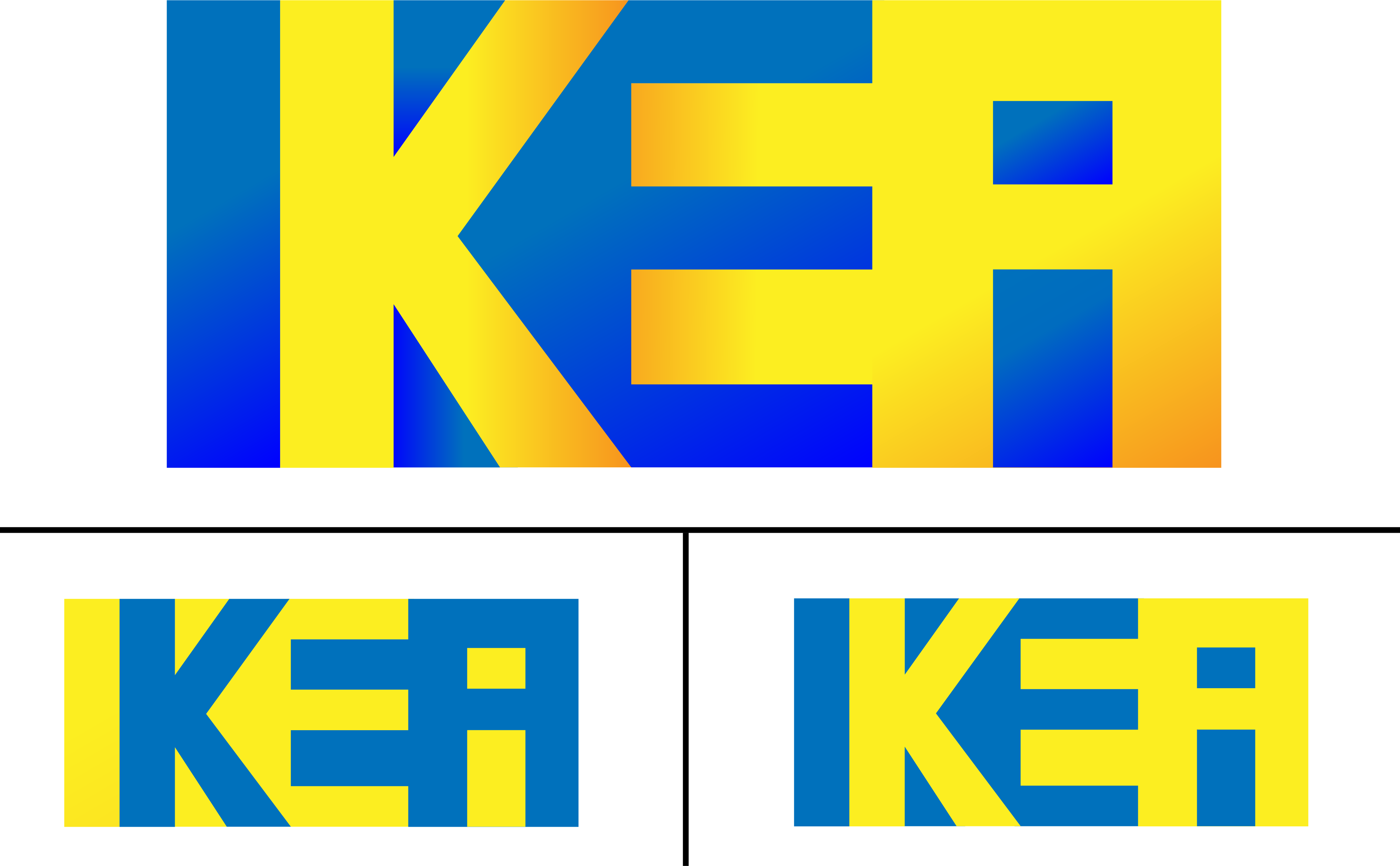
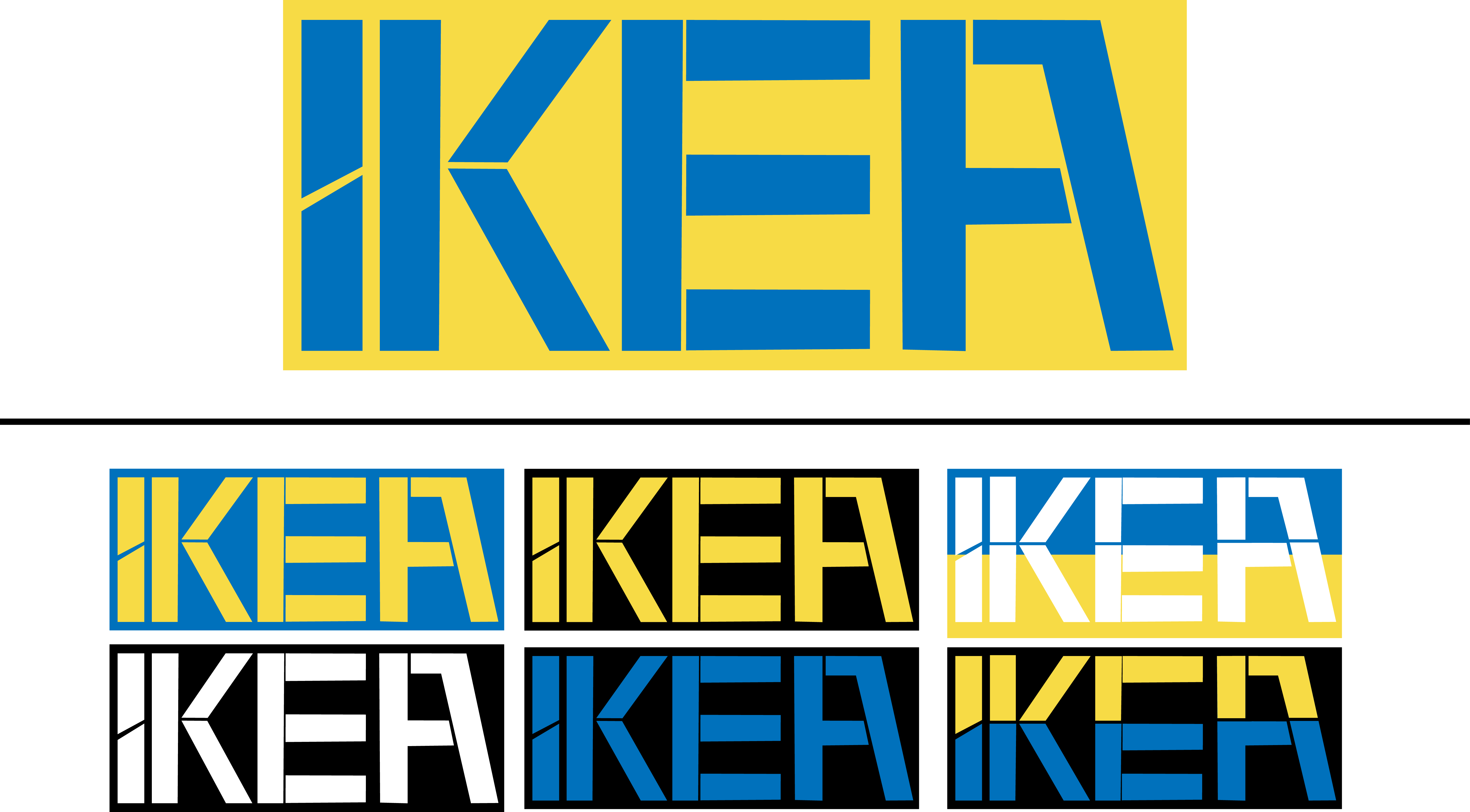
I’m currently studying Graphic Design and require some feedback for my re branding of the IKEA logo. These are my current logos I’ve experimented with and would appreciate some feedback based on the questions below. Thanks.
a)What does the logo represent to you?
b)Is it legible? Is it easy to read and understand?
c)What is the core product/service undertaken by the business?
d)What do you think about the company when you see this? (simple, innovative, stylish?)
e)Does it stand out and catch your eye?
f)Does it feel genuine?
Are there any technical, legal or budgetary issues that need to be considered?
a. I know what IKEA is as a brand.
b. The top 3 are not legible. While the others are to some extent, you have the letters jammed together then squashed in a box. I don’t know if that’s intentional, give the flat pack nature of a lot of IKEA product, but it’s claustrophobic and hard to read.
c. The IKEA logo hasn’t changed since 1968. It is a readily recognized brand and logo. What they do is known to the people who know the brand. People who don’t know it, won’t know what the company sells just by the logo.
d. Swedish meatballs.
e. the logo as you have it makes me work too hard to suss it out.
f. ??? Tell us your reasoning behind changing up a readily recognizable logo and why you think your changes are appropriate for the first rebranding of the company in 50 years. Will your logo last another 50? 20? 10?
Technical, legal and budgetary issues are between the designer, the client and in this case, the client’s legal team. Are you just redoing the logo? Or do you have to come up with a full branding package? Technical issues come from using a gradient in a logo and whether or not that gradient will step. Or if it can be done as a silkscreen on a box (though a lot of box companies can now print direct.) Can it be embroidered on employee shirts? How is the exterior store signage being produced? Is it going to be an upcharge to the client? Probably.
A total corporate-wide rebrand is a very expensive undertaking. Better not guess wrong.
As far as legal, that’s for the lawyers to decide when it goes through whatever process it has to go through for trademarking in the EU.
Nothing yet — it’s the first I’ve seen it. Logos take on meaning over time as they come to be associated with the organization they represent. IKEA, the Swedish retailer, represents something to me: inexpensive, poorly made, but nice-looking furniture.
No. Differentiating between the negative and positive shapes is difficult. The bottom logos are easier to read, but the typography is clunky and the box surrounding them is claustrophobic.
Are you asking whether or not your logo is suggestive of IKEA’s business? If so, no, there’s nothing about the logo to suggest what IKEA does. This isn’t necessarily something a logo needs to do, however.
Clunky. Poor quality. Confusing. (sorry)
Yes, but for all the wrong reasons.
I’m unsure what you’re asking. Is it a genuine logo? Well, no. It’s your school project.
Technical, legal and budgetary issues always need to be considered, but each requires the input and expertise of other people, like accountants, attorneys, fabricators, etc. I don’t see anything especially problematic along these lines in your designs, however, except that the top logos would be difficult to reproduce in black and white without becoming totally illegible.
I get the impression that all your questions might be those things your instructor asked you to consider as you were working on the assignment. You didn’t even bother to reword them into questions that make sense for a critique. I think I probably spent more time answering your questions than you took in posting them.
Graphic design is difficult. It requires a great deal of thinking and attention to detail. Design is about solving problems. A successful solution requires a deep and thorough understanding of exactly what the problems are that need to be solved. A logo design is about far more than juggling shapes around. I’m not at all sure you’ve really thought this through.
It’s a little bit confusing. I think that is difficult to rebrand a name that has been in the industry for many years. We know Ikea even if we don’t have the shop in our country.
Regarding your logos i can’t read the first one without seeing an " I" inside the A. So if I don’t know the brand it would be “ikei” at first sight.