Feel free to suggest a new logo for this site!

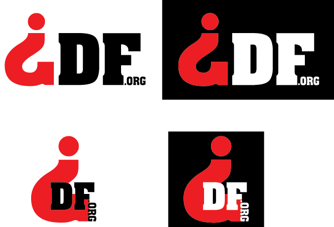
You may have seen my attempt to create a logo for GraphicDesignForum.org. I’m not married to it, and this site is a community project. We will build it together, so if you have a suggestion for a new logo, please do post it, and if it gets the most likes we will replace the current one with yours.

Logo Design Brief

Background
Logo Design Forum.org is a community site targeting graphic designers, at all skill level from beginner to professional veterans. The site aims to inform, inspire and most important help designers in their professional life.

What do we want to communicate?
We want to convey that this brand is contemporary, as opposed to the old GDF forum that is closing down, and which some see as old fashioned. The logo has to communicate high aesthetic values. It may suggest the community, but it’s not a must. Besides this, incorporate whatever GDF(O) means to you!

Orientation
The logo should have two versions: horizontal and square. The horizontal will show by default on the site in the top left corner. The square will show when you scroll down and it replaces the horizontal version.

Colors
The forum has two color schemes: dark (default) and light that can be selected by the user in their profiles. The logo should work on both backgrounds. This is why the current logo is made of colors that work on both themes. Currently the categories feature a color scheme, but it can be changed to match the colors of the newly designed logo, so don’t let them limit you.

Text
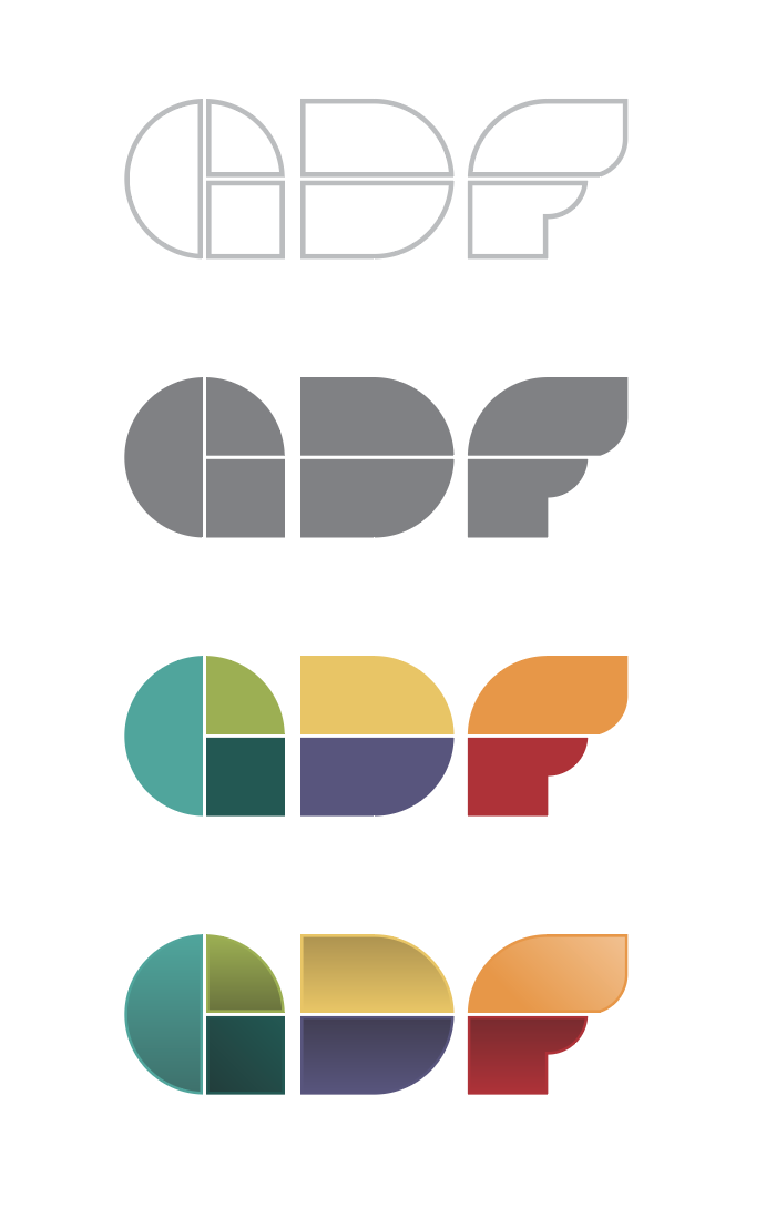
The logo doesn’t necessarily has to include the words 'Graphic Design Forum.org" but it can if you think it works better. We don’t necessarily need to use the acronym GDF (preferred) or GDFO.

Other Considerations
By submitting your work, please indicate your terms. By default we assume that you’re giving the logo for free, and you allow the community to change it to fit the need. However, you may decide that we can only use the logo as is, without modifications to respect the artistic integrity. Or, you can say that you’re only willing to give the logo for certain amount of money. It’s up to you, just let us know!

Please suggest any other information I should include in this brief!

Ah well, this is somewhat quick and dirty, and won’t meet all the (color) requirements listed, but perhaps it will help seed the thread and foster some growth here within our new home.

To me, GDF (will always be GDF, and) is mostly about questions; questions asked, and questions answered (usually), that taken together, offer a snapshot of our industry and our attitudes inside and outside of it. Expanding upon that, we find those among us who are aging out, aging in, and just aging, whether it’s gracefully or otherwise. Questions asked and answered at GDF are a barometer of change; some good, some bad. And so for my first proposal, in homage to the root of this new GDF tree; the question, I give you the granddaddy of all questions, “What the hell is this?”

image

2 Likes

Here’s my suggestion for the new GDF logo, I leaned on Ivan’s concept and colour palette. The idea was to subtly suggest a quill as a nod to communication. As the group appears to enjoy Ivan’s geometric concept, I used that as a starting point (I hope you’re cool with that Ivan). As this will probably be used only digitally and never in spot colours, I’ve extended Ivan’s initial colour palette to nod to different colour schemes (analogous, triad, etc).

Let me know your thoughts, move to critpit if you want.

3 Likes

I really like your logo. I think it’s a winner.

We could use just the ‘G’ as a square icon for favicon, etc.

Can you upload a larger version with transparent background (.png). I’ll throw it up on the site, let’s see.

2 Likes

I’d call it a team effort, your initial concept and the feedback from the critpit definitely moulded this. I’ll get the files to you once I get back to my computer

1 Like

GDF-favicon

4 Likes

*why did you have to give her/him THAT version?

Got a better logo? I’m all ears!

C H A L L E N G E :star: A C C E P T E D

Feel free to use for free however you like.

GDFText

Interesting. It’s not very attractive IMO, sorry. Not loving the colors, why brown and purple? The curves in the “F” need cleaning up. Kerning needs some attention also. Maybe you can tell us what make your logo a better option than what we have?

1:that’s orang. u colorblind?
2: it’s modern. That’s why.

No I am not colorblind. Thanks for asking.
Sepia This does not look “orange” to me.

At least orangish brownish

Wait, wait, wait, wait, WAIT! You’re talking to ME about COLORS and using THAT as a logo?

Dark Cyan, Darker Cyan, Dark Lime, GOLD?, DARK PURPLE?, ORANGE-AND-WHITE GRADIENT?!?!, RED?

I’ll MAKE IT THE MOST VIBRANT ORANGE EVER SEEN, AND YOU’LL RUE THE DAY YOU TURNED DOWN MY DESIGN!

It’s a great logo! But i would consider to remove this strokes & gradients, and maybe make a bigger space between shapes

Unless you can make it clear that your responses are done in a joking manner, you need to tone it down please. They are reading as rude and aggressive and are not constructive.

And the word you’re looking for is “rue.” You’ll rue the day…

Thanks.

2 Likes