This client I’m working with basically has the completed product, but then he asks me to insert a large “W” and a large “G” (his initials) in the logo, somewhere in the background.
I explained to him that creating something large like this would be taking away from the logo and make it look inconsistent with the focal point of the design, which is the script lettering of his logo.
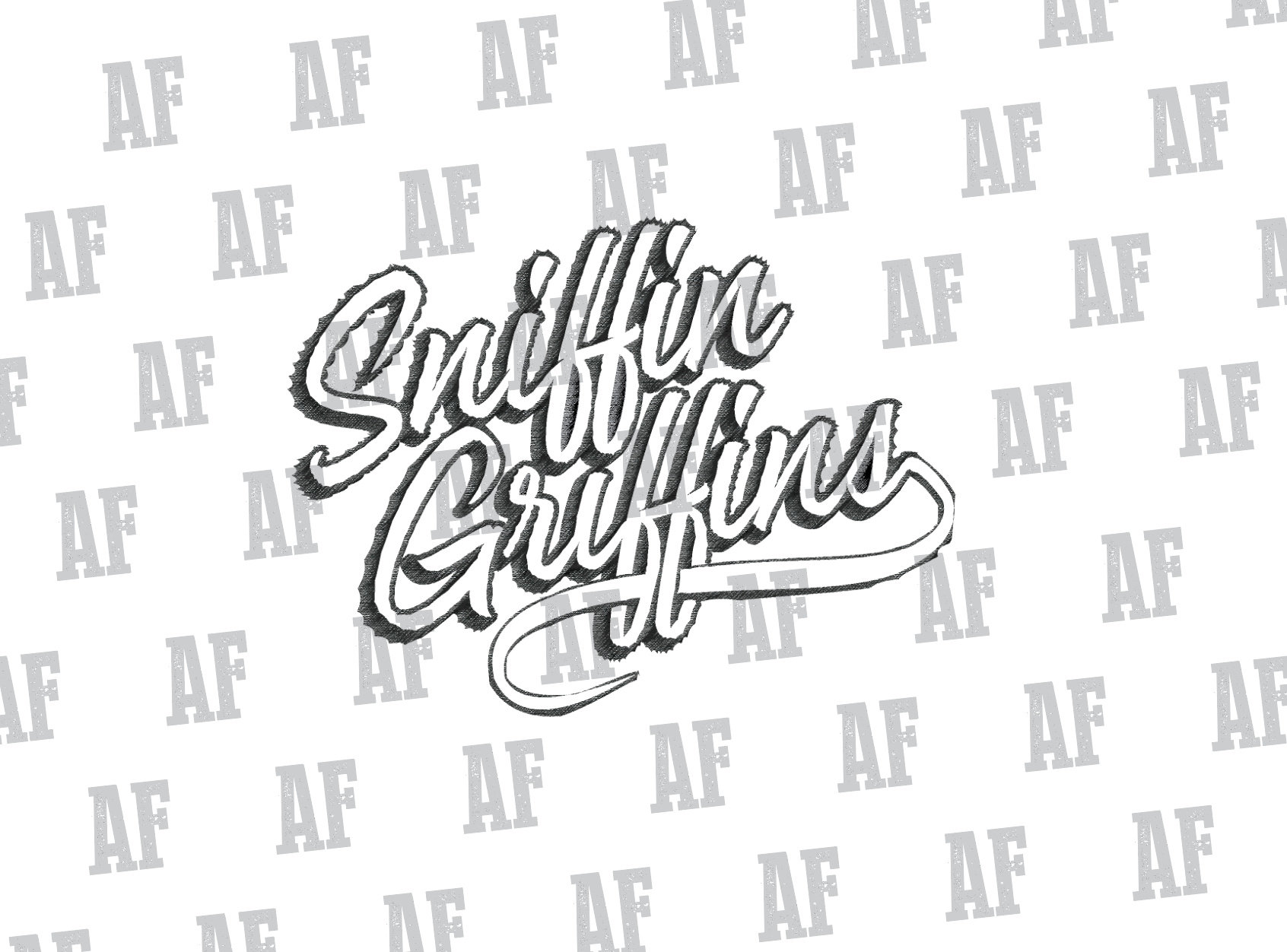
Problem is from what I’m seeing, I’m not sure how I can get these large letters entered in here (bbq styled font like how the watermark is). Possibly overthinking things, I’m not sure. Would love to get some insight or to get another set of eyes on here to see if im not seeing something effectively. (see attached photo) Thanks guys!
You’re right. It will take away from the logo. If Sniffins really does want it, my only suggesting is making the S and the G really big behind the logo and make it BARELY visible. Other than that I have no idea. that’s all I got.
Thats what I was thinking as well, but I think that will take away from what we have here already. His initials are “WG” (not sg). I dont see a way around it, or how to implement that effectively, and feel like he’d want a redo of this which would kill me haha
I’d probably tell him in order to do that, it’s back to the drawing board to redesign the logo from the beginning. Hopefully you’ve got a contract that spells out the number of no-charge revisions.
Either I’m missing something or I’m not being clear. If you get the artwork that you posted in a vector art format, it’s piece of cake to delete the AF initials and replace it with WG. The most time consuming part would be figuring out what font to use.
Haha ok ok clarification. RedKittieKat is correct. AF is my initials. Just a watermark if you will over the logo. WG is the clients initials, which he would like implemented, large, someway somehow.
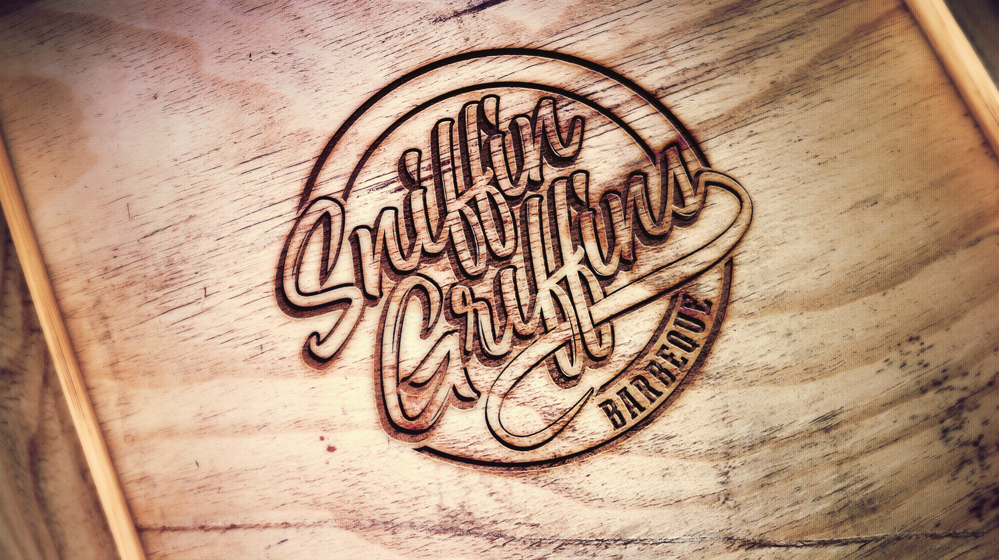
The final logo, prior to him asking for this, looked as such:
My question is, do you see a way for the WG to be implemented someway without redrawing and taking away from the focal point of the main design. Apologies for not being clear.
It’s already complicated, a bit difficult to read, but still nice. Adding a couple of superfluous initials, that will make no sense to anyone other than the owner, is a bad aesthetic decision. It’s also bad business decision, seemingly based on the client’s vanity, that will render the branding less effective than it might otherwise be.
I see no way to make it work well, but if the client wants it after your advise to the contrary, place it as an afterthought down below somewhere, then take the money and run.