Hello I started to make the presentation of my channel, with an animation on a blue background, it’s mainly animated text, there will normally be just a background of music.
(the progress or I’m at I would say 90%), I need your opinion.
It’s really a very simple thing.
Well my channel is aimed at the French speaking world, and also internationally.
So first there will be the animation in “English” and then in “French” afterwards.
The English will be subtitled in English for the international, the French which is behind just after will not be subtitled.
(And if you ask me why I put 2 languages for the moment, because I asked the opinion of a Frenchman, for a video that was before this one, who told me that English is useless, I don’t agree).
so to avoid some negative feedback from the French he will be able to see my presentation in French. (this is really, something I’ve never done, i.e. publishing the same video in 2 different languages one after the other)
here is the link to view my “draft” (it’s just part 1 in English):
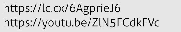
I put the links in an image, because my access to the forum does not validate them.
(the shortcut line 1 sends to the youtube link just below)
I need your opinion on the video, if you see anything bad to correct, tell me where I can correct it.
THANK YOU
For some reason, I hadn’t noticed your post until today. Here’s a more direct link for others to follow: https://lc.cx/6AgprieJ6.
Conceptually, I’m sort of questioning how you’ve approached the video. I’m not sure very many people will watch a minute-long video consisting of simple word animations asking them to subscribe so they can see more, I’m assuming, similar basic animations.
As an introduction video (if separate introduction videos are needed at all), I’d be inclined to concentrate on making a more entertaining, attention-grabbing video with some personality. I likely wouldn’t depend solely on examples of those basic animations to deliver the message.
OK then. My comments would depend what stage if development you think you are at. If you are just beginning, then I’d say, good job. Keep going. It’s a long road and you still have away to go, but you’ll get there. Some of your animations are a good start. If, however, you consider yourself to be an animator, I’d say, it’s a long road and you have a long way to go, but you’re not there.
As for the typographic one you posted, I am going to assume you are still in the early stages of learning the craft, but either way, honestly, it’s all bit basic and predictable. It’s been done many, many times before. If you are going to animate typography, it is a fine balance between elegant and cheesy. 3D extruded letterforms rarely look good in this context.
Currently, it looks like a collection of separate effects you can do to type. The words do not relate in any sort of coherent way. You still have to consider legibility and readability, the same way you do with static type, only you have the 4th dimension of time to consider too.
Research people who do animate type well and study them.
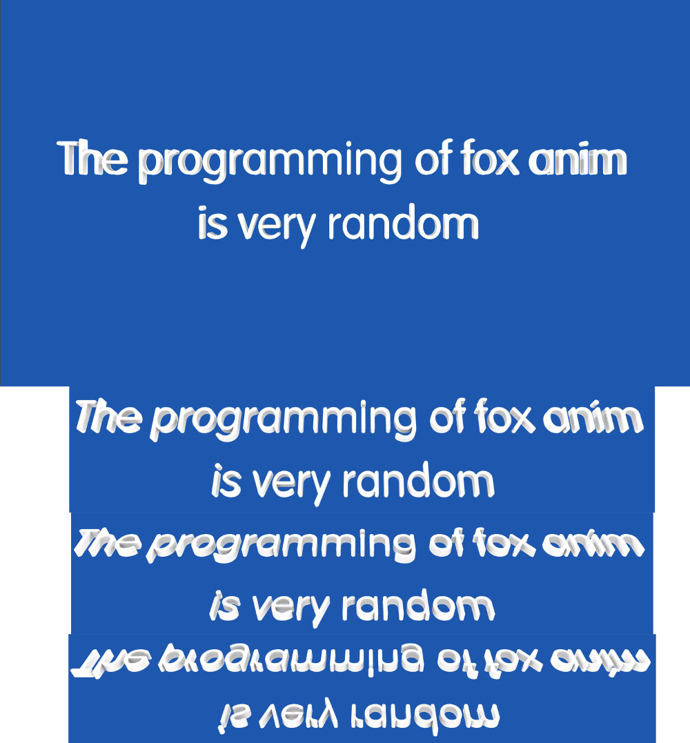
I’m answering a bit late it’s true, but there’s one font I didn’t know how to do, where there’s a 3D rotation.
In short, we see “the 3d” on the left and on the right, and nothing in the middle, so we think it’s badly done, when in fact I didn’t find a better angle with a camera, I had to modify the “focal view” and the depth of the camera to get it.
And I just wanted people to see the 3D, flat in 2D it wouldn’t have done the same thing.
I finished the video with the audio, I just put the French part first and the English part second.
I’ll publish it in a few months, or a year or so, I’ll see.
I’m stockpiling my videos, I’m waiting to have 10 ready, so I can publish one every month,
knowing that now I’m preparing at least 3 at the same time, I’d say that I’m trying to start on a big rhythm to get ahead.
Instead of doing only one very technical one, and wasting time on details that nobody will see, I’m preparing 3 to 5 at the same time, so I think I’ll be able to do them faster.
There are almost no examples of 3d type of this sort that are ever done well. The effect is the epitome of decorative cheesiness.
The only time it ever works is when it forms the basis of a concept or an artistic illustrative treatment. When it’s nothing but a canned, out-of-the-box effect applied to plain text for decorative reasons, the effect does nothing more than interfere with legibility and look bad.
That actually does serve a purpose. It can be used to show people what happens to 3D text on a wall when you want it made too thick. We don’t recommend the thickness exceed the ascender width, and even then proceed with caution. It will become illegible if viewed at the wrong angle or, more importantly, if the lighting angle is wrong.