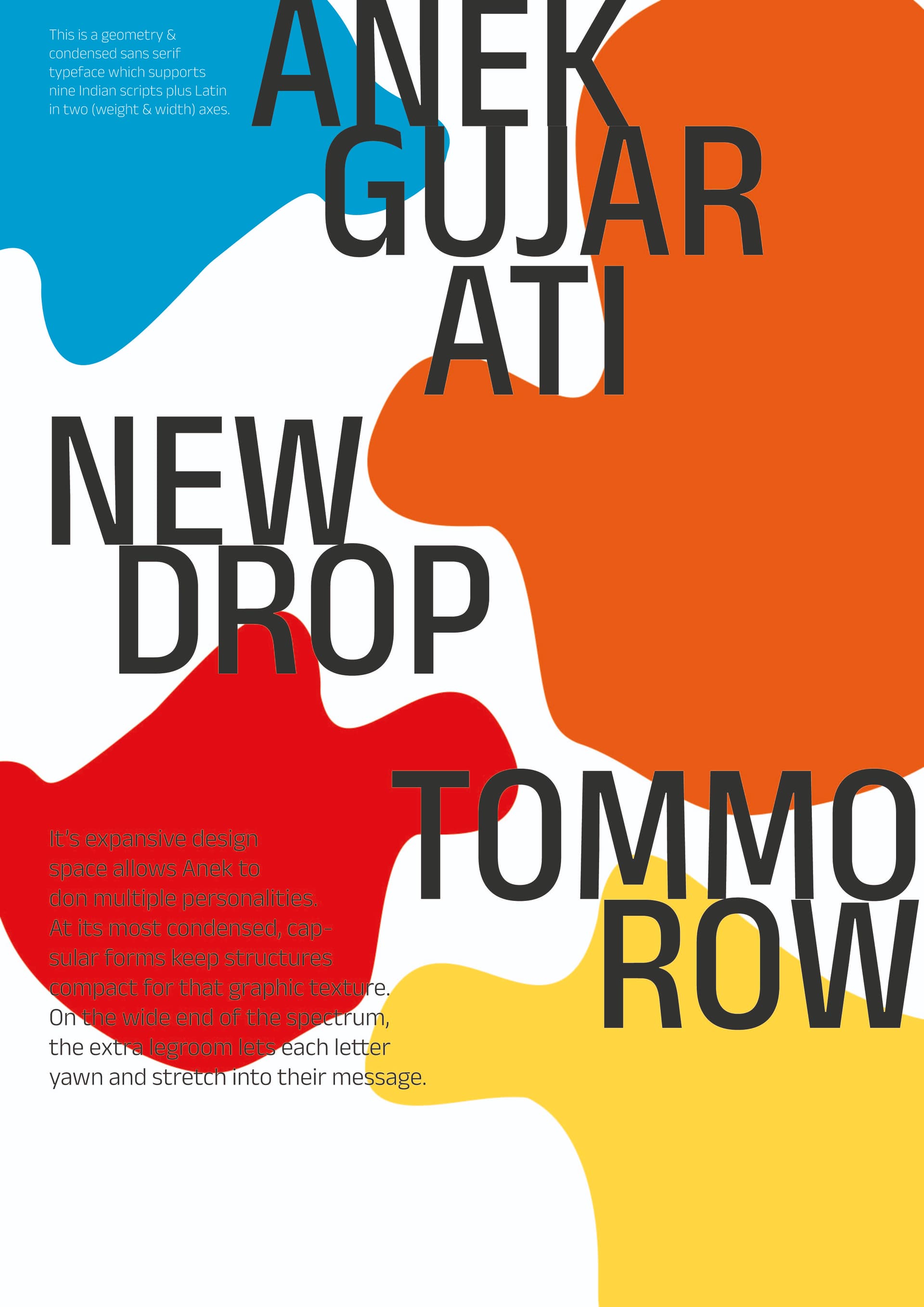
Concept : a typographic poster in whatever style (idk the names yet)
Purpose : make the typo stand out with visually pleasing shapes, please don’t focus on what is written
Format : for print in A3
Audience: anyone that likes typography
Experience Level: student, very first poster
Nature of Job: self-directed
I am aware of a lot of mistakes but please guide me with your keen eyes !
You’ve made a fundamental mistake that you recognize but have asked us to ignore.
First and foremost, graphic design is about designing practical ways to use visual communication to engage a target audience in an effort to influence that audience in some way — usually to benefit a client.
You’ve essentially asked us to ignore whether the poster serves this purpose and asked us to, instead, focus on the poster’s aesthetics. In effect, you’ve asked us to critique an art project rather than graphic design.
ok thanks, I will work on designing with a purpose and not just make shapes with different colors and call it a day. If you don’t mind me asking you, on the aesthetic aspect, what do you think ? Is it a good concept ? I tried to use a diagonal grid, does it work ?