Hello, I am new to this site so I am not sure if this is the correct place to post asking for critique on some flyers I did for a nonprofit. The flyers are honestly awful and very amateur but they were okay going with these ones attached for the different events. I want to get better and make them look more professional and less awful/amateur-looking. The content I am provided for the flyers is often what they request to be included (even if I purposely send a draft with something specifically not on the flyer, like not adding a picture of a person or taking off the word Theme, etc.). Many times it gets requested that the content get added back in (I will remove it if I think it looks too busy). The silhouette of the people pictured is purposely me blocking out the real picture of the people. I feel like some of the flyers have too much text on them but as I stated it’s requested that they want specific information on some of the flyers or make something bigger/smaller and I will adjust it how they request. They have given me an example of what they want the flyers to look like and personally I think the example is too busy but also you can tell it’s more professional and you can’t pull professional from an amateur. If I can find the example they provided or a similar one I will share it.
What specifically on the flyers (either in general or each one individually) is bad and should be avoided?
Or is good and keep doing or could use some work?
The flyers were created in Gimp except for the Elevation flyer was created in Microsoft Word.
Also, if this type of question/post could be better suited for a different forum please let me know. I wasn’t sure so this seemed like the best place to post.
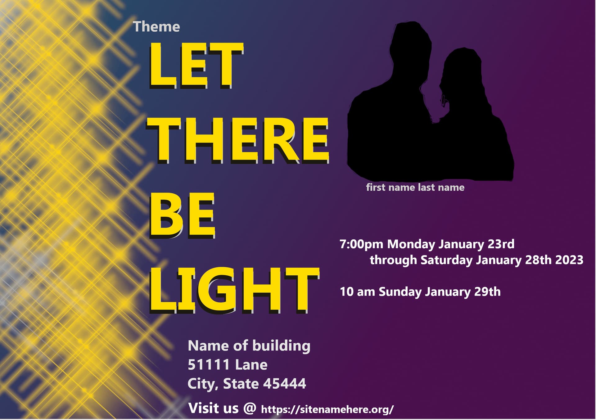
The Let there be light theme was the first one of 2023. Created in Gimp.
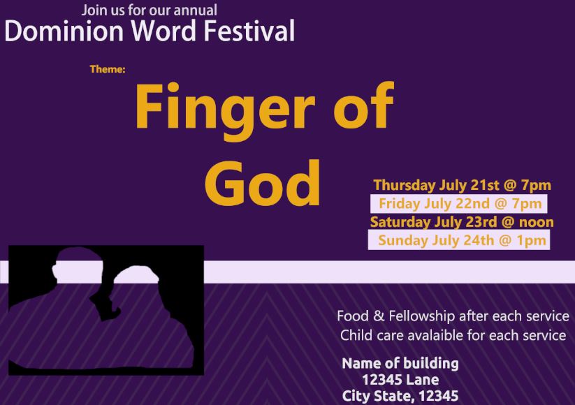
The finger of God flyer was done in 2022. Created in Gimp.
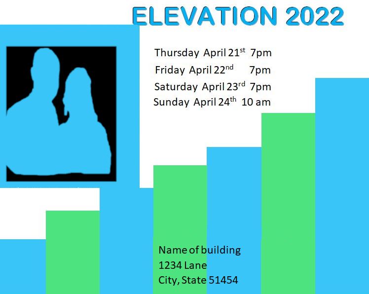
The elevation flyer was done in 2022. I used Microsoft word to create this one because I was having a hard time with Gimp.
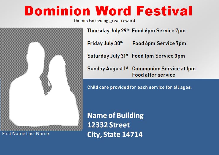
The red text dominion word festival was the first flyer I had ever done and it was in 2021. This was done in Microsoft Word.
There’s just everything wrong with them - as you know already - there’s nothing good to keep or anything.
I take it by the dates these events were last year?
If you want to get better there are no shortcuts - you need to do some course somewhere.
LinkedIn Learning has a free 1 months trial and plenty of courses around design.
You won’t learn it all in a month. But you can get better.
With a flyer you want to grab people’s attention first. Eye catching graphics can do this but then the attention will wander. They should not be doing all the work.
Have a line of text that describes the event and make that stand out. This has to sell it.
Next the name of the event, then details like venue, date and time in descending order of prominence.
Any logos you can use will give interest. A venue logo can be prominent, with associated logos (sponsors etc) further down.
Once you have the hierarchy sorted out, you can set about making the thing look nice.
Don’t be afraid to have some of the graphic elements in the background. This can give it depth.
You’ve broken quite a few graphic design rules of thumb, and there’s no way to give you comprehensive feedback that typically takes several years of formal education and experience to learn.
However, one thing that could help improve your layouts is by using an invisible grid to bring a sense of visual order to the compositions. The link below is to a company that I have mixed feelings about, but the advice they provide about using grids is pretty good.
@Smurf2 yes, these events were last year except for the Let There Be Light event (this was literally a day’s notice that they wanted a flyer). Everything else was about a 2-3 wk notice to come up with before the event kicks off. Thank you for the feedback about courses from LinkedIn I’ll check them out.
@StudioMonkey Thank you. On the most recent flyer, I’ve been working on for them I did start doing hierarchy and they said its the best flyer I’ve done so far, so it means I’m somewhat improving. That flyer is not in this group shared. I’ll share it at a later date.
@Smurf2 Thanks for the question. Its thought-provoking.
If I had to redo them now, I would definitely change the hierarchy around.
Going quickly from the top example to the bottom.
Light flyer (in no particular order):
Remove the theme (and hope it didn’t get added back but if it did oh well)
Adjust the ppl pic placement to one of the lower left or right sides
Keep the dates/times more in light w/the building and site
Adjust the font size so the dates/times aren’t the same as the building/address
Adjust where the light txt is on the flyer, maybe have the words slightly closer together
but going more left to right instead of all one after the other.
Get a better design than the brush used for light or maybe add different shades into what was done.
God flyer & Great reward flyer
Remove the word theme
Make DWFestival bigger and the theme of it slightly smaller and place it underneath
The food, fellowship, & childcare part is hard for me to figure out how/where to best place it
because I feel like that starts to cram up the flyer a bit. In some instances, it’s still needed on the flyer,
if anything, make that text a little smaller and place it in a different area.
Elevation flyer
Move the dates from the white space down to the green and blue areas.
Move the dates to the right a bit.
Make the picture smaller (sometimes they want the picture bigger than what I have it originally so it ends up being as big as they want it. Its always flyer dependent on the size of the ppl pic)
Make the Elevation 2022 a little bigger and/or keep it but have it centered.
Maybe a gradient in the text from blue to green to mirror the bottom of the flyer colors
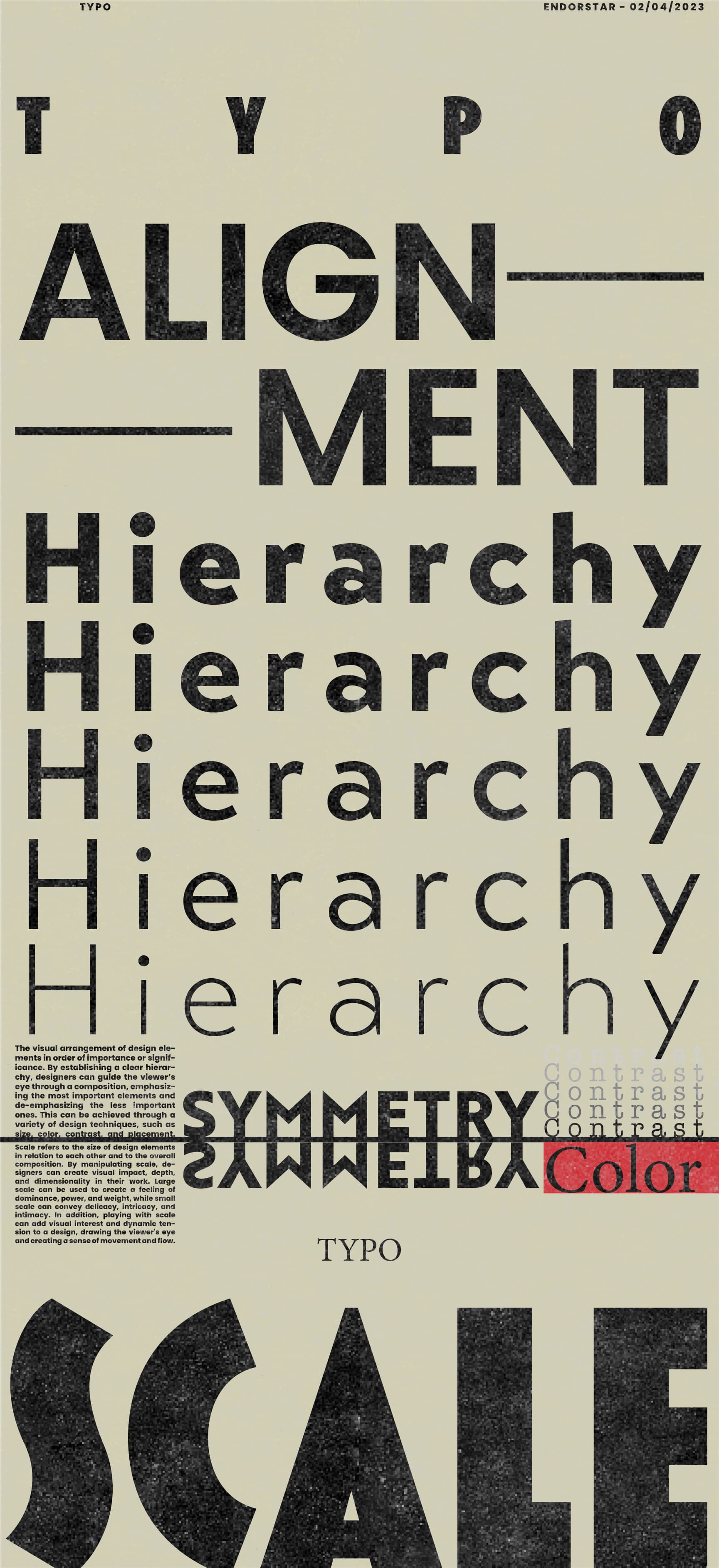
Not a work of art, but here are some concepts you might want to play around with a bit more. Based on your changes to the elevation poster, it seems like there still are alignment issues, and contrast issues might be there too.
The concepts displayed in the poster above I made are all things you can use to draw the eye with text only (I’m terrible at art so I do mostly typography)
If you ever want more in-detail tips hit me up in PMs
A suggestion:
Look up on pinterest or other image sources for some inspiration on the feeling or idea you want to convey in posters (like ad designs) so that you have some idea on how to go about arranging the text, what font to use etc.