Hi,
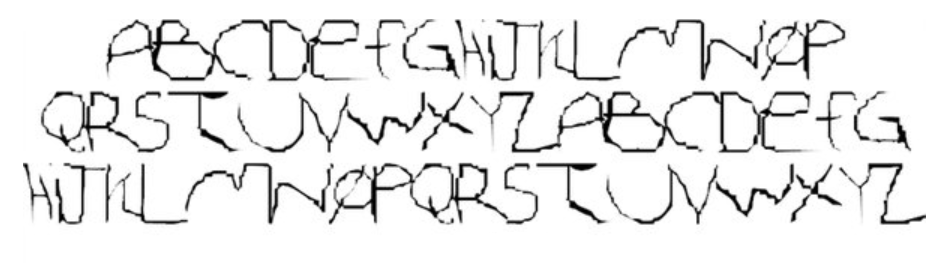
I feel urged to introduce a rather practical theme: How neural networks can facilitate producing font families? The simplest task seems to be just scaling of fonts out of their designs like this below. Any ideas how to?

Hi,
I feel urged to introduce a rather practical theme: How neural networks can facilitate producing font families? The simplest task seems to be just scaling of fonts out of their designs like this below. Any ideas how to?
That isn’t a correct font scale.
Only the vertical strokes are squashed by your percentage, leaving the horizontals (and obliques) at the same thickness. The font aesthetic is gone and it’s been reduced to illegible.
The exerted bare criticism is not valid absolutely.
Just take a lineal into your hand.
No suggestion was made instead.
What font aesthetic like is in the 21st century during the era of postmodernism, that is quite an unsure thing.

Try looking at AI tools designed for font manipulation, like Adobe’s Sensei or Fontjoy.
Think it’s pretty important to maintain some design integrity when scaling fonts.
Beauty is in the eye of the beholder…butttttt…
We seem to have a few language translation issues because your posts are difficult to understand. However, I think you’re asking about something that already exists.
The higher-end type design software applications have interpolation features built into them that facilitate the production of intermediate fonts between the extremes of, for example, light and heavy or extra-condensed and expanded or italic and Roman. Variable fonts use this technology to create the intermediates on the fly based on end-user preferences.
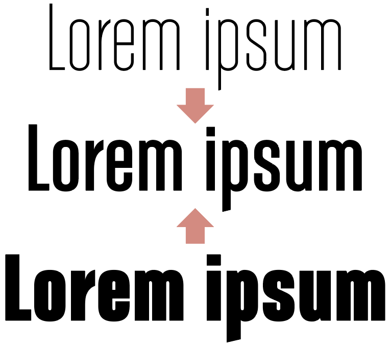
For example, here’s a sample from a typeface family that I designed.
I drew the outlines of the top and bottom weights, but all the intermediate weights — including the one shown — were produced by algorithmic interpolation.
However, the process is considerably more difficult than simply clicking a button. For example, each of the master weights must have the same respective anchor and control points in the vector outlines. In addition, certain aesthetic decisions can’t be interpolated — for example, the need to remove a detail from a glyph that exists in the lighter weights but won’t fit in the bulkier heavy weights. Those exceptions are handled separately through intermediate masters.
@Smurf2: That’s what I’ve been looking for, thank you very much for your hints indeed.
Right! - The modern hermeneutics after Gadamer says that interpretations are of much more interest or value than the author’s ideas themselves, i.e. no matter what Mark Twain was thinking while composing his texts, the thoughts of his readers are of much more interest than the original thoughts of MT dozens of years ago. Say, the old Greeks didn’t hold the death for dialectics of being and not being but considered it as cyclically changing like the sunrise and the sunset.
@ Just-B
Thank you very much for the time you have taken to reply.
Unfortunately, I have had no experience with algorithmic interpolation so far.
But I have seen corresponding options in software products.
Your mastery demonstrated is undoubtful as an approach well described in classic
manuals on typography. Preparing intermediate masters would imply inevitable time losses within everyday jobs.
On the other hand, I can see your mastery achieved. Probably, you could advise me how to proceed with global settings in font editors to effect horizontal shrinkings within the whole glyph set of a font as I suggested above? In order to avoid individual working on each glyph. - I would be greatly indebted for any hints.
Well, that’s an interesting take on hermeneutics. I wouldn’t necessarily assume that interpretation over authorial intent always leads to better understanding. It’s about applying one’s interpretation while striving to see things from the author’s perspective, which can push the boundaries of our own understanding.
Similarly, with font aesthetics, my initial interpretation might lean one way, but understanding the creator’s choices can shift my perspective. The original design might have specific characteristics for a reason. Viewing fonts through this dual lens can balance modern expectations with the original integrity of the design.
Understanding is always subjective leading to a subjective “truth”. Hence, the actual challenge is consensus, which pre-supposes the availability of willing. Which one is to subjectively decide again. Among which individualities are only the starting and ending points. Subjectivity is factual. Even not history. Say, the black interface instead of the light one. But why? Why books have been printed as black on the white but not vice versa for 500 years? So, referring to the aesthetics of older fonts is appealing to the history, i.e. the collective consciousness and unconsciousness, where one’s subjectivity has to decide upon in reality.
In FontLab >tools>actions, under “Effects” there’s an automated tool to change the weight. However, its results are never as good as drawing the new weight by yourself. It can be used as a starting point though. But, I have been looking for changing global settings for all the glyphs at once.
A little bit compelling in your deas about the subjectivity of understanding and truth.
Consensus requires willingness and a balance between individual perspectives.
The historical context of design choices, like black ink on white paper, was driven by practical considerations for readability rather than collective consensus.
Appreciating older font aesthetics probably involves understanding both subjective interpretations and the practical reasons behind design choices. a blend of history and personal perspective tends to guide our modern appreciation and adaptation of fonts, and probably design in general.
There are at least 5 theories of truth known; so it’d better to dismiss or even expel this notion as an competitive argument.
Now, as a matter of fact, 9 out of 10 Apps have dark interfaces, which cannot be compared with Gutenberg’s idea to print books on white paper and not vice versa if it would have had any advantages. Here, the ideas of postmodernism decide, i.e. those of the Eternal Today, without the past and the future.
The same in music: Musicians and composers are on the permanent searching for most spectacular compositions primarily performed within the solely 1-note-voicing (rap), with no harmony movement whatsoever, with most distorted timbres (sound distortion is in the foreground). We can merely transpose these actual statements into typography.
What I have found being of interest by now is the following. Tools that can modify the weight of all glyphs in your font at once:
FontForge is a tool that allows you to edit fonts.
Much more sophisticated as well as called by AI to produce also variable fonts is Glyphs:
Glyphs (Mac) is a commercial tool that provides a professional yet intuitive interface for type design. It has a feature to create multiple weights and styles. You can use the Filter > Transformations > Change Weight option to adjust the weight of all glyphs in your font.
There are multiple theories of truth, dismissing the notion as a competitive argument would simplify complex discussions.
9 out of 10 now favour dark themes, driven by user preferences and eye comfort, not historical decisions like Gutenberg’s choice for readability.
Printed books are reflected light, and screens are direct light. So the preference is not comparable.
In music, postmodern trends favouring single-note voice and distortion show a shift towards new aesthetics. In much the same way typography evolves with contemporary needs, balancing historical context with current design trends.
It is probably wise to adapt to the present while you can still acknowledge the past.
Yes, I’d agree that any religious notions like the Bible would simplify complex decisions.
Dark themes along with scarce direct light cause internal tensions in the eye just like spending one’s time in a dark room, which is not recommended in case of glaucoma, while reflected light is always natural, in other words, it is always a fraction of the sun light or comparable. Better readability is associated with the sun spectrum and its more or less uniform intensity.
New aesthetics is a designation for the play of the Good and the Bad, as we have experienced it during the centuries that passed away. So Plotinus was the last instance before Christianity thus doing his best without Lord. Only the Good and the Bad as a dichotomy. Just like the Good and the Evil. Occam’s razor requires no trinity for better understanding of nature. The model of the psyche by Freud involves such a trinity as Theoria, the Greek word for “contemplation”. Which one may be not the last instance. But nature does its best with dichotomies.
I have been seeing no acknowledgement of the past since as back as the 50’s to 60’s: orchestras dismissed, opera houses closed, musicians and singers worked at night clubs for the sake of these boys (3 chords only):
/The Beatles, Long Tall Sally, YT/
Now, they have descended towards 1-note-voicing, 1 chord only, no harmony at all.
Hence, I can see no future, they have reached the ultimate lines, as expected by Nietzsche, Spengler et al.
We weren’t talking about religious figures or the Bible, but that’s okay, conversations ebb and flow.
Interesting to bring in Plotinus, ok I’ll go with it, it brings interesting philosophical and historical depth to ideas like aesthetics and truth, which I think you’re getting at. Plotinus was a Neoplatonist philosopher, who emphasised the dichotomy of the One (the Good) and the material world. These ideas reflected striving for transcendence and higher truths, much like the balance we seek in design between historical integrity and modern innovation.
I agree with you about light and readability, including eye health, it’s quite well-known. However, dark themes in apps reduce glare and blue light exposure, which is beneficial in low-light environments. In this regard, it’s a modern adaptation, very much like how historical choices were driven by practical needs, which brings us back to Gutenberg’s use of black ink on white paper for readability, leveraging natural light.
Human eyes evolved over thousands of years to handle the spectrum and intensity of light, pretty much why traditional designs favour high contrast for readability.
In music and design, postmodernism challenges traditional norms, sometimes perceived as a loss of complexity. However, it can also be seen as exploring new creative boundaries. Typography and music reflect current and historical cultural landscapes, which is undeniably been shaped by historical foundations.
Your reference to the dichotomy of good and bad in Plotinus’s philosophy parallels shifts in modern design and music. The evolution from orchestras and complex harmonies to simpler musical forms, such as one-note voicing in rap, and from traditional typefaces to contemporary styles, reflects continuous cultural and technological adaptation. I don’t see it as a dismissal of the past but an exploration of new creative boundaries.
I see it as adapting to contemporary preferences and finding a balance between tradition and innovation.
I still cannot see any balance between tradition and innovation at present, the latter meant as progress towards no future, a total misconception, while they reached the red lines with 1-note-voicing, 1-chord- harmony. Billions of football and hockey fans have banned the Hammond Organ from all the stadiums worldwide!
I suppose that’s all due to the hypocrisy of the philosophy of postplotinism just like postmodernism nowadays. I hope America (Trump, Musk) will turn back to traditionalism, like Europe with Alain de Benoist and his The New Right as traditionalists. Return to the technical and cultural perfection reached instead of any ultimate degradation imposed.