Hello to all!
My name is Franca and this is my very first post. I’m not a professional graphic designer, but I would like to learn more about it. I just found a certain typo on a bike frame, which I really like. I tried to identify by myself, but was not able to.
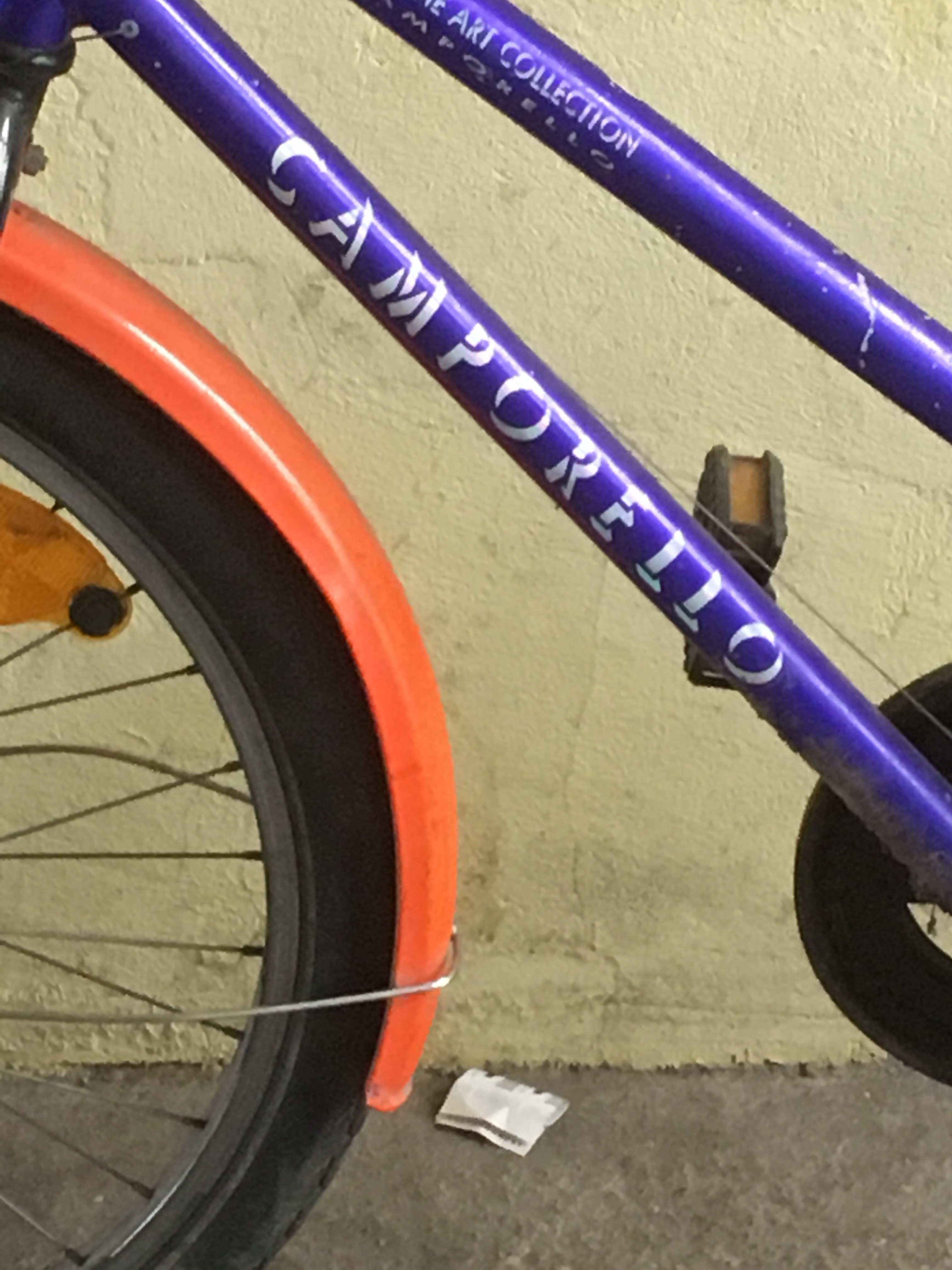
Does anyone know this one?
Can anynone of you describe a clever way how to create this of (shadow; it is not really a shadow…) effect? I tried to reproduce it by layering the typo multiple times using white on top and black for all the following layers, but it does look good.
I would be really happy if anyone could help!