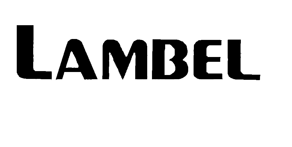
Not quite. It has a similar feel, but the glyphs are different. I am not quite sure what it is exactly. I think it is probably a bastardised Peignot. Can’t see any decent type designer holding their hands up to that B. Bit of a shocker.
Perhaps a small caps version, but yes, the b seems be be customized. It’s a starting point in the very least.
From just this example, everything but the L and B are Peignot. There are a few off versions of it out there but they also have round lower case caps and angled Upper case caps. The L is too long for a cap and the B has been cut out of something.
I wouldn’t raise my hand to the B either lmao ![]()
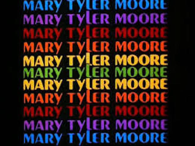
It looks like the font from the intro to The Mary Tyler Moore Show.
Peignot is the font from the MTM show ![]()
It’s definitely not an '80s computer typeface. It’s more of a late Art Deco face from the tail end of the 1930s.
It’s also definitely Piegnot, but somebody didn’t like the unorthodox lowercase b, or l or uppercase L of the actual face, then changed the letters to suit their preferences.
Thanks for the help guys. I need to recreate that logo so having a similar font to start will help. Not the greatest font in the world…
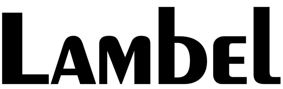
Hmmm, Piegnot is a wonderful typeface. It’s different from most and a bit quirky (like many Art Deco faces), but it’s had staying power for about 80 years and is highly regarded as a classic from the 1930s.
I quite like the font personally, I can see it being quite nice in some scenarios of Typography
Personally I’m not a fan but I’m coming around after seeing the whole family. Here’s how it is used for this company I’m working with. For some reason I’m getting strong 70’s/80’s vibes.
That’s likely because it had something of a resurgence during that period. For those of us who were around in the '70s and '80s, it was part of a revival of people’s interest in an Art Deco look — a style that had gone out of style three our four decades earlier. It’s interesting to me that people see it as a '70s & '80s face when to me is screams 1930s.
I personally strongly dislike Peignot, I think it’s rather ugly. lol But I fully agree that it has its place.
I’m sure it’s because it surged to popularity in the 70’s with the Mary Tyler Moore show. It always makes me laugh when a new crop of kids comes of age every couple of decades. They suddenly discover old things that they believe are new. They are shocked when it’s pointed out that it existed before in one form or another. Songs and fashion come to mind right off ![]()
When I was a newbie beginner in design school, way back in the late '70s, we were only allowed to use five different typefaces for our entire first semester. I think the reason was to force students to gain an appreciation for the subtleties of type rather than going hog wild with different typefaces, like beginning students are typically prone to do.
Anyway, Peignot was one of those five faces, so it seems like something of an old friend.
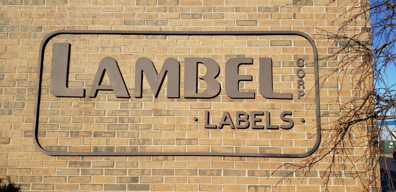
Kind of surprised they don’t have the logo in vector art considering they appear to be in the printing business. What about calling their sign fabricator and asking if he has a vector file?
It’s no big deal. I was about to outline the font and modify it to get their design. You are right though, one would think a print company would have their design already vectorized.
Pre-Modern Post Art Deco Bauhaus rounded Extra Bold.