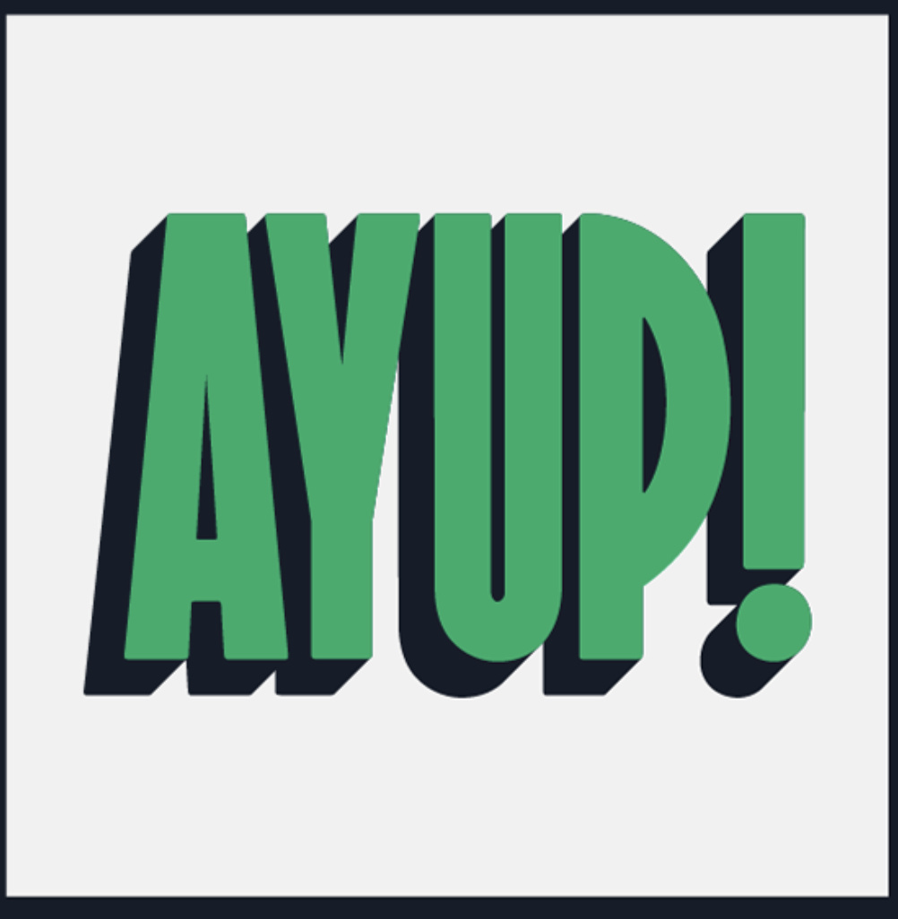
Hello lovely people
after an id on this font
Thanks!
Sorry, I’m just seeing this. I can’t give you an exact answer sadly.
It’s reminiscent of the Art Deco style, but danged if I can find an exact match.
It also looks someone stretched and over exaggerated to me. But that doesn’t mean anything. Folks like Nick’s Fonts have similar designs.
This could very well be a mixture of fonts or a one of a kind creation.
Here are a few that have similar properties in one way or another. You might find something that will help or replace what you are looking for.
Harvest Moon (Without the shadow of course) ![]()
Someone else might have more info. I’m just not finding this one ![]()
If RKK can’t find it, it doesn’t exist. LOL ![]()
Google some font identifying sites and upload your image there.
Not enough letters to bring up a hit.
Thanks for your help guys. ill look into some of those fonts…
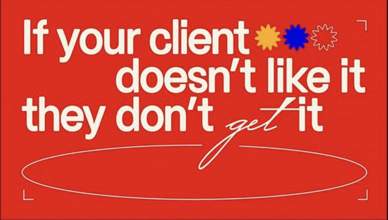
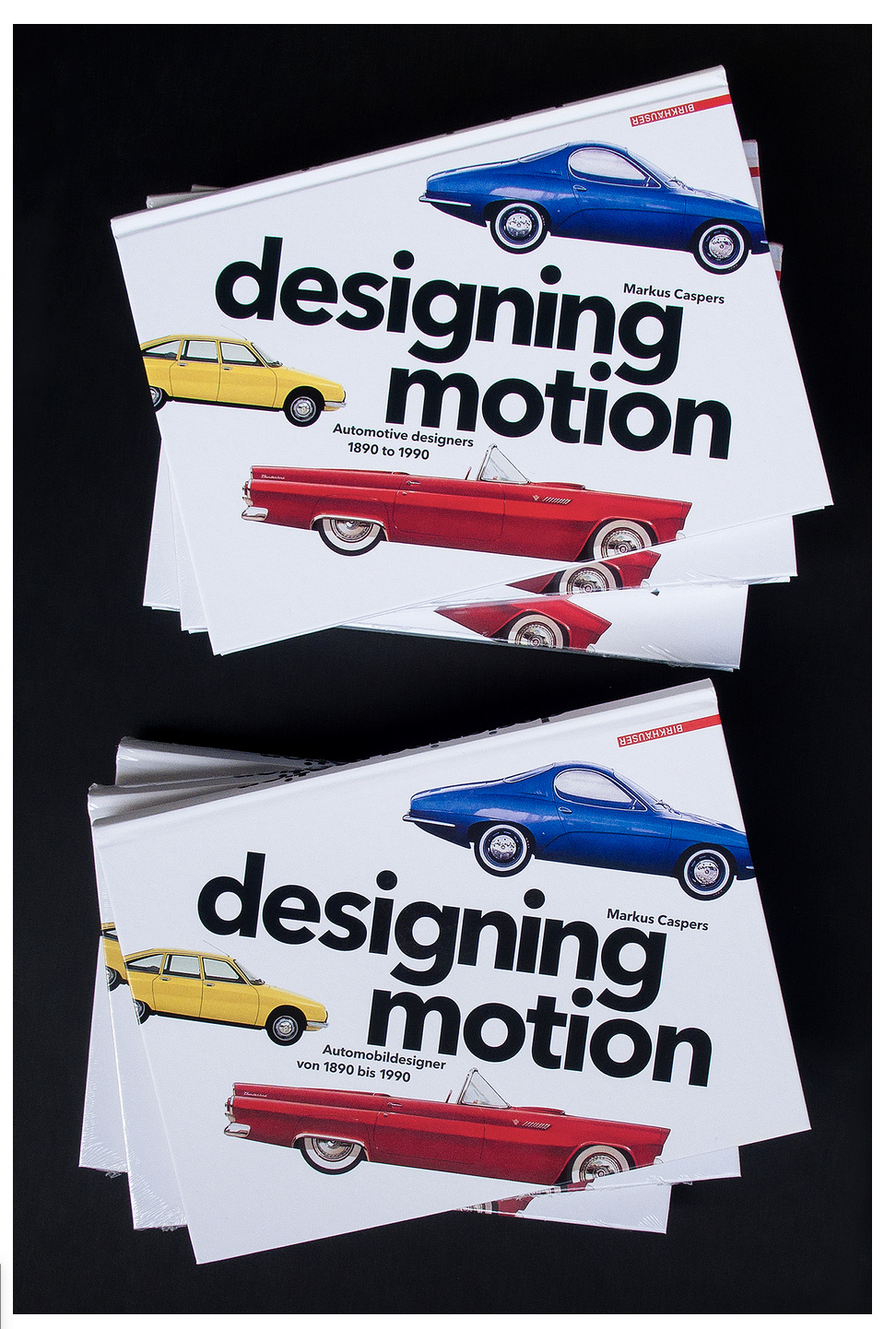
While I have you all, can I get some id’s on these fonts too ![]()
Thanks so much for the help
"get’’ is a weighted possibly stroked P22 Zaner
“designing motion” appears to be Cera pro bold
I can’t help on the “If your client…” that c and e are throwing me. Maybe someone else will have an idea ![]()
We can only pray that no one ever finds that one. It should never be allowed out in public! That’s one ugly font! The f and e are both going to keep me awake at night.
The s is the letter that jumped out at me. It seems to be falling over backward. The c isn’t the shapeliest thing I’ve ever seen either.
We could go on… I think whoever put this together (I hesitate to use the word design), must have had a few lemonades and then traced Helvetica with their thumb. This has to be up there in the top ten of truly bad fonts pretending to be serious, I’ve ever seen.