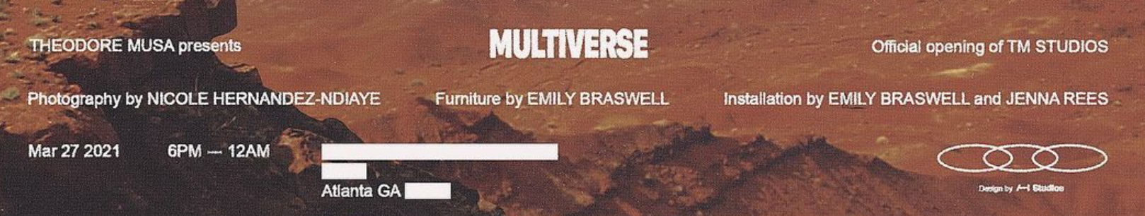
Hello all,
I know this is probably quite a popular font but I am terrible with id-ing fonts!
Is ‘Multiverse’ different to the rest?
TIA!
Hello all,
I know this is probably quite a popular font but I am terrible with id-ing fonts!
Is ‘Multiverse’ different to the rest?
TIA!
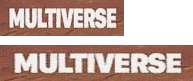
‘Multiverse’ is set in a very heavy DIN Condensed font of some kind, the rest looks like Helvetica.
Multiverse looks crushed. The verticals are narrower than the horizontals and it looks wonky.
Yes. Here’s an example with it stretched back out to something approximating its normal width. What typeface it is, though, I don’t know.
It’s always easy to spot this sort of misguided type squishing — the ratio between the horizontal and vertical strokes changes, making the horizontal strokes thicker than the verticals, which is the opposite of how well-proportioned type is almost always designed.