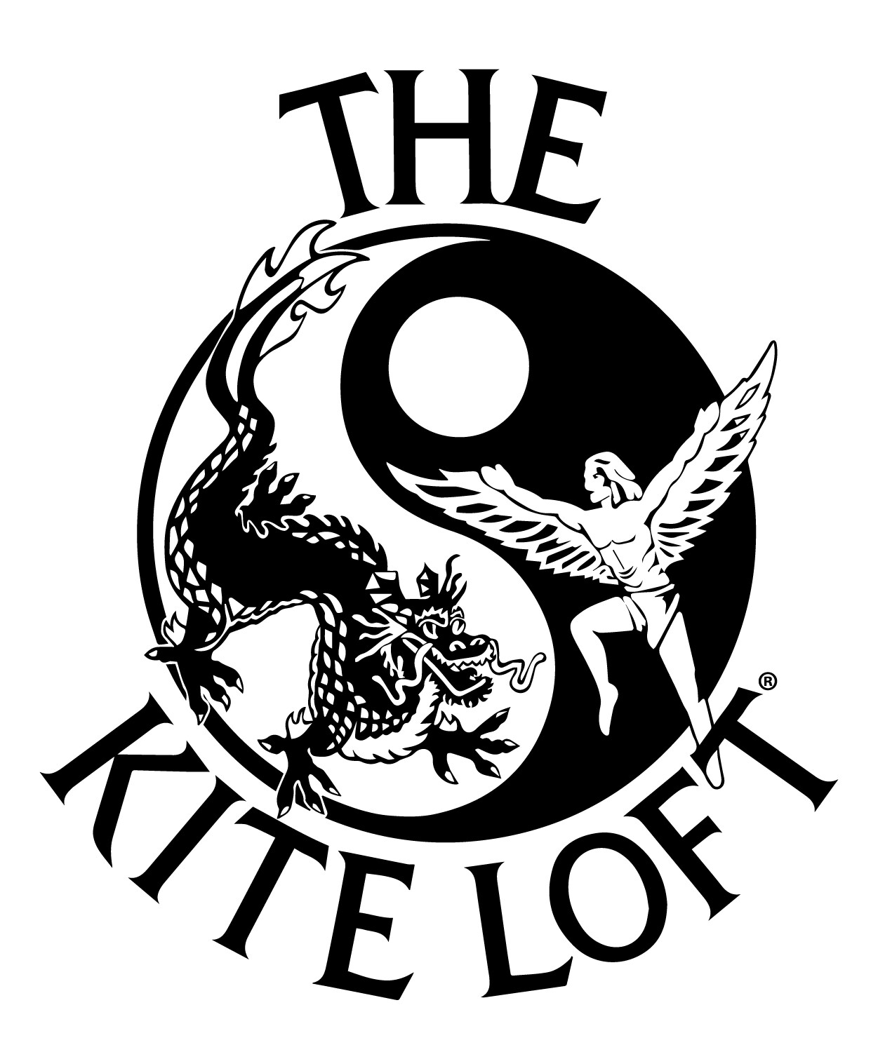
Greetings, everyone! First time here…was hoping someone could help me out by identifying the font used in this logo. Thank you, in advance
Looks close to Fritz Quadrata. With some modifications to the T and K.
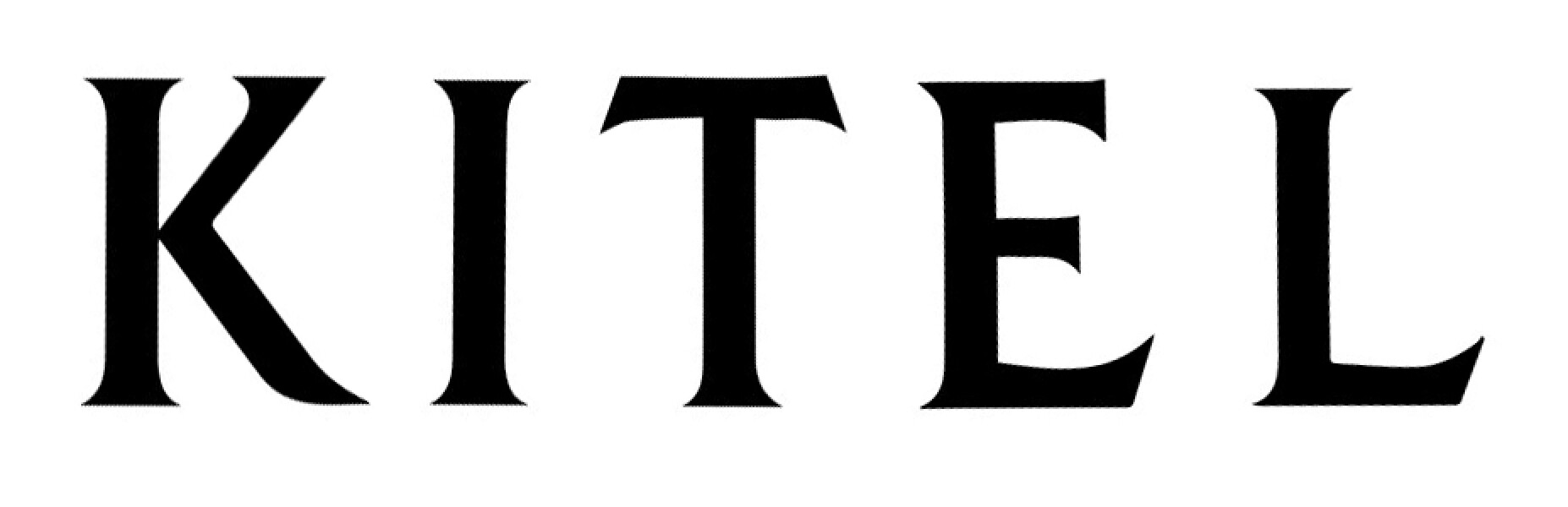
I straightened a few of the letters to use at a few font matching sites. I figured I would include it here for you or others to use as well.
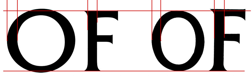
The “O”, though, looks odd.
The O definitely looks odd, but it most likely was simply horizontally squished.
Thank you, so much!!!
The Fritz Quadrata O is definitely squished and shrunk, throwing off the size and weight relationships. If the O needed to be narrower, they should have adjusted the vertical stroke weights and, at the very least, made the letter the same height as the others while preserving the overshoots. Agggghhh!
Are the basics of typography not even taught in design programs any longer? Then again, who bothers to get an actual degree anymore? Yeah, I’m ranting. ![]()
2 Likes
Friz Quadrata was the go-to face for my mentor in the business. This brings back happy memories.
@Just-B I did some digging and found out through a video (about 4:27 into the video) that The Kite Loft logo was created in the 70s. Couldn’t find any further details on it, but a possible theory is that the whole logo was drawn and put together manually by hand, resulting in the strange looking O and imperfect size and weight relationships.
I just did a logo and the client insisted on using zeros for capital ‘O’s - “because they’re rounder”. ![]()
![]()
Not the first time this has happened, apparently - here’s one I noticed last week;
Ahh, that explains a lot. Nice sleuthing! ![]() I watched the video. The kite store is pretty cool.
I watched the video. The kite store is pretty cool.
I hate to admit it, but I started my design career in the late '70s. Fritz Quadrata was a popular typeface then. The logo also has a '70s look.
I’d be willing to bet the original logo was inked and that Letraset rub-down type was used. I suspect they didn’t like the round O, so they substituted one from another typeface. Everything was probably scaled using a stat camera and pasted up.
I’m pretty sure the logo has been digitized and redone as vector artwork, but that care was used to make it look just like the original. They really ought to clean it up a bit and fix some of the flaws and inconsistencies..
1 Like
You’ve mentioned something that makes me want to geek out a little — sorry.
The numerals in a typeface design are always a problem because there are so many choices regarding the default design.
Before OpenType, type designers had to choose between lining and old-style figures. Most type designers chose lining figures, which rarely matched the letters since they are monospaced and designed to line up vertically in columns.
Including lining and old-style (essentially lowercase) figures in OpenType fonts has become increasingly common. Below are the numerals in a typeface I designed that includes both lining and old-style figures.
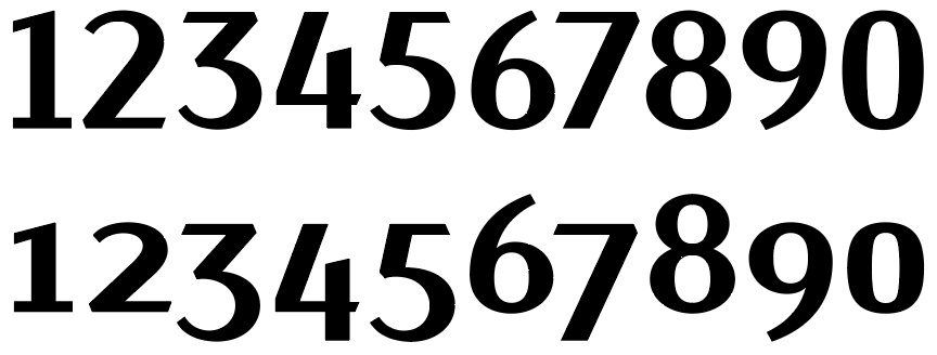
In addition, proportional figures are sometimes included. These numerals are designed to match the look and feel of the uppercase letters instead of being monospaced and designed to line up vertically. Proportional figures would have solved the 2000 problem in your example.
If that weren’t enough, there are also the numerators/denominators and the superscript/subscript numerals. It’s not often that an OpenType font includes all of these, but a few do, which amounts to 50 different numerals. When spread across six different weights, that’s 300 different numeral glyphs. Designing them is a pain in the butt.
2 Likes