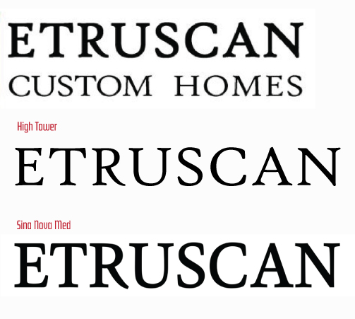
I recognize the R but can’t find this font. Does anyone know this font?

It is: High Tower Text
I only have the regular and italic. It looks like its slightly thicker so you could find a different weight. Otherwise the difference is 1pt.
1 Like
Looks to be Sina Nova med. But it’s a little hard to tell as it’s a bit blurry. Those serifs can make all the difference and there are many that are very similar ![]()
I think whoever designed it added a stroke to the High Tower. Sina has the right weight, and I cant find High Tower in a heavier weight than regular/italic. I suspect this because how the aperture between the stem and tail of the R have closed in.
2 Likes
That is entirely possible. ![]()
1 Like
Thanks everyone! I knew stopping by here would yield positive results!
1 Like