Have just been reading this article about the mechanisms at play when we view fonts and why we think one is better suited to a certain context vs another:
I found it super interesting, however am always a little dubious of anything with “psychology” attached to it (mainly because I don’t think psychology in general is always an exact science or is perfectly understood). What do you guys reckon?
It is a hugely important and oft-overlooked area when studying design. How the brain processes in formation, both visual and lexical is crucial to producing effective solutions.
He lost me as soon as I got to the part where it became apparent that he didn’t understand what condensed and extended typefaces were. Consistently misusing the word font was another strike against him.
He said that mixed case words were easier to read than either upper or lowercase, then justified it by citing a study about street signs. A study on street signs isn’t much evidence for drawing any conclusions about readability other than on street signs. He equated blackletter typefaces (but didn’t seem to understand that Fraktur was only one style of blackletter) with the Nazis — well maybe in Germany. Here in the U.S., there’s more of an association with beer labels, Oktoberfest and cheesy typography on motorcycle gang jackets. Many of the characteristics he assigned to various faces were just his reactions, which don’t match up at all to mine.
And what’s that thing he mentioned about brain network nodes? Last I checked there’s no such thing, but maybe he was speaking metaphorically. I think his explanations went a little too far in breaking down things in ways that resulted in a mumbo jumbo mix of his own ideas and accepted wisdom.
I mostly agree with most of what he wrote, but sort of rolled my eyes at other things. It all boils down to this guy’s take on things. I’m just not seeing him as much of an expert — just a guy who’s thought about it enough to have some opinions.
Although psychological factors are important, that article / video are particularly spurious. As Just-B said; Nodes?! Really. He pegs it as though the brain is one big filing cabinet of information. This is all pseudo-science. How the brain processes information is important, but it is important to know that different areas of the brain deal with different stimuli. It is far more specific than some idea of nodal soup.
Yea I thought it was about a bit weird what he said about title case being easy to read. I was also disappointed comic sans didn’t make it onto this awesome list of super popular fonts:
However I think there’s some merit to some of the other stuff. Was absolutely blown away by the subconscious influence effect. I do wonder though, if it’s “node activation” that actually causes us to be more likely to think of certain things than others when we’re subconsciously primed or some other mechanism that is yet to be fully discovered and understood.
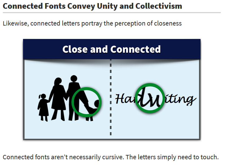
I was a bit unsure about the connected fonts conveying unity and collectivism:
You get a sense of human-scale, approachable because they derive from handmade, scribed manuscripts or brush kettering, not because mummy held your hand when you were five!
Most everything in graphic design has subconscious and subliminal components that need to be consciously considered by the designer.
For example, let’s say you’re designing the cover for novel about Transylvanian vampires. You’ll likely use lots of dark, cool colors to convey a sense of night, evil, mystery, fear and danger. You’ll use typography that complements this personality.
All these things are subliminal cues to the people in the target audience. They don’t consciously think about the colors or the typography — they just react to them on an emotional level in ways that you’ve planned out by using these and other subliminal triggers.