I’m having a very hard time coming up with a simple ad that looks good.
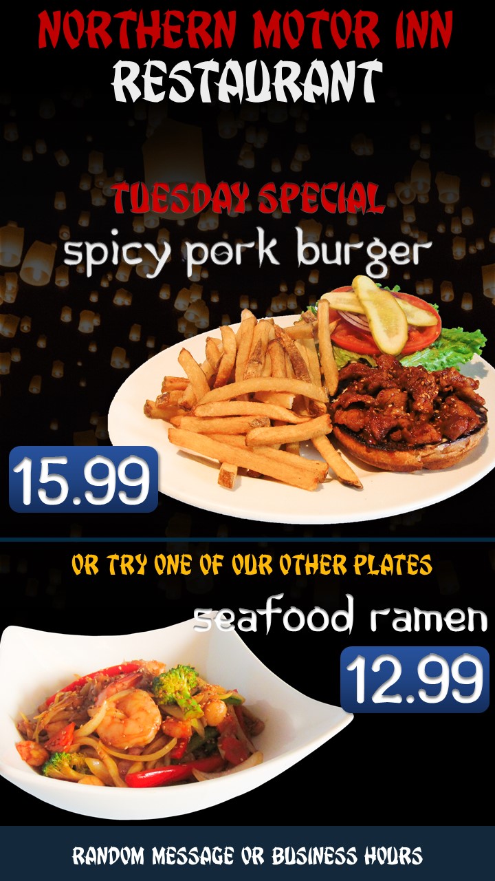
We have about 9 food items that we want to show in rotation, so there will be some motion graphics happening with the text and pictures.
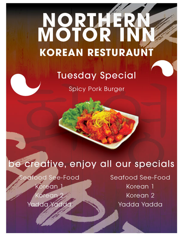
But I feel like this layout is not very good.
It’s for a Korean based restaurant. I’m having a hard time with colors and fonts and even just the general positioning of the text and food pictures.
We don’t want create a “menu board”, we’re just trying to create a way to promote products that are unlikely to get ordered because people don’t know what to expect.
And while you’re making the food the hero (the food looks appealing), please do not use that tacky, fake oriental type. There are classier ways to say Korean than resorting to bad typography that cheapens everything,
This place is in northern British Columbia, very normal to see prices like this at a restaurant. US quite a bit cheaper as far as I know. A 12 pack of beer is 18$ here
As PrintDriver mentioned, we have forum rules that prohibit taking someone’s work and redoing it for them. It’s great that you made the extra effort to do so, but keep the rules in mind going forward. Thanks!
Here’s the relevant rule:
Here’s a link to the rest of the forum rules. They’re fairly short and easy.