How I imagine Apple, and other famous logos will look like in the future.
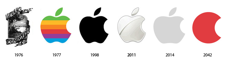
Apple
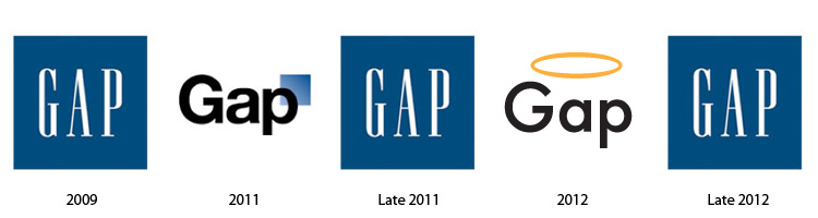
GAP
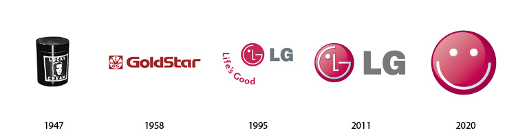
LG
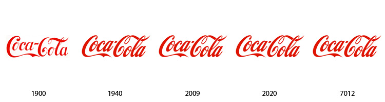
Coca-Cola
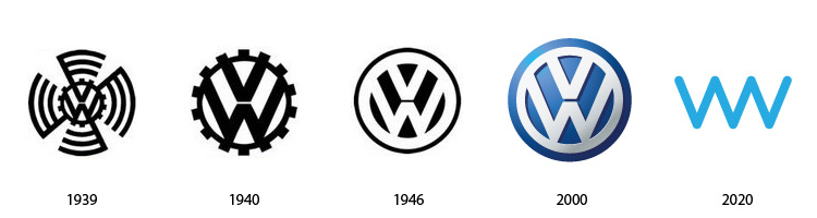
Volkswagen
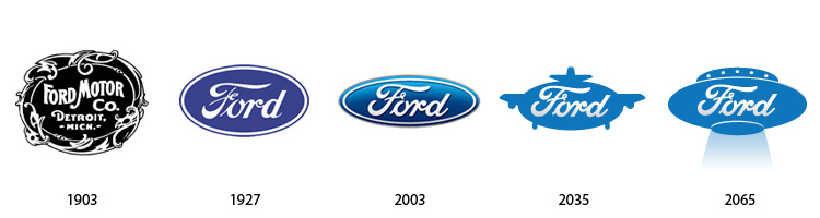
Ford
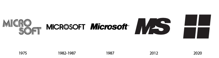
Microsoft
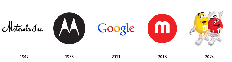
Motorola
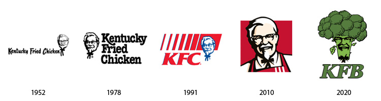
KFC
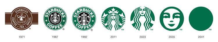
Starbucks
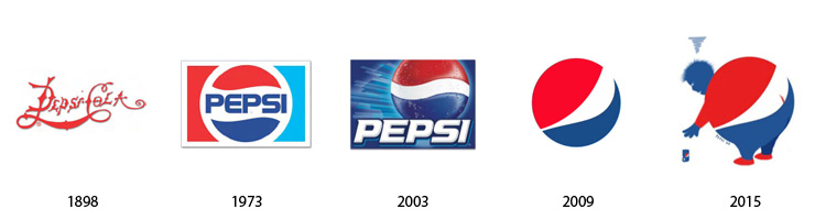
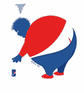
Pepsi
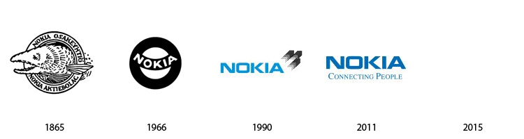
Nokia
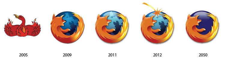
Firefox
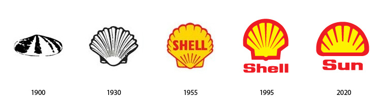
Shell
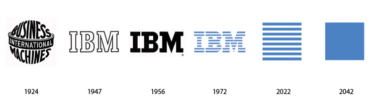
IBM
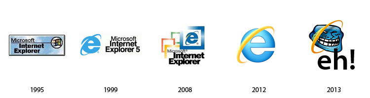
Internet Explorer
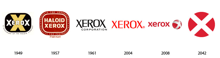
Xerox
How I imagine Apple, and other famous logos will look like in the future.
Apple
GAP
LG
Coca-Cola
Volkswagen
Ford
Microsoft
Motorola
KFC
Starbucks
Pepsi
Nokia
Firefox
Shell
IBM
Internet Explorer
Xerox
Those are funny. Especially the ones ending in a circle. ![]()
I’ve predicted that for two decades now that all logos eventually will be just simple circles, or circles with some skinny-assed typeface representing initials.
Those are great!!! ![]() I especially love KFC going green
I especially love KFC going green ![]()
I’ll have a leg of that broccoli please! ![]()
![]()
Extra crispy?
Of course! ![]()
The Pepsi rebrand was in 2015? I haven’t seen the new logo used yet. Not even here in the future. ![]()
I created this before 2015, just reposted it here, because the site it was posted on (stocklogos) originally got yanked.
I like how Shell drops all pretence and becomes the sun!
I love that of all of these, the Coke logo hasn’t changed beyond having the text become slightly heavier and progressively more tilted to the right.
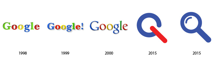
But some of the logos are wrong ? like the Google one for example ? Or I am missing something ?
But some of the logos are wrong ? like the Google one for example ? Or I am missing something ?
This was done few years ago!
It’s all a bit of a joke. Maybe you’re missing the humor?
A post was split to a new topic: Spam post