I gotta say this looks pretty crisp. Seems like the classics (ie. Helvetica Now) are getting a digital update.
2 Likes
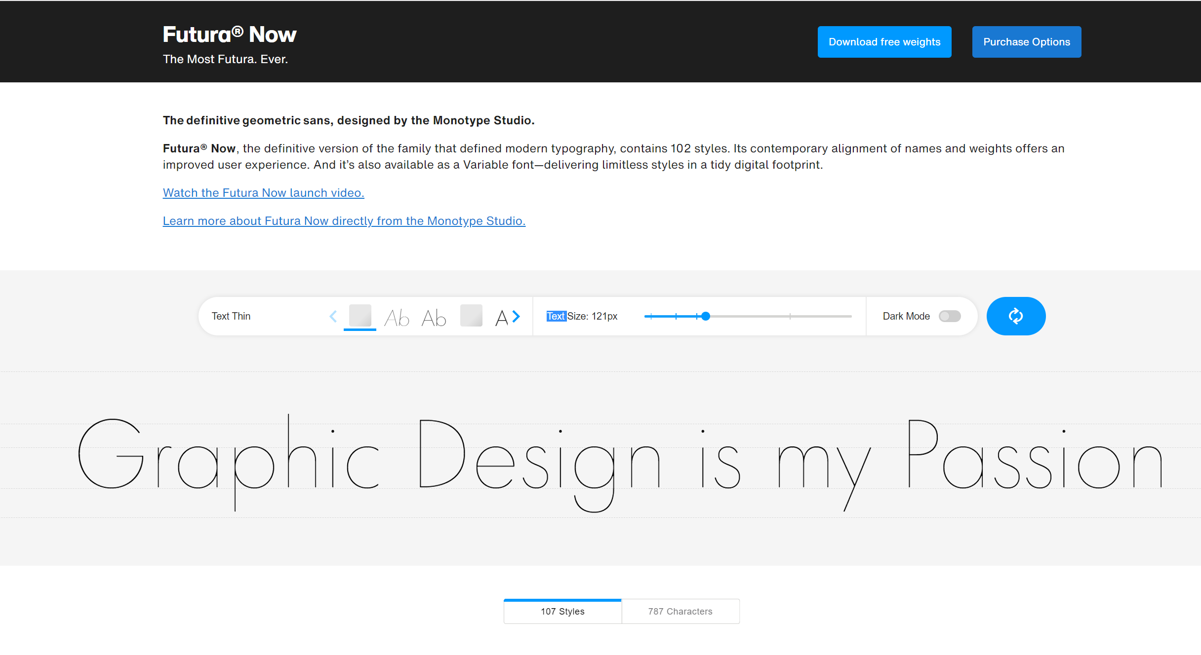
1st thought - it’s about time Futura got a redo, especially if they fix the dodgy spacing
2nd thought - 102 Styles ???
3rd thought - Back to the Futura ![]()
Perpetual best sellers always make money, so there’s a reason to squeeze a bit more money out of the audience by creating updates.
I was pretty excited by this. One of my brands uses Futura PT because it’s on Adobe Fonts, but I may consider using Futura Now for greater flexibility.
I don’t know . . . I’m happy with the Futura BT Light. Too many font variations for my feeble brain!
Personally, I can’t wait for the stuff to show up with yet another variable in the mix. I already get files with a single font mixed up with three different versions (OTF, TrueType and Postscript) all in the same document. We won’t talk about the same font name from different foundries either…
Take this opportunity to clean the crap outta your font management system please.
1 Like
I guess we have to ask ourselves is Futura really Futura then if its Futura Now, Futura PT? Or is Futura really only existence in the traditional movable type casts.
That’s an interesting philosophical question, but it probably doesn’t really matter as long as it works for the job at hand.
Futura has never been one of my favorite typefaces. I like the caps for certain types of headlines, but the big, round bowls on the lowercase make it awkward for text.