I don’t disagree with Sprout, but I’ll give you some advice on how you can improve your flyer or leaflet. The leaflet won’t be great since I think you’d need to start over, but you can make it a little better by doing a few things.
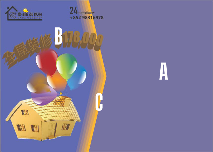
I’ve placed letters over your leaflet to indicate what area of the leaflet I’m referring to.
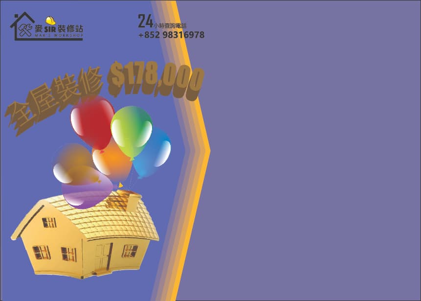
A — What is this area? Will promotional text go here explaining what the leaflet is about? I’m assuming that must be the case or the large purple space makes no sense.
Why is the purple in this area a slightly different color than the purple area on the left side of the layout?
If text goes here, keep in mind that there might be printing problems reversing text out of a color. Your leaflet won’t be printed using purple ink. Instead, it will be printed by combining CMYK inks or toner. If the ink isn’t laid down perfectly, the white text could look out of register, blurry, and make it difficult to read. To guard against this happening, it’s usually best to use black text on light-colored backgrounds.
B — Is the type here the price of the house? Placing dark letters against a dark background lessens their legibility. The words and numbers need more contrast with the background. You can do this by making them a lighter color.
I would also remove the drop shadow. The shadow makes no sense. Shadows don’t float in space, nor are they brown. Sometimes a subtle, blurry drop shadow can improve the contrast between words and a busy background. However, the way you’ve used the shadow lessens that contrast and, subsequently, lessens the readability of the words.
C — Why is this shape here? Is it only for decorative purposes or is it meant to point to the text that I assume will be on the right side of the page? The geometric shapes on the examples you provided make sense because they’re nicely integrated into the layout. Your shape, however, is a single, random shape placed on the page.
In addition to what I’ve already mentioned…
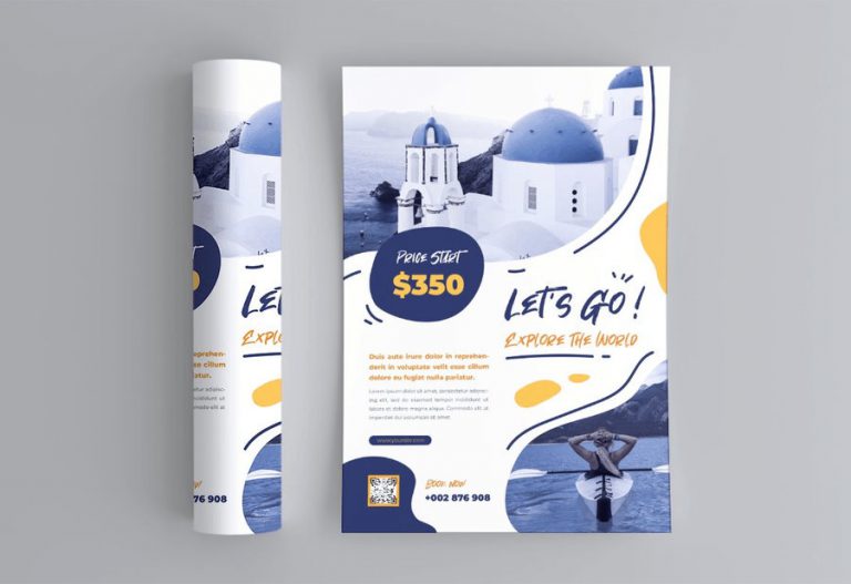
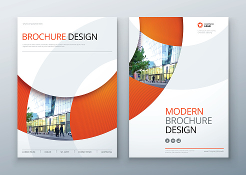
On the first and third examples you provided, notice the dynamic relationship between the negative and positive shapes (the background and the foreground elements). The white backgrounds aren’t just backgrounds on which everything sits — those negative spaces form interesting shapes that contribute to the design by visually interacting with the foreground shapes.
On your leaflet, the big purple background is just a big sea of color. Instead of doing this, the background should visually interact with the foreground shapes in a way that makes the background more than just a big sea of purple on which everything else floats. The interactive relationship between positive and negative shapes and spaces is a difficult concept to understand, but it’s essential to good graphic design.
In my first reply to you, I mentioned the principles or elements of design. Do a search for them on the internet and study the example you find. They might help clarify what I’ve written.