Hello.
I brace myself to try a geometric design, and I come up with this geometric design that i did.
Feel free to comment, really appreciate any feedback for me to improve
Sincerely,
Melissa Christine
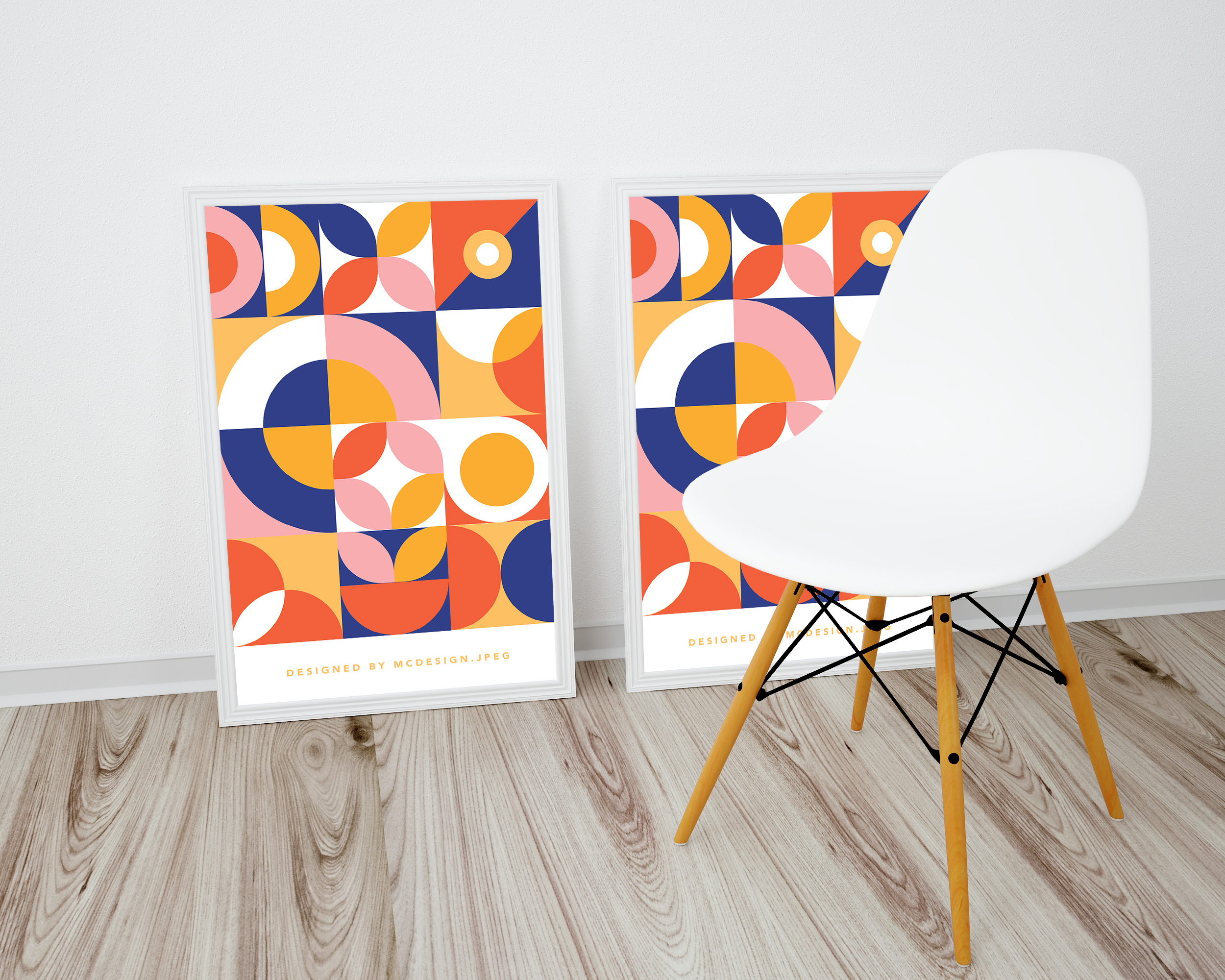
Hello.
I brace myself to try a geometric design, and I come up with this geometric design that i did.
Feel free to comment, really appreciate any feedback for me to improve
Sincerely,
Melissa Christine
That’s more art than design, but it is marketable enough nonetheless. If it fulfills your artistic vision, then it’s good.
I agree with HotButton’s comment about it being more art than design. Although it could be used as part of a larger design piece.
That said, I think you did a good job with this. The color palette is nice, and the overall layout and balance is pleasing. My only suggestion would be to look at a couple of different options for the top right box. I don’t mind the diagonal color split; but, with the circle being on the smaller side, it really emphasizes the diagonal which seems a little out of place with the others.
I’m liking the posters. They have something of a 1960s look.
Over the past couple of months, I’ve been doing some corporate visual branding work for a software technology company. I’ve quietly tried to steer things in this kind of geometric, flat, colorful direction as a way of differentiating them from their competitors. It seems to be just a couple of steps beyond their comfort zone of expectations, however, and they’re pushing back.
On the bandwagon with this being art not design per se. I see it more of a poster type visual and I love it. I would hang it up ![]() I’m diggin’ the 60’s vibe.
I’m diggin’ the 60’s vibe.
Looks good!! I like it. I designed something similar recently… Colors look good. I’d hang it!!