I want to incorporate a gradient into a brand I’m working on but some designers have told me I shouldn’t because it can be complicated to print.
It would mainly be used for product hang tags, postcards, business cards and closing bag stickers.
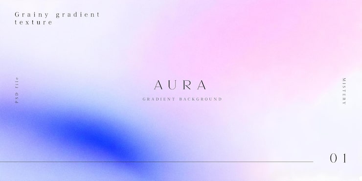
This is the type of gradient Gradient I have in mind. I’d appreciate any advice or recommendations if I decide to go ahead with it.
Yeh best avoided. Usually ends up looking different across different substrates. And different print process can produce different results.
You’d really want a master sample you’re happy with and supplying that physically to the production team each time to match.
Or if inconsistency is OK then you don’t need to worry about it.
1 Like
I would be hesitant to do it because of the risk of banding. If it were for one situation, I might chance it, but for an entire brand, no — especially when the banding would be so noticeable on something you wanted to have a minimal, high-end look.
Rather than write a long explanation, here’s a link that spells out the problem better than I can.
Besides, down the road, when you’ve moved on, and the company needs to recreate these subtle, irregular gradients in different shapes and sizes, there could be issues.
They throw a production and printing complexity into the brand implementation that’s probably best avoided.
2 Likes
Usually for banding the gradient created in illustrator or photoshop with a2=3 percent noise added was usual in our prepress workfkow.
I think we used to rasterise to output size and add noise, if memory serves me.
But that won’t stop inconsistent replication across substrates and print methods.
Rasterize and add noise is what we did too.
16 bit gradients often do much better. Especially gray ones.
Pink to Blue is my least favorite of gradient combinations. Ranks right up there with light blue to white.
1 Like
Thanks for replying, sorry to ask but I’ve seen an artist who does watercolor art and some brands have used her handmade art for some paper pieces, how do they do that since the watercolor is some sort of gradient
I haven’t seen the watercolors or the printed pieces, so I can only generalize on watercolors as a whole.
Photoshop- and Illustrator-produced gradients are smooth, mechanical, and created by hundreds of discrete steps from one shade, tint, value, or hue to the adjacent one. Watercolor transitions are much more organic and painterly. Instead of being smooth and uniform, the paper’s texture and the uneven distribution of pigments in the water create organic irregularities that prevent banding.
This happens in much the same way as adding the noise @Smurf2 and @PrintDriver mentioned does — it breaks up the mechanical transition from one tint or shade to the next by introducing tiny irregularities in color and ink or halftone dot consistency, which help prevent banding artifacts.
Here is a detail of a watercolor. As you can see, the “gradients” are organic, mottled, and uneven.
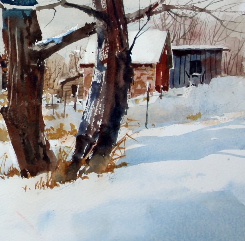
When enlarged, the organic irregularities become very apparent.
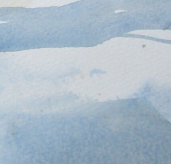
Of course, the closer a watercolor comes to the smooth, mechanical gradients produced by software, the greater the risk of banding.
There are ways to mitigate the problem, such as adding noise, using 16-bit images, lining up quality-conscious printers, and knowing what will happen on various substrates. However, adding noise can create a visual texture you might not want, and the extra hassle and expense of dealing with these and other issues every time the company prints anything will soon have them wanting a visual brand identity that doesn’t require jumping through these hoops.
In that sense, it’s much like creating a complicated logo with lots of detail and a dozen different colors. The logo might look great, but it becomes an expensive, limiting, and time-consuming pain in the butt when faced with the many situations in which the logo must work. In a short time, the company will be looking for a simpler logo.