I just had a class today where we discussed the failure of Tropicana’s Package Redesign and was wondering if there were any resources that discussed other failures? I wanted to do some research of similar failures to do some learning.
I tried doing a google search but most I came up with were memes. Does anyone have an idea where to search or specific ones they know about that I can search up?
Well, there’s the New Coke fiasco from what, the 1980s. A few years before that, in the 1970s, there was the time when NBC abandoned their peacock logo for a trapezoidal N before reverting back to the peacock. And as long as we’re going back in time, let’s head back to the 1950s when Ford came up with the Edsel flop, which was primarily a design/branding/marketing failure.
More recently, there was the GAP rebranding disaster and a very similar misstep by JCPenny.
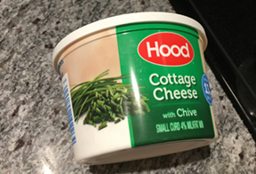
Ever time I buy this Hood product, I have to wonder what they were thinking to print moldy looking cottage cheese on the packaging. It looks really gross.
That one is a self parody .. they knew what they were doing and trying to cause controversy and interest so to speak. Tons of folks were talking about it … so it worked actually.
Might be more bad advertising than pure design, anyway there’s the new Strand cigarettes in 1959 Britain ( withdraw 1960) branded with the tagline:
“You’re never alone with a Strand. The cigarette of the moment.”
“Using stark cinematography, the ad featured a Frank Sinatra lookalike - the actor Terence Brook - as a lonely soul walking rain-soaked city streets at the dead of night.
The commercial spearheaded a multimedia blitz and public awareness of the brand and its advertising soared to more than 90 per cent within weeks. So how come defeat was snatched from the jaws of seemingly certain victory?
The most popular theory is that even in the relatively unsophisticated 50s, people could recognise a sad bastard when they saw one and had no wish identify with him.
Others suggested the ad was just too depressing and made solitary smoking look like solitary drinking, something in which only addicts indulged.” https://www.campaignlive.co.uk/article/history-advertising-18-strand-cigarettes/1074298
It’s very reminiscent of the old detective movies. I half expected some femme fatale to come rushing over to him … “ya gotta help me mister … ya just gotta”