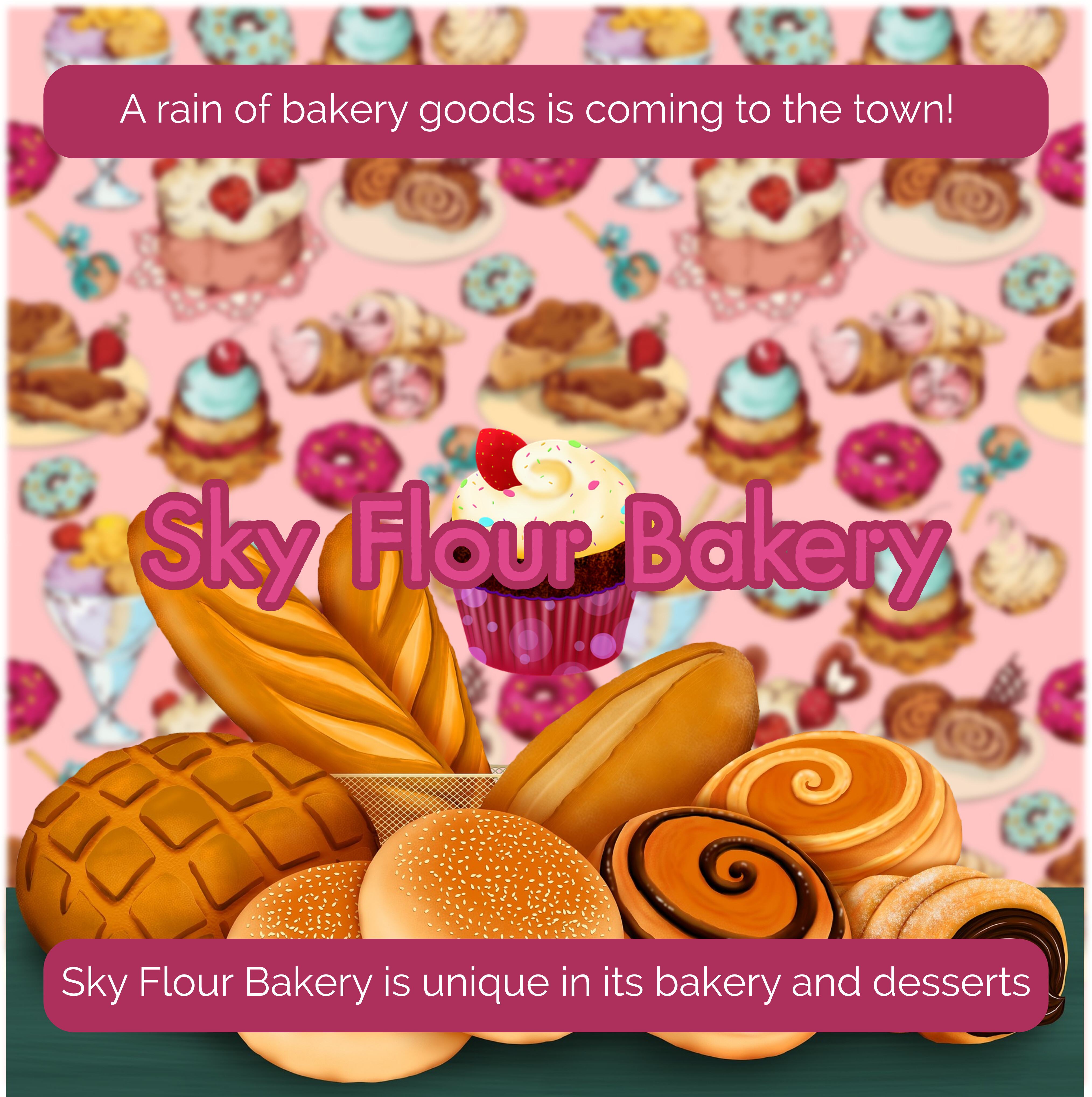
And here are the two other designs, take a look and tell me what do you think :


1 Like
I’m going to be blunt.
None of what you have come up with appears to have a concept.
Every design you have shared has been blue bar with logo and text, odd AI generated photo (IMO) and blue bar with text. Also, I realize English may not be your first language, but the text is also off in that it does not feel natural.
IMO you need to start with a concept. A concept that is more than just ice cream as a date option. @Steve_O also alluded to that with his earlier post about ice cream and making a heart shape. That is not to say that you use that exact concept, but you need to come up with an actual idea on how to best promote ice cream for a dating couple.
At the moment you are missing nearly every key point of a design. It is just blocky and not well thought out.
A flyer is in some cases like a billboard. You have to grab someones attention in 5-10 seconds or less. All I see are some generally lifeless and not very engaging ice cream photography. Your text is all caps and all the same size. I have no idea what to look at first because nothing stands out. And because nothing stands out, because nothing is engaging, I (as an end user) don’t even care to read it or follow up.
Also, there is no actual call to action.
Have you looked at other ice cream flyers, or just any other sort of promotional flyer. What works, what doesn’t? Did you do sketches of your flyer before just jumping into the design? Did you do any brainstorming to think of overall approaches and concepts that would make the flyer stand out? If not, you need to scrap all of this and start form the beginning.
2 Likes
Thanks so much GraigB, i would not say “Blunt” but “sincere” and I thanks so much for your sincerity and I appreciate all you help with my design. This is really apreciated, I just watched one Ice Cream design which is here but as You say, yes I will. I am going to do all my work for again and I will come back. To all of you Thanks so much for help, Anyway this is not a flyer, it is a poster so I will make more improvements and watch more Ice Cream posters.
There is another thing to make it clear … i never get disappointed or frustrated by your answers, more than that It makes me want it even more better and improve my designs.
Why is there a space before the comma?
Why does it look phallic?
1 Like
Sorry, but that really is no better. Arguably even worse. I don’t want to be too scathing or disheartening here, but so far, I am not seeing an awful lot of natural aptitude for design – I had a look at your portfolio.
I am not saying don’t pursue it, but, you really need some educational grounding in the basics. What is your end game? What do you hope to do with design? Is it just a hobby, or are you hoping to sell you services? If that latter, you really do need to know what toy are doing, otherwise, at best, you are not being honest with yourself and at worst, you will be doing a huge disservice to your customers.
The path you are currently going down, even with some really solid advice, you seem to have managed to digest and ignore completely, or rather miss the point.
I didn’t wade in here initially, as I would only be reiterating the good advice you’d been given already. Also, I have a habit of being somewhat unsubtle with my advice and I assumed you were a young person and still at school, so I thought better leave it to people with a little more diplomacy than me.
As I say, I’ve no desire to crush, but if I am going to be brutally honest, I really think you need some sort of formal education in the basics of typography, colour theory, layout, conceptualising, lateral thinking, critical thinking, communication, etc. Right now, it appears you don’t know what you don’t know and are producing work that simply doesn’t, well, work.
By all means keep posting stuff here for critique, but I think, currently, you are not seeing why things are not working even when shown directly.
I hope you can get to where you want to be. I apologise if this is hard to take – and it is, after all, only my opinion – but I figure brutal honesty is always more useful in the long run than feint praise and pussyfooting around (not something, as you can see, that I tend to do all that well).
Good luck.
1 Like
HI Again, I am sorry, yesterday was really late and I upload the wrong design. And Sprout thanks so much for your feedback. I really love all the feedback even good or bad.
We all start somewhere.
Its a slight improvement to the previous but has many of the same flaws, which shows some basic knowledge on how to improve and increase the deliverables of the design required.
Maybe asking ChatGPT for copywriting to include in the poster/flyer.
1 Like
Ah yes and thanks! but speaking about the images I always use from here : https://pixabay.com and the writing of the design I will take a look next time, this one was not finished yet. You can see it from here : https://pixabay.com/photos/ice-cream-chocolate-dessert-4894270/ (sorry but i didn’t considered the image as phallic and it is good detail to take look next time, I just made the image like a cartoon or vector drawing)
In context it is.
1 Like
Hi Again, I have been checking some documentation and some design, now I know where I was failing then I am going to make three different designs which three different subjects (ice cream is going to be one of them) and I am going to show them this weekend. Again thanks so much for all your help and thanks so much to be so patient with me. I am going to do my best and not failing again like before (I was not aware and not putting all attention on my designs)
Well that’s how you get to Carnegie Hall… practice!
Hi Hello, here are some design I made this week. Please take a look and I would really appreciate your most sincere feedback because this really help me to improve! and thanks so much for all your help ! :


Your designs make me sad. But I’m not giving up on you and you shouldn’t give up on yourself - you can do it, but I feel you’re being lazy about it, and not intentionally but because I don’t think you have the formal training. Some people are naturals, and some people are not.
I’m in the NOT category. It took me a lot of work to get better.
I’m not going to lie, these are terrible.
So the bellow is to help you - and it’s basically what I had to do. Because I have no natural drawing/design skills to draw on - I had to learn - and so do you. It’s a much difficult path. But if I can do it, so can anyone.
You need to work on your typography and your overall layout skills. I am not sugar coating that because you will not improve if people tiptoe around it.
Right now your pieces are very hard to read. The yellow posters with green text simply do not work. The headline is lost. The hierarchy is all over the place. None of that is fatal but it tells me you need real practice, not another round of guesswork.
The best way to learn is to rebuild things that already work. Designers call this a master study. Pick up flyers that come through the letterbox or grab supermarket promo leaflets. Recreate them down to the smallest detail. Do this over and over until you can match the layout, spacing, colour and rhythm without thinking.
You are not copying for use in your own client work. You are teaching your eye what good design actually looks like. You begin to understand what makes something readable and why certain choices feel confident and professional.
After that, move on to magazines, newspapers, adverts and posters. Rebuild them, question them, improve them if you can. Analyse what holds your attention and why. This will give you real foundations, not shortcuts.
If you stick with this for a while, your work will level up fast. It is the least glamorous method but it works.
And finally - Analogue Prototypes
Try not to sit at the computer at first. Grab a sketch pad, grab a pencil and ruler. And draw each one out on paper first - to the detail, size, round corners, even the typefaces.
This forces you to think in Black and White at first, without adding colour/textures/imagery etc.
It doesn’t have to be perfect, but you should get it as close as possible. For images you can sketch basic photo or leave a box with an X in it.
Then and only then - transfer your design to the computer - and follow it verbatim.
Don’t change the design, layout, text, etc.
As it is, to the nanometer.
2 Likes


All the same problems as before.
No improvement.
OK thanks so I am going to focus on this two then I will come back. There is one thing, I must be sincere that I didn’t used before Layers.
I decided to add this old design just to give the following message
Yes, This was one of my first design six month ago (while I was doing great not like now that I am doing some “crab” (yes like the crustacean, I mean that I am not going forward and I keep going backward and I don’t want that). May be I was focusing to learn new programs like Blender 3d but I just stopped practicing Graphic Design (My own mistake). At the moment I am reviewing my designs and re-designing some of them (make improvements) and watching some videos of Satori Graphics (YouTube) to get some ideas. I want to apologize with all of you because may be I made some of you disappointed with my new designs which it is just a mess. But in any case I am not frustrated, this things just made me think to practice and make some improvements. Anyway thanks you all, I will stay on the forum helping other designer but not making mess anymore ! at the moment I just building everything again to make improvements my own design and I stopped to learn Blender 3d until I improve my own designs !