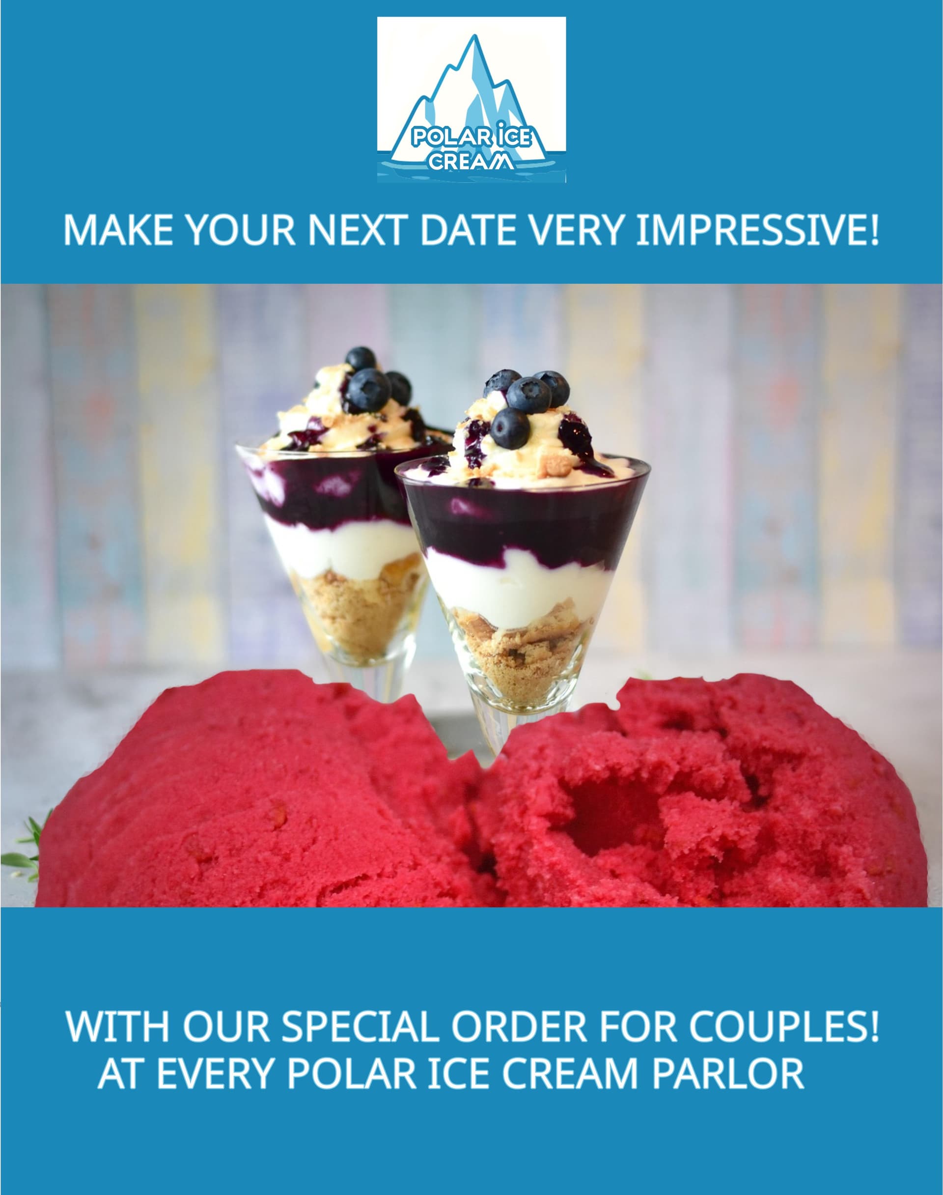
Hello there, colleagues! I made this Flyer (as a prototype) for my personal portfolio, which will be for an Ice Cream Parlor, just encouraging people to have a date at their Ice Cream Parlor. I have this creative idea, but I would like your opinion on everything in general ! (the two logos are added this way to make an impression of north pole and south pole( but I can change depending on the opinions.). Thanks so much for your help !.
It’s not a style I come across often, definitely has its own flavour (pun intended). The concept of connecting the two logos to represent the North and South Pole is interesting, but it’s not immediately obvious from the design. Without explanation, it’s hard to understand what the intention is there.
There are a few technical bits worth tightening up too: some of the text has odd double spacing or misplaced commas for example, “SOMETHING , THAT YOU CAN SHARE…” could be smoothed out for readability.
Visually, it’s not quite the typical ice cream flyer style either. The text is quite small, so it gets a bit lost against the images. You’ve got great photos that grab attention, but the message and especially the call to action doesn’t stand out as much as it should. Right now, it feels like a cross between a flyer and a poster… a floster? Or maybe a posyer? Either way, deciding whether you want it to read like a quick-scan flyer or a more visual poster would help sharpen the impact.
For example, the text is too small and too much text to gather at a glance.
Overall though, the creative idea of “cold desires” and sharing ice cream as a date concept is fun it just needs more polish and clarity to make it feel cohesive and engaging.
1 Like
Hey Thanks Smurf for your feedback, I am taking this very seriously and I will polish the design make the letters bigger and about the logo, I think I will keep the concept. I was thinking to make one art the bottom and I said mmmmm may be I will add two logos one on the top and one of the bottom, and I would like to see more feedback from all of you ! (if is possible).
I’ve been trying to decide how to respond. I want to be honest, but I don’t want to be a butthead. So I am going to make three suggestions.
-
You need to work on the marketing message. Design and copy go hand-in-hand to craft the overall marketing message. In this case, your copy is way off. If you are going to be serious about this, you need to either work with a copywriter or learn to write copy yourself. If you are looking for book suggestions, check out “The Copywriter’s Handbook” by Robert W. Bly and “Confessions of an Advertising Man” by David Ogilvy. Both are older books, but they are excellent for developing copy and marketing.
-
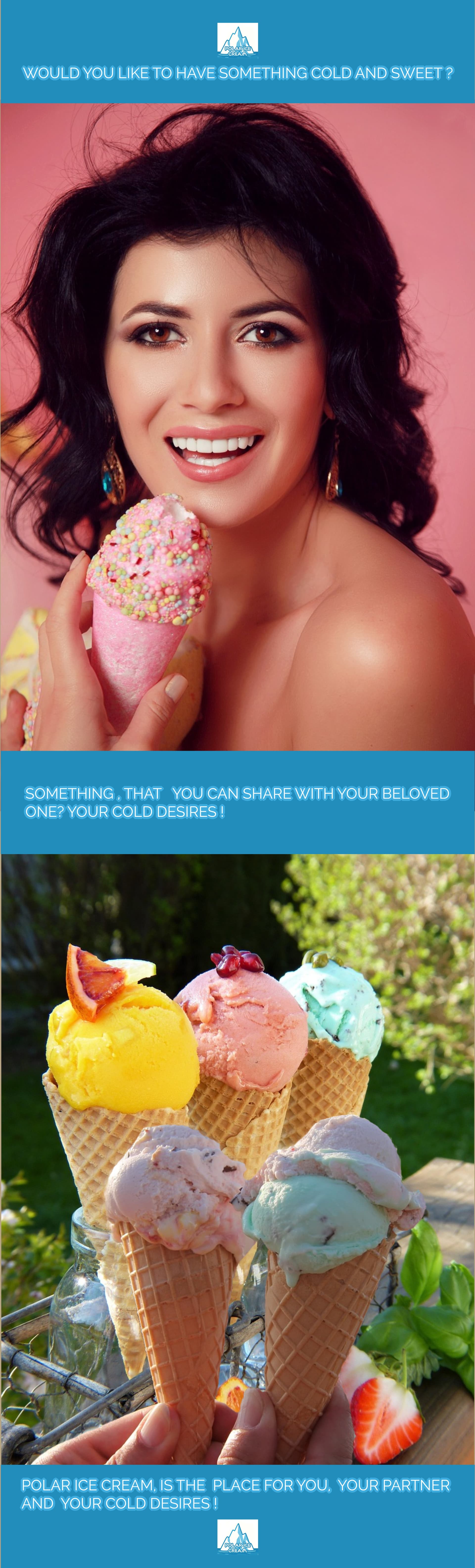
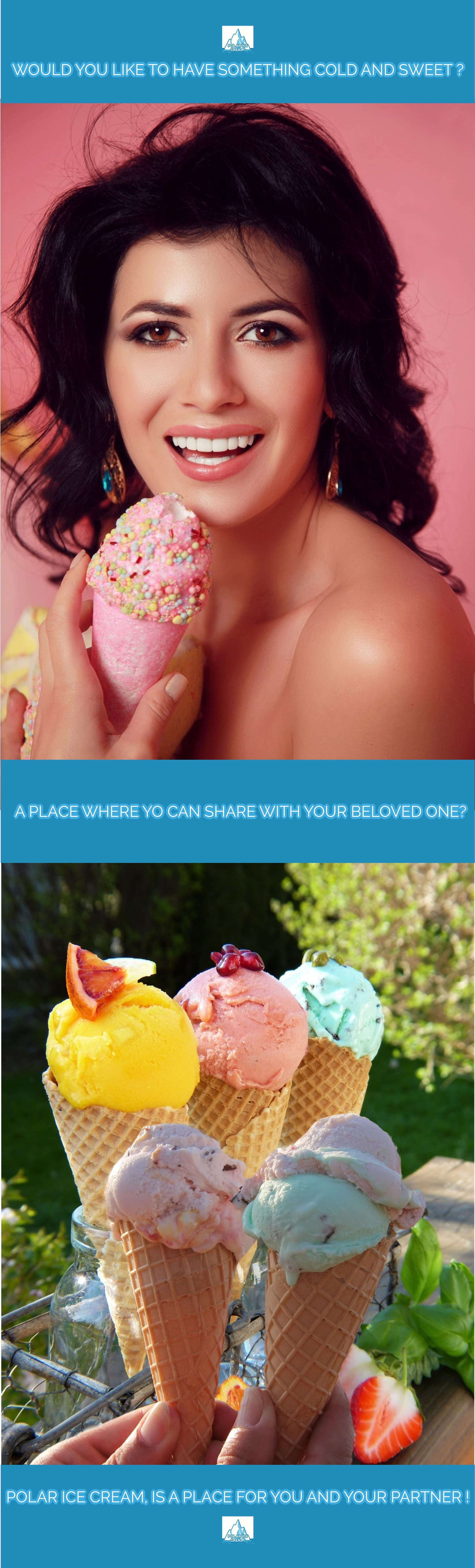
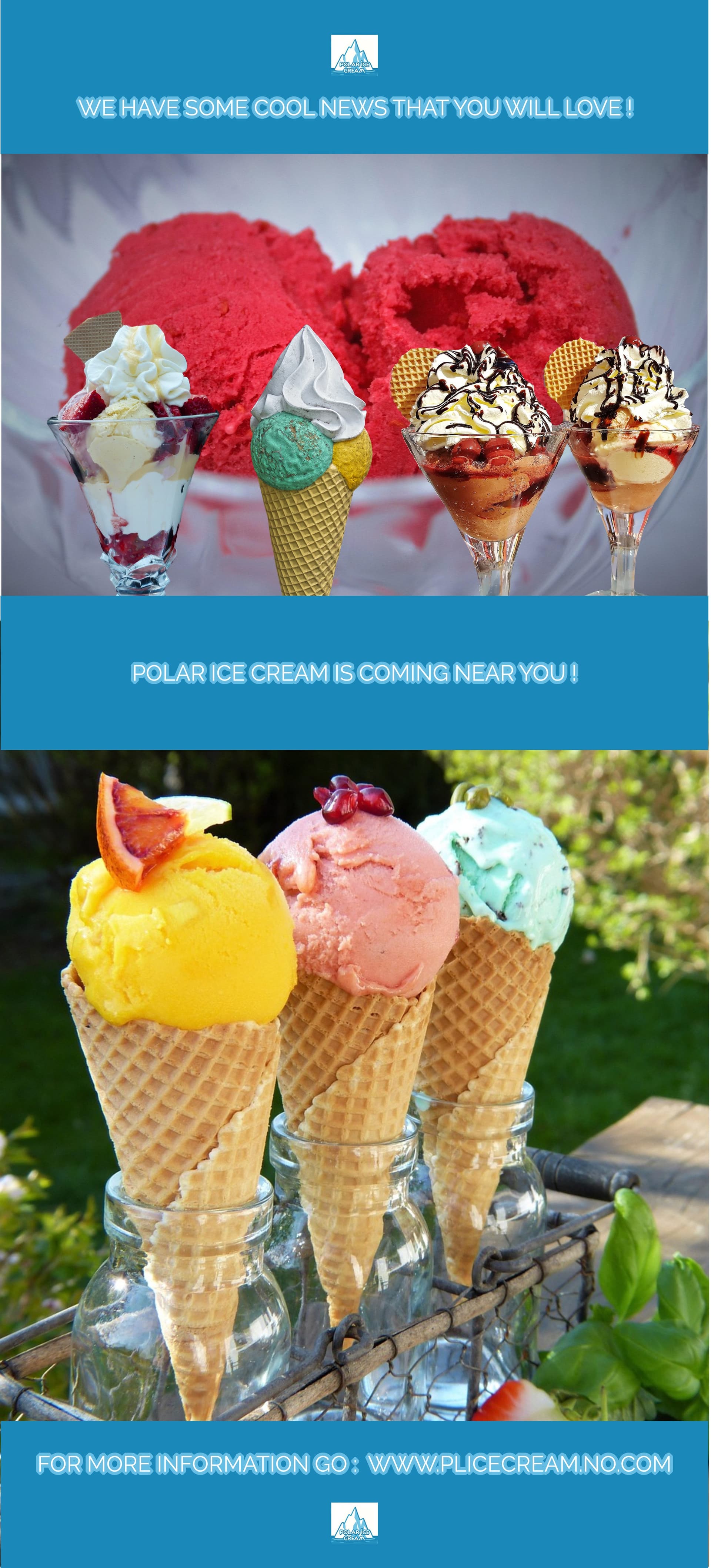
You need to work on story telling. This really goes right along with number one. Right now, you’re not telling me a story, you’re just showing me random images. There is one picture of a lady completely done up in makeup, either wearing a formal off-the-should dress (or she’s naked), with long, formal-looking ear rings who appears to be sort of getting it on with her ice cream cone. I can only assume she drove to the photo shoot in a convertible. Then there is another picture of five ice cream cones with pretty poor light rendering. It’s outside. It’s casual. It’s sort of farmhouse or hipster with the ice cream cones being held in Mason jars. This is in total contrast (and not in a good way, see below) to the first photo. If the idea is that ice cream should be a date destination, why are there five ice cream cones? Polyamory?
-
You need to work on balance, contrast, and spacing. These are some fundamentals of design, and you’re not showing me that you have a grasp of these concepts or how to use them.
2 Likes
Yeah, I’m with Steve on this one he summed it up really well, where I was dancing around the hot coals deciding if I should step on them or not.
When I first commented, I was trying to be nice about the layout because it’s not necessarily a bad idea to go for something a bit different. When I immediately looked at it I saw it’s missing the fundamentals of what makes a good flyer actually work. The small logos, the odd copy, the way the text is treated none of it really lands the message. There’s no clear call to action, and the overall story just isn’t there.
It looks like the start of an idea, the “cold desires” and date concept but it needs to be expressed in a way that’s instantly readable and visually clear. Right now, every signal that tells someone, “this is an ice cream flyer, come visit us,” is either missing or buried.
Don’t get me wrong, I like experimentation, and it’s refreshing to see something different, and putting thought into it that’s a good thing. But the design and copy need to connect, and at the moment they’re sort of working against each other.
Here’s why it’s confusing:
Is she the date? Or on the date? Was the ice cream bought for her? What flavour is it? What’s in it? Is it natural, gluten-free, lactose-free? What’s the USP here?
Why would a date buy five ice creams? Is that an orgy?
And why do you think ice cream isn’t sexualised? Why make it sexy with a glamourous woman? Is it meant for kids? Teens? Families? Does it send the wrong message or idealise extreme beauty?
These are the kinds of questions and potential backlash you can face in the real world especially if the brand message isn’t crystal clear.
2 Likes
Hi there ! thanks so much for your feed back to both of you and this is really what I wanted … a clear message to see where I was failing on ! (in reality this graphic design was made in practice purposes, that’s why I made a prototype). I am going to re-make the poster (this is a poster not a flyer) with story telling and other stuff (it will take a couple of days …) and I will come back !
To all of you thanks so much for your help ! and this is really appreciated !
1 Like
I’ll add my thoughts too.
Whether it’s a poster, flyer, billboard, or print ad, each must capture a potential customer’s attention quickly and deliver a memorable message that aligns with the ad’s placement and the audience’s level of potential interest.
The friendly face and ice cream cones might catch a passerby’s eye, but they don’t deliver an effective, actionable message on their own. Successful advertising messages are presented in logical steps, with each step sharing information efficiently and guiding viewers toward the next step.
At each stage, some of the target audience will lose interest as their focus shifts away from the ad. With that in mind, it’s important to communicate messages in order of importance so that, even if their attention wanders, the key messages have already been conveyed.
Now, let’s look at your poster/flyer.
You might grab people’s attention for a second or two with the woman staring directly at the viewer with an ice cream cone, but there’s no clear next step in your message that viewers can understand within that brief moment. A short, clever, big headline could be the next step, but it’s missing.
After that, you might hold an interested viewer’s attention for an additional second. So, what’s the next most important message? The name of the store selling the ice cream, its logo, and location seem awfully important, but you haven’t included that either.
Instead, you’ve skipped from capturing people’s initial attention straight to expecting them to read tiny, fragmented, and barely decipherable text about sharing ice cream with a loved one. In that leap, you’ve probably lost 99 percent of the audience. No one will pick up on your north pole, south pole thing. No one will recognize the store name as Polar Ice Cream. (Or is that the ice cream brand?) Almost no one will remember the ad because it hasn’t communicated anything important that resonates with those who glanced at it and moved on.
In other words, your lack of a logical strategy for communicating an effective message to entice potential customers to visit this ice cream store makes the ad almost entirely ineffective and a waste of the client’s money.
The goal of advertising is to convey a compelling, actionable message. Attractive graphic design helps do this, but it’s a tactic, not the goal.
1 Like
Thanks Just-B I am making some changes and my new poster is going to be different with a clear message (which is different), you are going to see the new Poster tomorrow. I may ask you to make some changes from another graphic design that I do have on my online Portfolio and I am going to show them soon (just 5 or 6 designs).
Hi again and thanks so much to all of you for the help ! and I catch a good idea which I will show soon as I am making a new design with a new concept. At this time is not speaking heart break couples or anything like this. It is more a direct message like “A Ice Cream Store coming to your town !”.
Hi hello here’s another prototype (not perfect but i will arrange everything later) :
Let me know what do you thinks and again thanks so much for help !
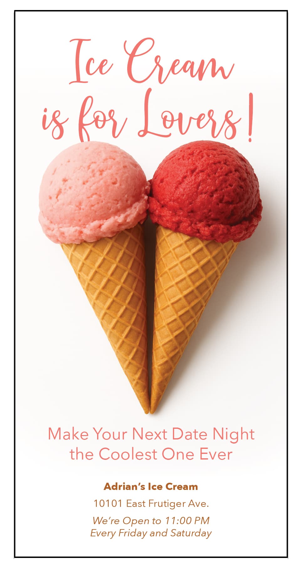
The original post had a germ of an idea. What can be done to promote the idea of ice cream being for lovers or a date night activity?
When you try to combine two disparate elements, you can come up with some great solutions. So what can be done with “ice cream” and “love”?
Could ice cream cones be turned into a heart — a universal symbol of love?
Your last effort really is no different than the previous version. I think you need to scrap this and start completely from scratch. Or maybe give up on the ice cream idea at this point since I’ve probably affected your thinking on it. Pick some other destination and see how you could make an ad promoting it as a date night activity.
3 Likes
Hi There and thanks for this Steve, you give another Idea (and I am going to combine the two designs with a new one !). I will work on this on the weekend (I will have prepare this for the next monday).
For all of you I wish you a great weekend !
I think the fontsize is to smal and also the stroke makes it harder to read
2 Likes
Hi Baris and thanks so much for your comment and I really appreciate all the help that all of you are doing to me !. I will take care the font size and I will add a new design (combining my two old ones) in a new one very different !
Backtracking on the niceness. They’re not good. The redos were no improvement.
Idea good etc everything except the execution of the design.
1 Like
Hi There, then I prepared a new one (I am making two designs, this is one) so please take a look and tell me what do you think about :
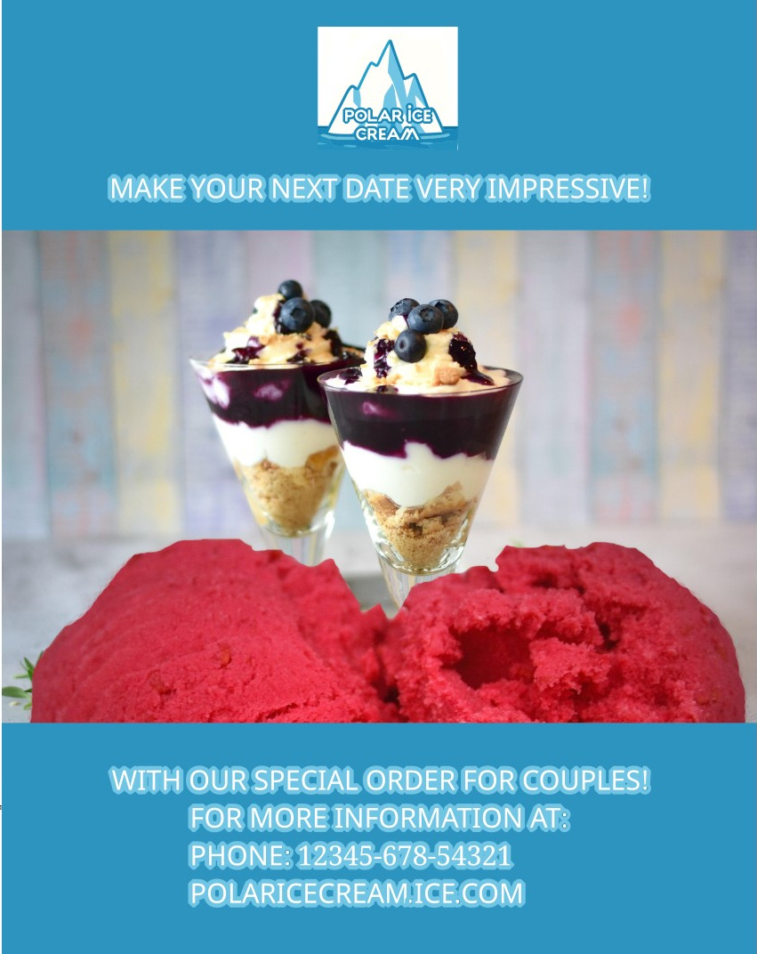
Your latest is an improvement over the first, but it’s still difficult to read. Consider removing the light blue outlines; they interfere with the legibility of the type. You don’t need the line that says “For more information at” — people already know what a phone number and website URL are for. I think the advertising value would benefit from a larger headline and a larger mention of the business.
1 Like
Thanks to all of you for help !, yes I will follow the instructions and I am preparing another version (different shapes and same information).