Hi All, Im looking for a critique on my work from a graphic designer or someone that has designed flyers. I dont feel like this flyer meets my expectation but for some reason I always end up struggling when it comes to coming up with ideas for flyer designs which feel like bringing something out of nothing. Any advice can help! thanks so much designers!! I also designed their logo which im still Iffy about..


The general layout and design is decent. No real issues there.
However, some of the type blocks have little to no margin from your cut line. the blurb about Mauro Sandri on the front, left-center. And Mauro Sandri’s name above his photo on the back. These items are sure to cause issues in printing/cutting. Also make sure a proper bleed is present with the photos that touch the sheet’s edge.
Block of type under “highlights” is awkwardly off center.
1 Like
To start…
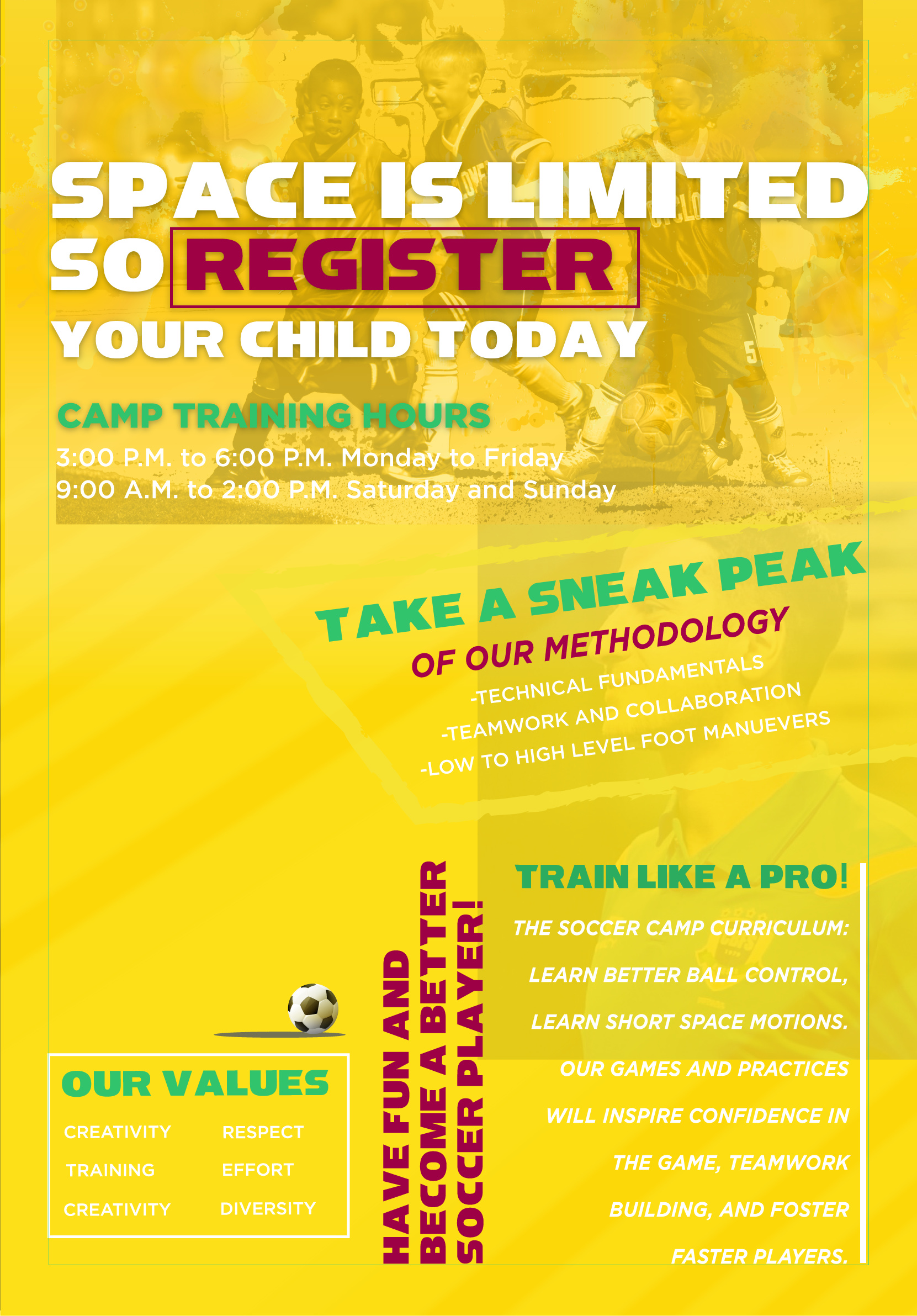
If this is for print, you should read up on the need for “bleed” and “safe area”. You’ve got text that runs up to the edge of the page. On the back side, the trim line runs right along the side of the yellow jersey man’s face. The trim could end up slicing off part of his face. Will your client be upset if these things happen?
It looks like you want to center things, but they aren’t really centered. On the top of the back page, the word Highlights isn’t centered. The paragraph below that is shifted to the left. The training hours lines aren’t centered to each other. The Game System description isn’t centered under the words Game System.
On the front, I’d get rid of the 2018 graphic and just add 2018 to Children’s Winter Soccer Camp. You’re trying to center that whole section while incorporating that graphic and it throws the balance off.
1 Like
There are a lot of things that could be improved there, but I’ll concentrate on the typography. It’s really all over the place, with so many variants in color, size and case, that it defies any sort of logic. The desire to “bring something out of nothing” has caused you to commit the typical amateur mistake of making each piece of type different in some way, as though the goal is for each section to pull its own unique trick; different than the one before it.
In a piece like this which conveys important information, your type treatment throughout should be systematic and cohesive, not decorative and diverse.
Start with hierarchy; “Children’s Winter Soccer Camp” is the event, and should be the biggest headline. “Brazil Soccer System presents” should still precede it, but in a supportive role, like an adjective to a noun.
For the rest of it, organize the information so the reader’s eye can follow logically and extract critical information in order of importance.
- The dates, times and location(s) should be on the front, closely associated in proximity and style with the name of the event. (I don’t see a location on there now; am I missing it?)
- If Mauro Sandri is a known name, then feature his name and headshot on the front, but don’t repeat “Physical Trainer of…” 3 times, and try a bit harder to make it eloquent. “Physical Trainer of the Biggest Beginning of Futsal Training” is a pretty bizarre turn of phrase.
- The headings that say “details” are superfluous and only add “mud” to the composition.
- Choose a font and an alignment and keep it simple and consistent. Type set in all caps is hideous and tension-inducing in any instance where there are more than just a few words.
In addition to what others have said, I’ll mention the lack of visual hierarchy. Everything on the flyer has, more or less, the same visual weight. There’s really nothing there that demands attention and nothing that strikes me as a subordinate detail (other than those things you’ve labeled as details, I suppose).
Everything is just sort of the same, which means that a reader doesn’t have an attention-grabbing entry point to pull them in. Most people aren’t inclined to read through a flyer without having, first, been engaged by some attention-getting device sitting at the head of the visual hierarchy that, unfortunately, isn’t there in your layout.
One should design these kinds of flyers with a step-by-step engagement of the reader in mind. First, you need to identify the target audience, then place something that will immediately engage members of that target audience in a way that will command their attention while enticing them to read through the details of what’s being offered. Short of that, most people will not even bother.
I would try to make this more exciting since it’s as much sales pitch as it is informative. Instead of just listing a bunch of matter-of-fact statements about the program, the flyer might benefit from that information being presented in a way that communicates to parents why they should be interested and how their kids will love being part of it.
Aesthetically speaking, the whole deal feels washed out.
Thank you!!
Thanks for your feedback, i made some major changes in part due to the clients request, because they prioritize professional vs child geared, so would love your feedback
Thanks!!!
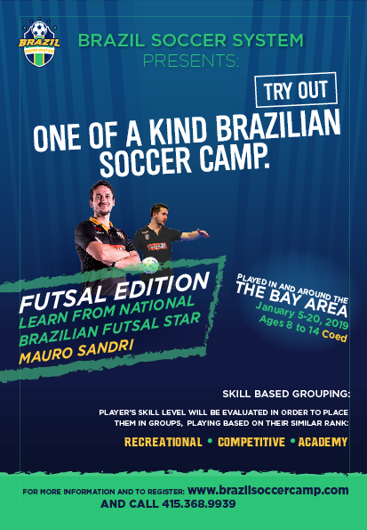
I’m going to comment on a bit of the copy:
- I’d change Try Out One of a Kind Brazilian Soccer Camp to Brazilian Soccer Camp Try Outs.
- I’m not sold on the angled type. The only play it works well is in the photo under the players. On the top and “in the Bay Area..” spot it looks weird.
- I’d move the Brazil logo on the top left to the bottom left.
- I’d change the line break and use of www in the domain name to the following…
For more information and to register
visit brazilsoccercamp.com or call 415.368.9939.
Unless you go with SurfPark’s advice and change the wording, ONE OF A KIND should be hyphenated, as in ONE-OF-A-KIND. It’s a compound adjective and compound adjectives are supposed have hyphens. The line is also not a sentence, so it shouldn’t be ended with a period.
Did you intentionally not center the tight white border so that when it’s trimmed off-center it won’t matter?
Aesthetically speaking, the whole deal feels energized due to a more dynamic layout.
I didn’t notice those extra-thin white lines, Mrnamesa.
Thin lines reversed out of a multi-color background are especially susceptible to ink registration problems. As PrintDriver mentioned, borders around the edges also make even the smallest paper trim irregularity stand out far more than it would otherwise. It’s probably best to avoid these kinds of elements when they’re not needed. And in my opinion, they’re not needed here.
If you keep them, though, I’ll suggest moving the type and logo away from those lines instead of having it bump right up against them. Things need room to breathe, so unless you’re going for an uncomfortable, tense and claustrophobic look (which you’re not here), add a little space between them.
Hi guys your comments mean alot to me! Ive tried to abide by some of the things mentioned. Please give more pointers! This is a flyer front and back. the boundary lines ignore those. and the images havent been cutout properly i havent gotten to it yet. but over all layout how is it? Too much info? I wanted to get all of the info in. or do you think some is superfluos?

yeah, on point.
Thanks for sharing, guys. Found a lot of interesting stuff for myself here.