I am curious on what resumes people are applying with. I’m tired of mixed signals, but s lot of those arent coming from a graphic design profession, so I wanted more realistic examples.
Are you making them more visual with your skills listed?
Are you listing ALL work experience or just related experience?
Are you putting a summary/objective?
KEYWORDS are crucial. Usually a technical tool is the first thing that scans resumes. But not always…
That said, I don’t think there’s one approach that works, these days. Graphic design “requirements” (html! css!) have gone so far out of the lane that there’s no way to predict how any given company will react.
I’d just do your best to read between the lines of the job description and the company, and tailor your resume as best as you can.
It’s typically best to tailor your resume for the company to which you’re applying.
Just a personal opinion, but make your resume look nice, clean and professional, but keep it simple.
Although a fancy resume might impress an art director, it could make it difficult for a company’s HR department to scan the text to run though their hiring software.
Good designers know when to use restraint and when to pull out the stops. Let your resume make an impression through the clarity of what it says. If you get an interview, let your portfolio impress them with your design virtuosity.
As for listing work experience, what might be relevant for one job might not be relevant for the next. Listing that you worked at McDonalds while going to college probably isn’t relevant. Listing that you soon worked your way up to manager at McDonald’s while holding down a full school schedule might be. Think it through, put yourself in the position of the hiring person at the company, then use your own judgment as to what they would like to see.
Lots of people will disagree, but I see no point in a statement about your longer-term objectives. You’re applying for the job at hand, not for one two years down the road. As for a summary, if you keep your resume short, concise, readable and well-organized, there’s no need for one.
I don’t disagree. The corny old played-out objective statement is just an opportunity to recast what has already been too bland for years. I’d much rather read a couple well-written sentences about the difference a person will make in my operation during their first month, or their first year. Just boldly, but without hyperbole, state what you know should motivate me to forget everyone else and hire you.
Just-B you’re awesome. Thank you for always having thoughtful and extremely helpful responses. I’ve been juggling several of these ideas as well, so it’s nice to hear someone lay it out plainly. Thank you again. I will take this information an apply it appropriately
This is very helpful! I’ve seen a couple samples that Express what you’re talking about and I feel I can incorporate this in my own resume as well. It helps to have real people in the graphic design industry replying with this kind of information instead of the vast samples of my friend Google. Thank you!
We recently just went through 100+ applicants for a couple designer positions. The number of basic word document resumes we received was depressing. I’d highly recommend making a PDF with a nice layout that is, professional looking (not overly stylized), and more inviting to read than a word doc full of New Times Roman.
As for information to use, unless this is your first gig, I’d only show relevant work experience. Summaries/Objective/personal interests aren’t needed, but with some wit, they could make you more memorable than others.
And personal pet peeve here - I wouldn’t show your skills as self defined levels or percentages, just list them.
Yes, I think we agree on that. A resume from a designer needs to look well-designed and not look like it was put together by an accountant or an engineer in Word. It should lean more toward the clean, simple and svelte styling of a Porsche, not a pickup truck
That is really helpful! I am definitely working on a balance that is easy to navigate but isn’t very plain. I also hate the skills as percentages - I played around with it for a hot minute about half a year ago, and was like “I don’t know how much I can do, I just can do it and will learn it if I can’t” so I gave up on those. I feel it under shows you. Thank you again!
That’s where research comes in. I’m looking for that Pickup Truck. Someone that can get out there and carry their own weight (design it and know how to install it,) not someone who’ll sit in the garage most of the time looking pretty.
(They’re actually very hard to find these days.)
This is the reason that analogies are so difficult. It’s always and apples-to-oranges situation.
My point was really that there’s a difference between run-of-the-mill, no-frills, resumes that most people send out and the clean, smartly designed resumes that befits a designer.
I see lots of resumes from designers, writers, copy editors, etc. Some are set in Times Roman with Arial headlines centered above the otherwise flush left paragraphs, which are set in 12-pt double- or single-space Word default text. They scream out, “I’m pretty much average.”
Others, using similar copy and with equal simplicity are beautiful in their use of typography, paper stock, color, negative space, rhythm, balance and all the other elements of design, yet still simple and unadorned with graphics.
Both kinds of resumes can be minimal and well-written, but the clean, tasteful ones are always, without exception, from the better designers.
By the way, I’m also fond of actual pickup trucks. I need them to haul things, and the SUV I have right now just doesn’t work for transporting sheetrock from Home Depot or heading into the mountains to saw up load of fireplace wood. I’ve been looking around for a good pickup, but the dang automobile companies just don’t make 4-WD trucks anymore with manual transmissions. Never in my entire lifetime have I owned an automatic transmission, nor do I want to.
Your analogy was fine B. I was making more reference to the Research The Company part. The resume should be appropriately tailored to the job opening.
You can still special order a Toyota Tacoma with a stick, but only in the upper end TRD models, at pretty close to $40K. You don’t like the extended cabs though, right? They may still carry the shorter Access cab. Not sure.
2018 was the last year for sticks on the Dodge Ram and even those were SuperDuty sized and mostly diesel.
It’s possible Nissan Frontiers can be special ordered too.
How did you know that? I must have brought this up before. I’ve become resigned to being OK with the extended cabs having a bit of room for stuff behind the back seat — that could actually be useful. But I have no need for full-fledged back seats in a truck — especially when bed length is sacrificed because of it.
Wicked, thanks! I have only been sending it out digitally so far. If i print it off, I will get it done at Kinkos again so that the quality is high. I have an image version of this as well at A4 size, so I could realistically print off one giant .jpg if I needed to. Thanks for inquiring, that is definitely a good point!
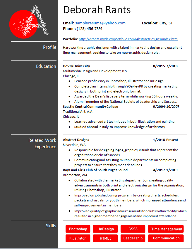
3 suggestions that might bring it closer to Porsche:
• Double the size of your margins around the page, and matches the spacing on each side.
• Left column with the gray background - its appearing heavy to me, maybe try a lighter gray? Or make the gray background “white”, and the white text “gray” , but keep the top logo in a gray box- this way you don’t have to worry about a bleed
• the skills section - the red boxes are creating an optical illusion in the white spaces in each corner - maybe remove the red boxes all together and make the text either red or gray, listed with bullet points all at the same pt size.