Hi, I am a beginner and I have a problem cause I do not know is it a good overlay. What I can change here actually I have not done yet but I think this seems like an empty overlay if u can help me I will appreciate.
Hi, I am a beginner and I have a problem cause I do not know is it a good overlay. What I can change here actually I have not done yet but I think this seems like an empty overlay if u can help me I will appreciate.
Hi. Welcome
You will need to give us a bit more information if you want us to critique it. What is it for? Who is it aimed at? etc, etc. Design has to have a purpose and without knowing what it is, we can’t really make any comments that would be useful to you.
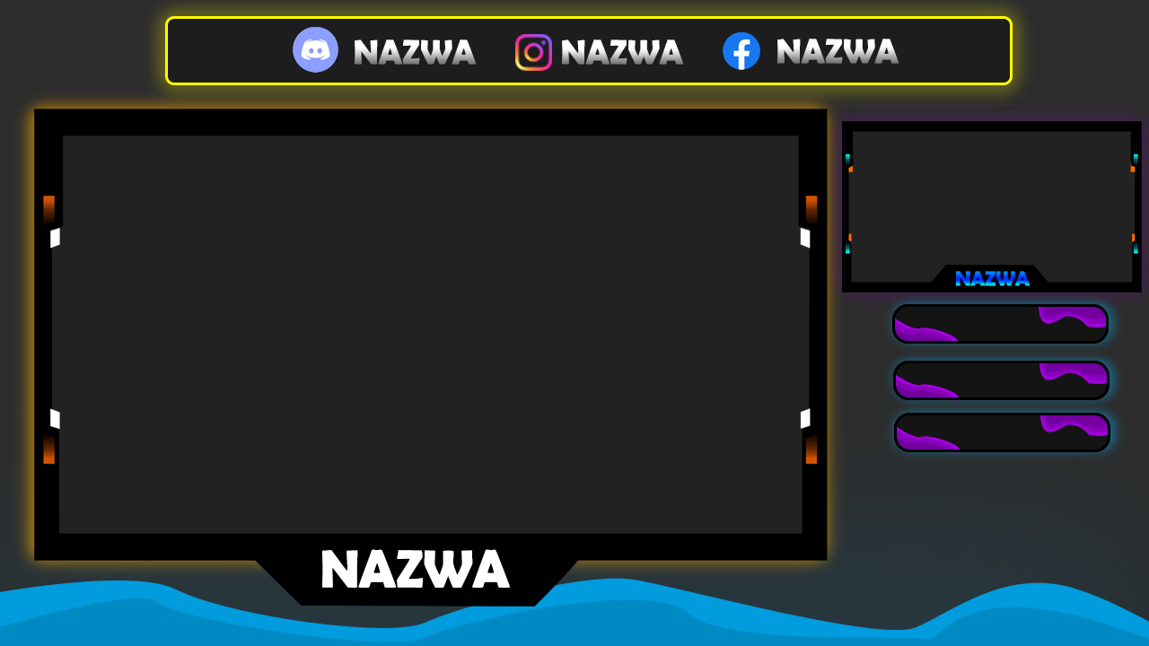
Okay, so this overlay is for youtube streamers on the left side there is a an overlay for game in the right side there is a face cam and under it there is Osquare for top donate, last donate and time of end live stream. I think this is so empty on the background what I can actually add or remove from this?. ![]()
I like that you are searching for feedback, I am not very experienced in the field yet, however, I can say seeking out help and putting yourself out there is one of the fastest ways to grow as a designer.
That being said, I like the concepts, however, the colors seem to be all over the place and the only word on the screen being Nazwa makes it hard to envision what other words would look like. One important thing to remember is at the end of the day the end viewer of this design is wanting to watch the game and gamer while the design is a nice way to compliment it but not “steal the show”
thanks for giving opinion u really helps me a lot and the Nazwa is a meaning name I will change a few things and then I will back to show my work again ![]() soonly as possible I think in nxt week
soonly as possible I think in nxt week
There is still not enough information to give an honest critique, I’m afraid. For example, If it is aimed at children, it has some merit. If it is aimed at middle-aged men who like gardening (which I guess it isn’t), then it completely misses the mark. I am assuming this is a self-initiated, fictitious project. There is no brief? It would help if you write yourself a brief, so you know what you are supposed to achieve and what problems need solving. Think like a client that needs a designer to solve a problem for them, then become the designer. It will have more focus.
It can only be critiqued on practical things, such as hierarchy, colour (even then, that needs context) and typography (ditto). In terms of hierarchy. Are social media links more important than the name and more important than the video itself? What is the purpose of the little white and orange flashes next to where the video would appear. I’d find them distracting if they have no purpose. Ditto the purple, amorphous shapes on the right. You mentioned that this is somewhere to donate. To what? There is no instruction, no explanatory text.
Sorry if this sounds damning, but at the moment it is a selection of shapes, colours and minimal type. There is no sense that humans have to interact with it.
I am a little in the dark, as I am still not sure what it is supposed to do. Could you show examples of similar things, so we can see where you are headed with it.
Thanks
You must not be too familiar with gaming and twitch streams and such. What the OP was attempting to do was make an overlay for a streamer where they could place the video of the game in the large-sized rectangle while keeping other information to the right. The demographic really for gaming has been opened up a lot and is really for the most part one big theme now. However, I do agree with you that a brief from a fictitious client would rather suffice in getting the nitty-gritty stuff as a new designer.
I agree with all your statements on the color and hierarchy of everything. Those need context and reason. However, the donate areas are for when the streamer receives a donation for playing the game the donor’s name will pop up in that area as the “most recent donor” while if another donor donates the most they will appear at the “top donor” area.
I understand what you mean but humans are no more meant to interact with this design than just to sit back and enjoy the streamer’s games!
Sorry to reply just back to you sprout but I was just trying to add some more context as I understand the OP from the streaming world as well as the new designer world as I am just starting to move out of that title myself.
Thanks and hope this helps some!
You are correct. Gaming us not my thing and context counts for a lot.
so u mean to do a smaller everything around and overlay for a game bigger am I right?
Dragon, I think you need to go back to the drawing board overall and I encourage you to go look at popular streamers overlays. A lot of the time they have a face cam and that is it. They do however have different graphics and such that will pop up when certain achievements are reached etc.
I would encourage you to find those types of graphics and practice on something that is a little more challenging. On top of that add some restrictions to the project such as a certain color palette and such. I would love to see some more from you!
okay so I will change a few things and I will back