Hey all, so i submitted my record cover and did a presentation on it for my packaging design class and my professor told me that my cover reminded her somewhat of Graphismes by Frutiger and said i should look into how Adrian Frutiger designed these forms and counter form things using this wood texture.
Can anyone help me understand what Im suppose to be looking at? Or where to start researching what went into the process of making these? Googles just showing me books for sale.
Isn’t graphisme just the French word for graphics? Adrian Frutiger was a type designer, but also experimented with non-typographical forms, like the ones you’ve referenced. Even with these, though, he used the same thought processes as he did with his type design — black & white and concerned mostly with the basic elements of design, like contrast, rhythm, shape, texture, balance, etc..
I don’t know what the wood grain in his designs was all about. I think it was just a style he was experimenting with in his personal art. Maybe there’s more of an explanation in the “Graphismes by Fruitiger” book, but I don’t know.
Frutiger’s graphic shapes are interesting, and for someone interested in him and what motivated him, they might even be more interesting. However, it’s his type designs that are important. His graphic prints are really just an oddity and something your professor probably likes from an academic perspective.
If you ever become a famous designer, like Frutiger, you might have the chance to publish a book about yourself. In it, in addition to your famous work, you’ll get to also insert all the odds and ends about your career that nobody ever noticed. Professors will gobble it up and tell their students how important it all is. At that point, you’ll know your legacy is secure. If it were me, I’d take note of what your professor is saying, tuck it away in the back of your mind, then mostly forget about it.
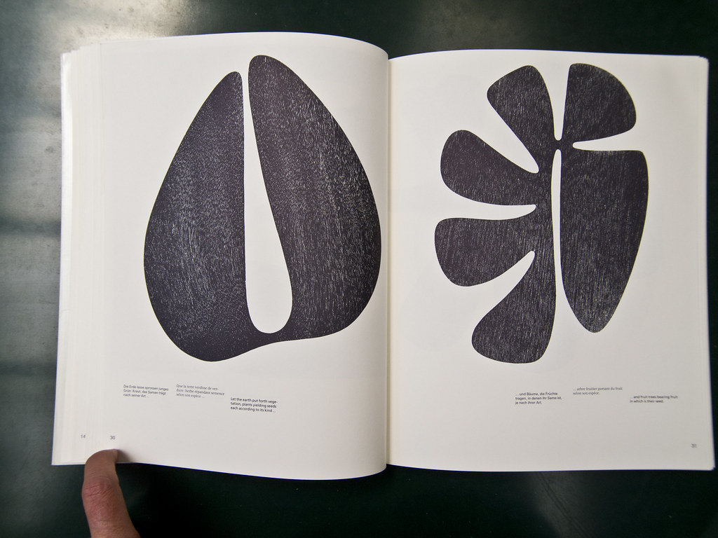
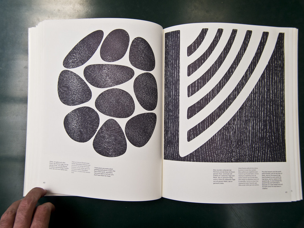
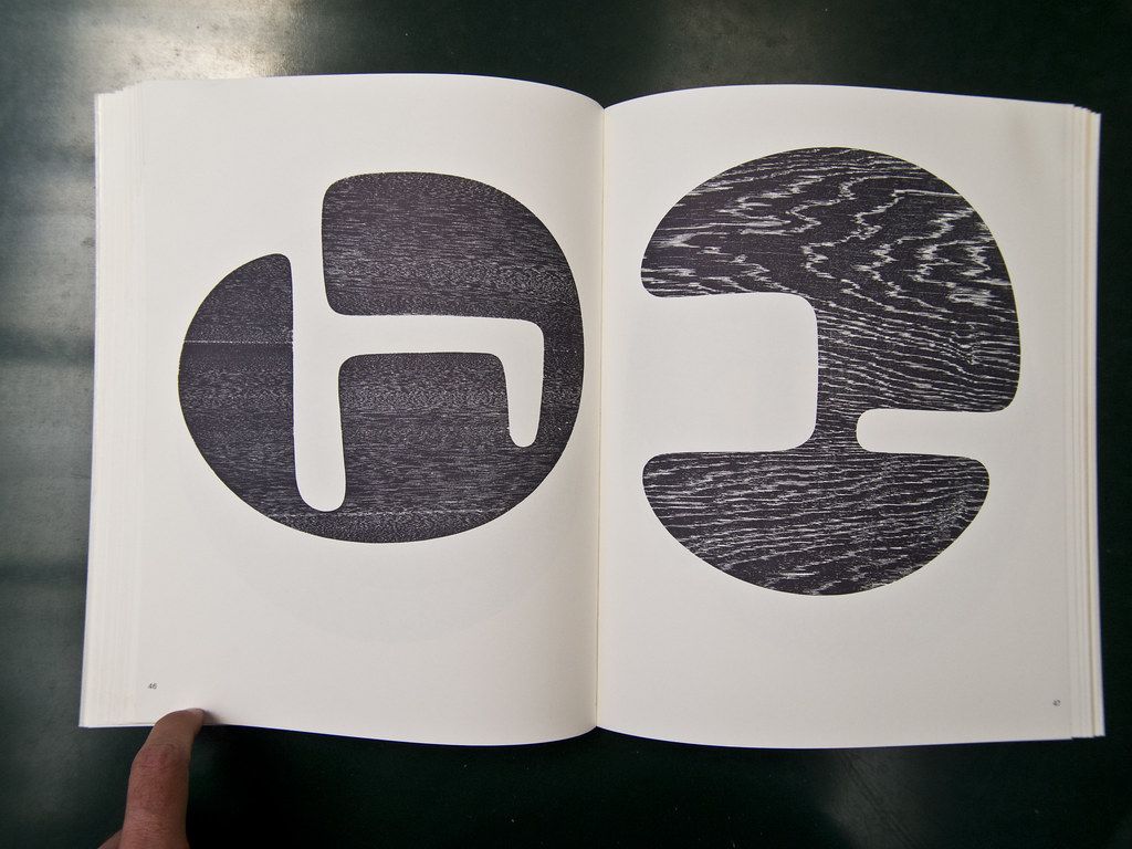
Graphisme can maybe be better translated to “graphic works” in this case. Frutiger was indeed one of the greatest type designers of the 20th century, but his symbols and signs are just as important and reflect his spiritual side. He expressed many themes such as the Cycle of life as well as christian themes. These shapes were cut in wood and printed, this explains the wood texture.
Looking at those prints, I would think it’s all about the shape - the wood effect is there simply because he used hand carved wood blocks to make the prints. I could be wrong.
These are woodblock prints. Frutiger made the shapes in wood and printed them using the shapes as woodblocks, inking them and printing them, probably on a letterpress printer