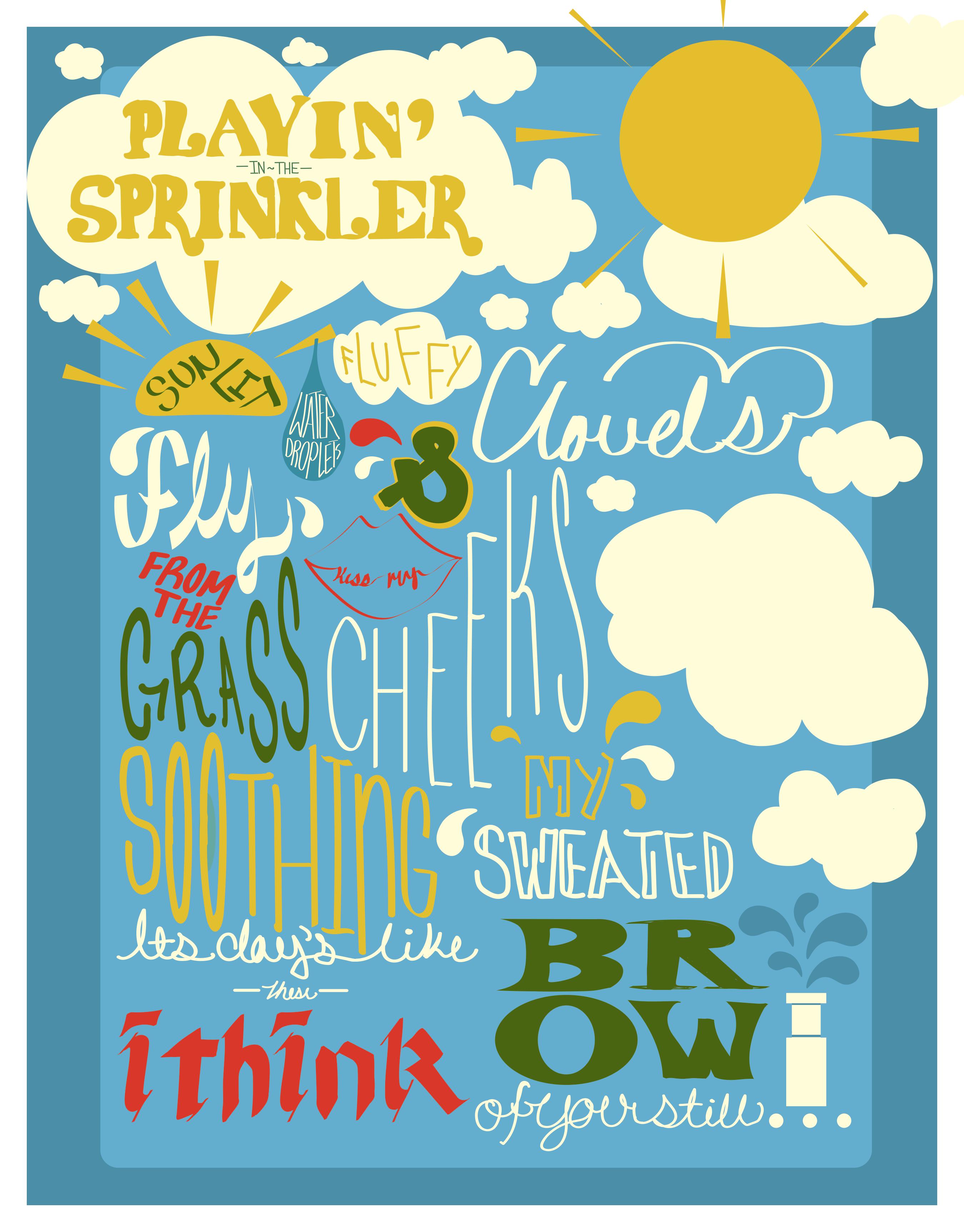
This is my first post ever on this community so please bear with me. I’m working on this poster for an illustration class and I wanted some advice on how I could push this composition further. I appreciate anything I can get.
we wrote a poem and then were asked to illustrate it using typography. The professor has asked that we play with type and “illustrating type” rather than creating an illustration.
I think you’re off to a good start. The biggest issue I see is the way the words are grouped. Here’s how I read this with each line being a separate thought:
– playin in the sprinkler (this is nice and contained)
– sunlit
– water droplets
– fluffy
– clouds (I agree with EB, this is hard to read)
– & (the backwards ampersand bothers me)
– fly from the grass
– kiss my (this is also tough to read)
– cheeks
– soothing
– its day’s like these i think (should be “it’s” not “its” and should be “days” not “day’s”)
– my sweated
– brow if your still
My suspicion is that what is outlined above is not how it’s supposed to read. If not, look for ways to adjust the layout and type so that it will read the way you want it to read.
I hope this isn’t too discouraging since I do think you’re off to a decent start.
I think you’re off to a good start too-- I also agree that it should read like the poem was supposed to. If you hadn’t said it was a poem I never would have guessed that. Where would your line breaks naturally be if you were writing just the poem on a piece of paper? Start with that and add line breaks where it makes sense… then add the ‘extras’ around it. For now it feels like the type is wrapping around some of the illustrations. You can also have fun with the shapes-- I really like what you did with the water droplets!
Clouds reads to me like Clovels too..
It reads less like a cohesive poem because it uses.a dozen plus handwriting styles. I realize you were asked to play with and illustrate with type, but I think you could do that without it all being so disjointed.
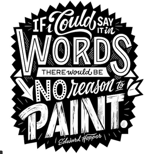
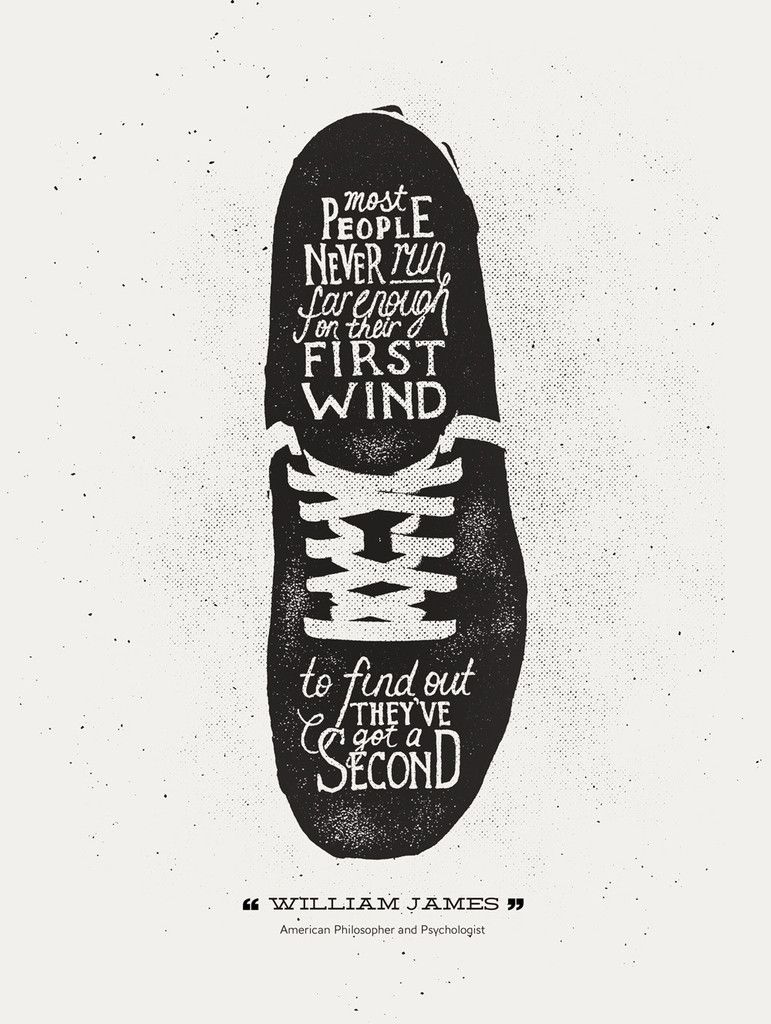
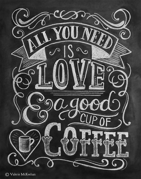
Here are a few examples that might inspire you to rethink your approach.
I realize all of these are black and white, which I’m not recommending based on your poem. I also realize that the text on a few of these examples is shorter. I just think you could play more with your composition, incorporate smaller illustrative elements, and even if you do use multiple handwritten elements, ensure that they are working better together instead of making the separate elements compete with each other.
I’m with CraigB on this one.
I don’t think you want to push this any further. There’s already way too much going on.
Graphic design is about using design to communicate a message clearly. Play with type, but keep the message clear. And point that out when defending your critique if asked why you pulled back. The message is what’s important.