Hello everyone, I was wondering if I could get some feedback on a photography edition I’m working on.
If any of you have a few minutes to spare, I’d really appreciate it if you could take a look and let me know what you think. Is there anything you would change or add to make it a more engaging ?
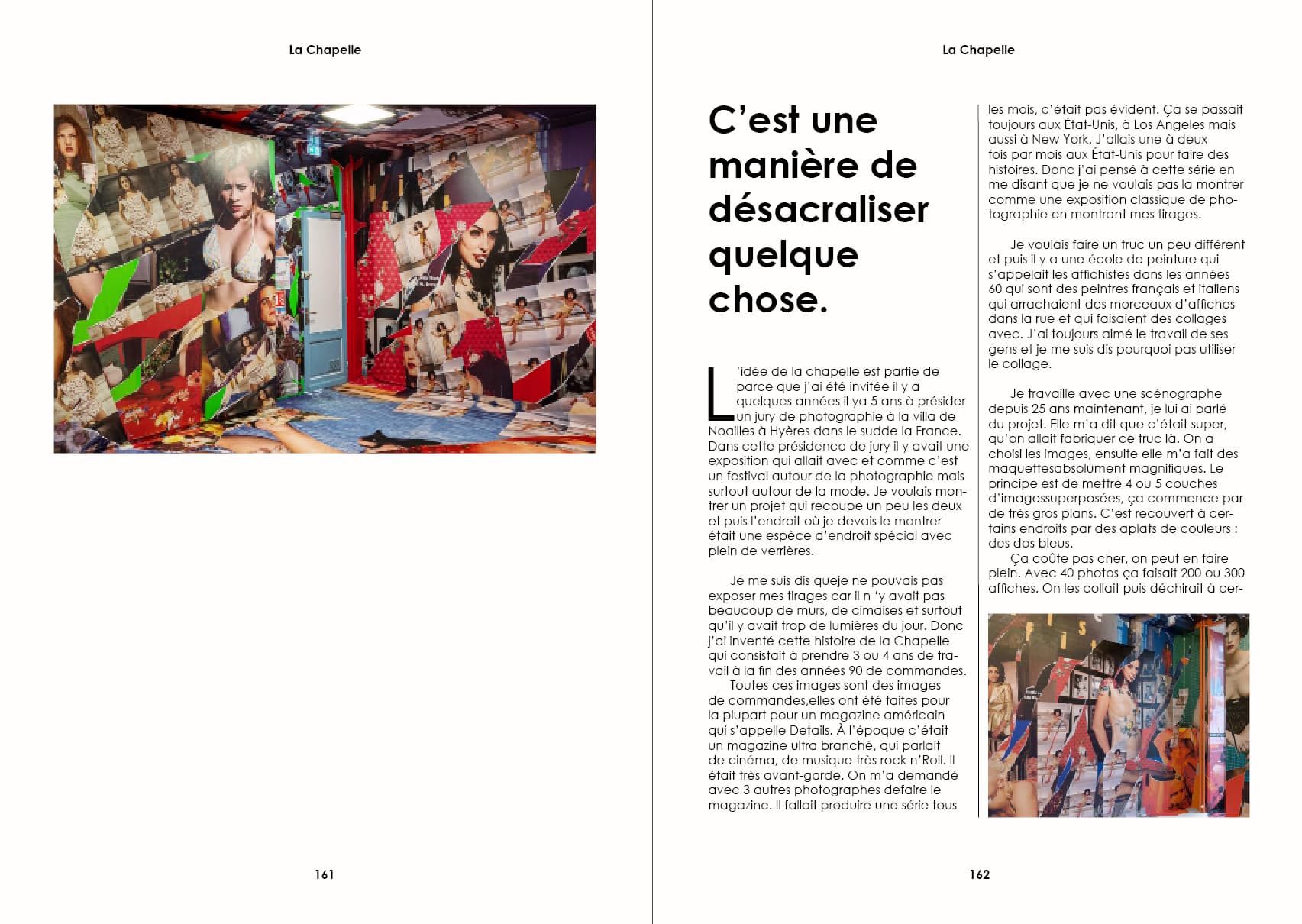
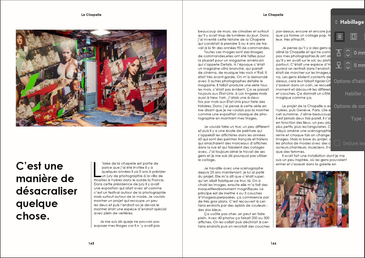
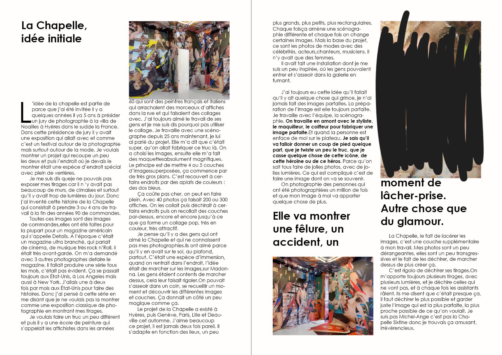
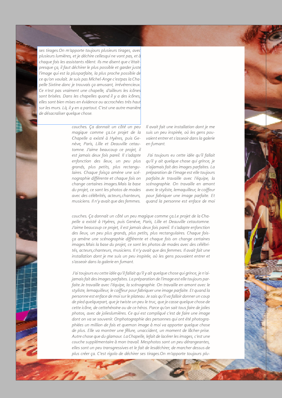
I’m working for a photography book on a fashion photograph.
Here is different layouts I’ve tested, but I don’t know which one to choose. I don’t want to stand against the pictures with too much colorful/bold layouts.
What is the nature of the project? Practice, school assignment, paid commercial work, other?
Part of me is confused because I get the feeling you’ve thrown a lot of different stuff at the wall, here. Why is the fourth image so different from everything else. I am trying to understand, but I don’t really know what I’m looking at. Maybe it’s because I don’t speak French, so I can’t put anything in context.
I hate to say it, but I can’t really offer a critique because there isn’t anything here that can be fixed with a critique. Sorry, not trying to be harsh, but you need to go back to the drawing board on this.
I don’t want to repeat what @Steve_O said, but I see this much the same way.
If you’re a student, I’ll move this to the student forum, where you might get some good advice from professionals aimed at a student trying to learn.
If you’re a professional yourself, I’m not sure what to say because this isn’t professional-quality work. On the positive side, you recognize that it’s not engaging, which is a first step. Perhaps if you supplied more context regarding what you’re doing and your experience level, it could help focus the advice a bit better.
Boxy, linear, conventional. It looks like you’ve dropped your content into someone else’s template. Are these templates?
For a book on photography, I would expect the photography to be more prominent.
If you are tasked with designing something you’ve never designed before, begin by looking at everything you can in the same genre, and deconstructing their presentation. Why do some succeed and some fail? What are the best practices?