Hi guys, I designed this header for my real estate page. Unfortunately I’m not satisfied yet.
Would you have a suggestion?

Whether or not it works within the context of the entire page, I don’t know. This is a little like playing 5 notes from a song, then asking if it sounds right. There’s no way of knowing without hearing at least two or three bars of what comes before and after.
1 Like
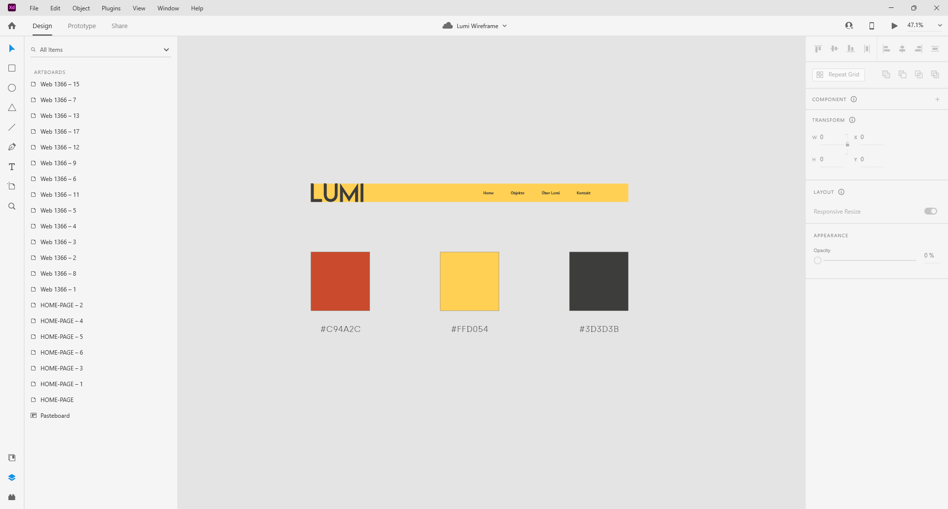
Other than it says Lumi.
There’s no Red in it but it’s in the colour palette.
The text is so small it’s hard to read from this distance.
I don’t know what LUMI is - it could easily be a lightbulb, a torch, a new type of fruit…
This seems like the beginning of an idea — not something that has been thought through. Develop the brand a little more and come back to show us what LUMI is.
1 Like