You have two problems with this poster.
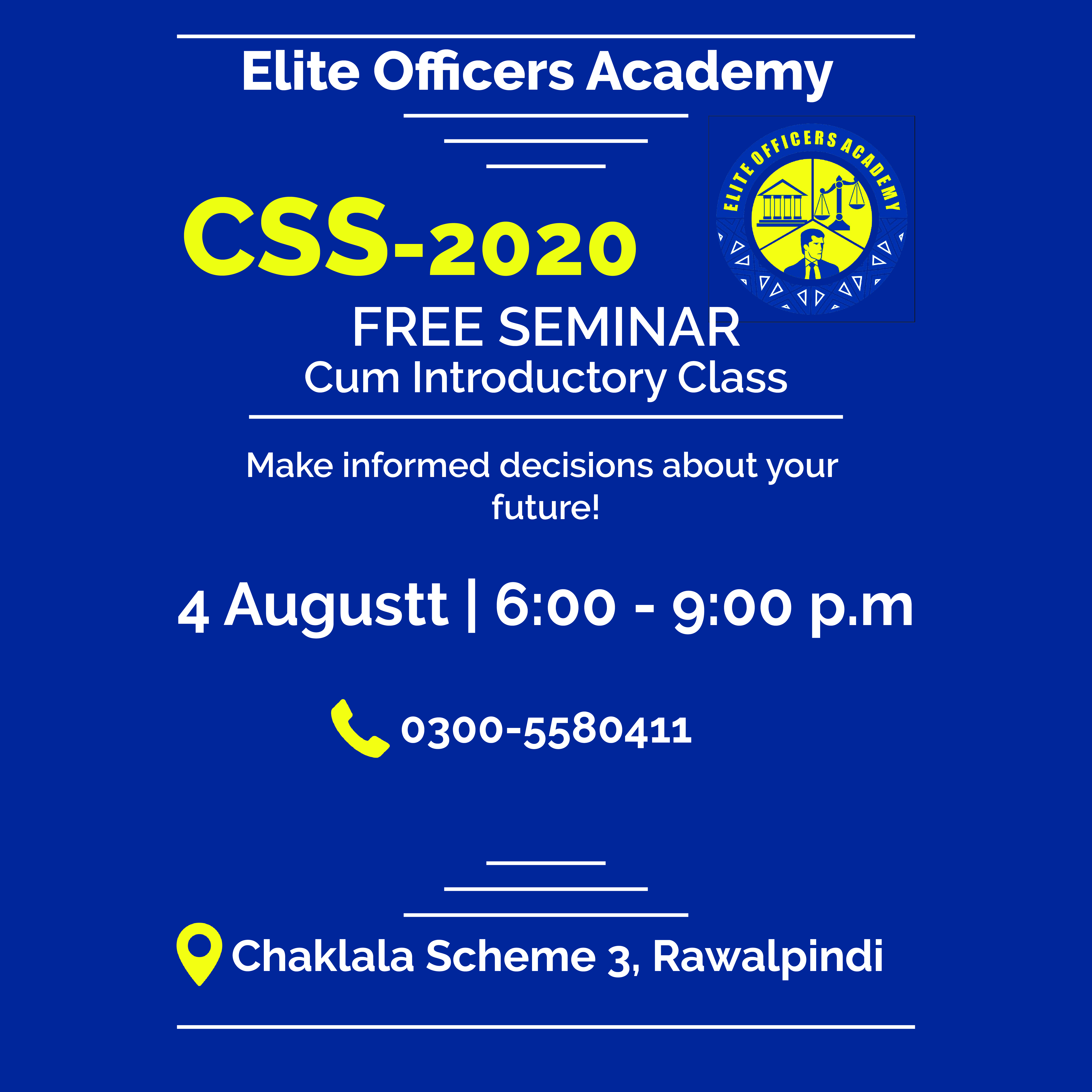
The first is the messaging. I see the CSS-2020 first. After that, my eye goes to the top and reads from the top to the bottom. As a reader, I see no benefit to me or nothing to grab my attention unless I am familiar with CSS-2020 and Elite Officers Academy. Eventually, assuming the reader will keep reading, they’ll see the “Cum Introductory Class” and “Make informed decisions about your future!” These would be better as headlines than what you have now, but they’re still pretty vague. Work on the copy. Come up with a strong headline that will appeal to the target market and grab the reader’s attention. This is the first task.
The second problem is the design itself. It’s pretty flat and non-engaging. There is nothing visual to grab my attention or appeal to me.
If you are keeping this design (which I would suggest you start over with more focused copy), there are still things you could do to improve it.
– Adjust copy to improve spacing and create better visual hierarchy.
– Move “future!” up so it’s not on a line by itself.
– August is mis-spelled.
– You’re missing a person after p.m
– It needs a web address for more information.
– Is the reader supposed to RSVP?
Use standard paper size, posters are usually put up with other posters and those that don’t fit in won’t look good.
Personally I’m not keen on ligatures on posters, or headings generally. “Officers”
Might want to change the line about the Free Seminar etc to “Free Seminar-cum-Introductory Class” all on line. “Cum Introductory Classes” is rather open to unfortunate misinterpretation.
Thank you sir, about flat design i have made it for the instagram post size. Thanks for the tips and do tell me about headlines. I left space on both sides to use negative space.
Sir this poster is for intagagram post. I have made according it to the post size which is 1200*1200 pixels. thanks!
The biggest problem I see is that I have no idea what this poster is about, nor do I know anything about the target audience and whether or not they will understand it any better than I do. I don’t know what an Elite Officers Academy is, and I don’t know what CSS-2020 is. Making informed decisions about one’s future is important, but I don’t know what decisions you’re referring to. You’ve provided a phone number, but expecting people to call to get basic questions answered will cut deeply into your response rate. There really should be a website or, at least, an email address for people to ask questions.
For me, the poster poses far more questions than it answers. Then again, if this is targeted to a very specific audience that will understand what it’s about, it’s less of a problem. Unfortunately, you’ve asked us to critique something without giving us enough information to do much of anything beyond making comments about what it says and how it looks.
As already mentioned, you’ve misspelled August and omitted the last period from p.m. This is a picky one, but you should use an em dash instead of a hyphen between the times (this is precisely what em dashes are used for).
And then there’s the word cum. It’s a nice Latin preposition that means something serving two purposes, but it’s hardly ever (as in almost never) used in American English. Maybe in Rawalpindi it’s more commonly used, but if I were you, I’d use the word and instead. More problematic is the more common slang usage of the word, which I’m quite certain you don’t mean and don’t want.
CSS is a competitive exam here in Pakistan and Elite Officers Academy is for the preparation of the exam. The decision is to enroll and take classes for the preparation of the exam to make your future bright. It is for specific audience.
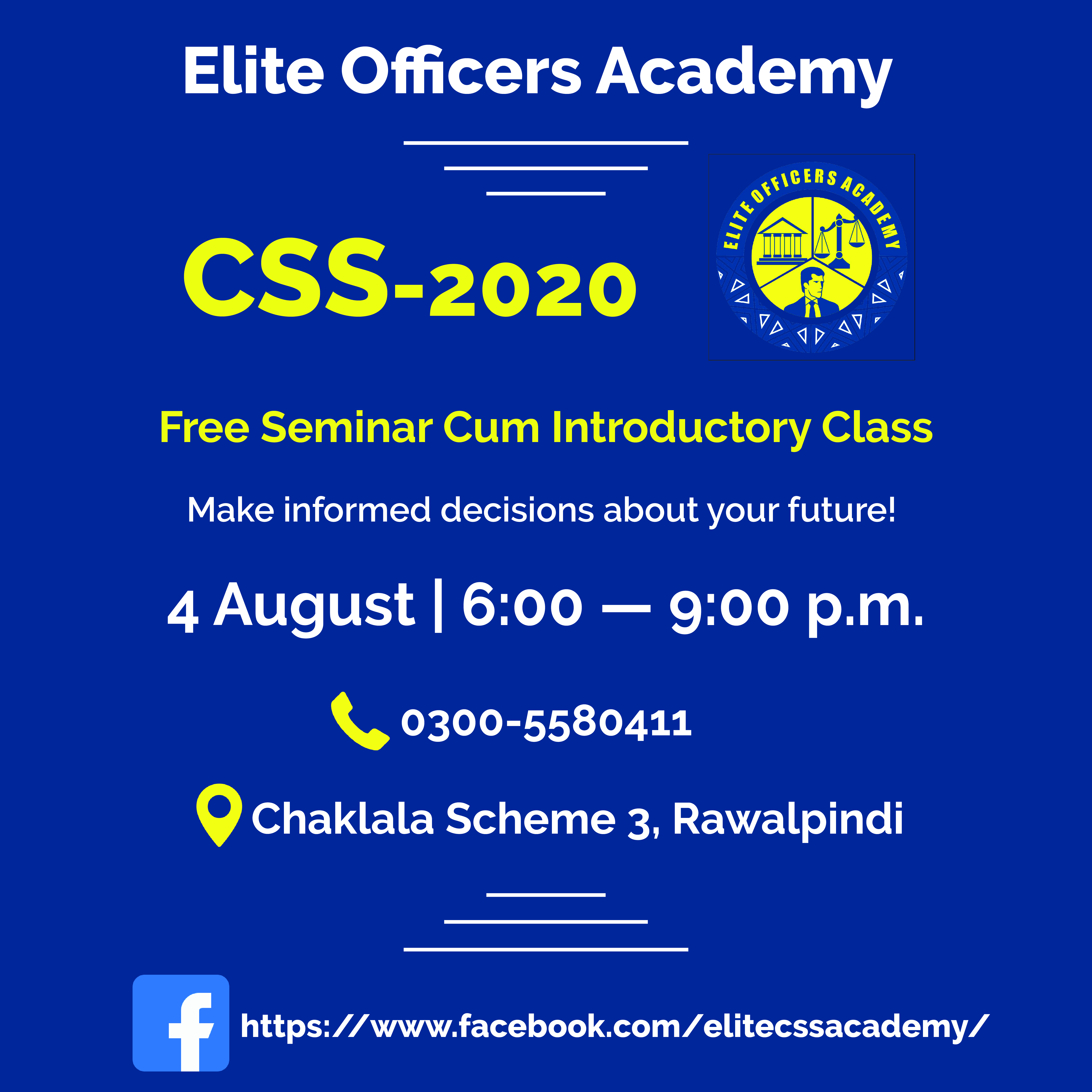
I am afraid that is no better. You have only made tiny tweaks and they have not improved it at all. It’s still just as vague.
then tell me how to improve it. Thanks
All the previous answers should be enough to give you the guidance you need. It’s all about message, hierarchy and typographic clarity. You have chosen not to come up with a vehicle to promote this event, ie a visual metaphor or supporting content. Instead, you have kept it fairly dry, factual and informative. If you go this route, your typography has to be spot on, as this is all you are relying on for people to take their clues from,
The perception of a seminar is usually that it is going to be a fairly dry affair. Your poster is doing nothing to dispel this and make people want to come, beyond the utilitarian stating of facts.
What is the net gain for people attending? Focus on this. Make them want to come. As it stands, this would make me walk past it, unless it happened to be an area I was already interested in. I assume you want to attract people who wouldn’t ordinarily come,
Distil your thinking. Put yourself in the shoes of someone who has no idea about, or interest, in the subject. What would make them want to come.
If you saw a poster that said, for example:
Today, 3pm
Lecture cum talk cum seminar
The effects of low protein silages.
You’d probably walk straight on by if you were not a sheep farmer.
However…
Organic lamb helps save the planet.
Today, 3pm
All welcome
May just pique your interest
And that’s before you go anywhere near, design, hierarchy, typography, etc.
Hope this helps.