Because that’s how many spot colors are required to get a reasonably accurate rendition of your full-color images and text using dry offset printing. However, I still don’t understand why there are two dark blues with the same number.
If you’re trying to remove one color, it might be the light blue, but only if you’re willing to have the sky in your design printed as a lighter screentint of the dark blue. I’m just speculating, though.
Sure, thanks everyone for helping out again,
I have one last question.
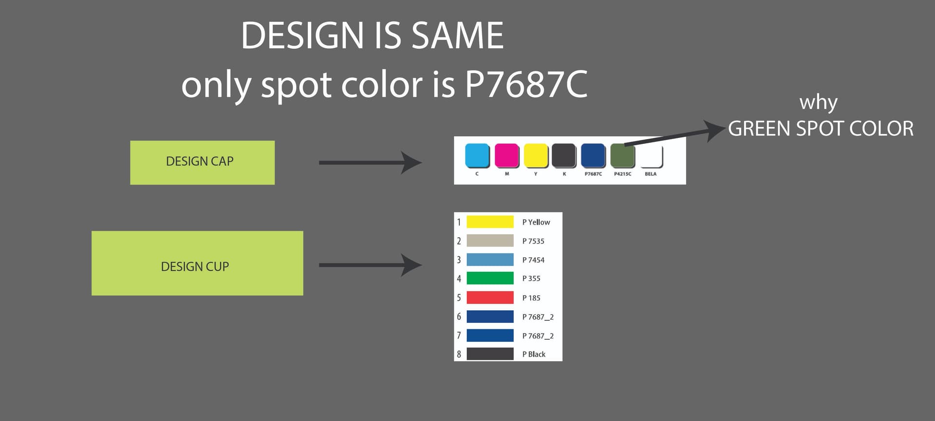
Why they sent diferent colors for same design?
Literally design is same, as you can see they sent me green P4215C for cap, even if i only send them blue P7687C spot color and the the background is CMYK.
The material where the design will be printed is white in both cases, so I don’t understand how that green color appears in the cap print, but it doesn’t appear in the cup print, even though the print design are literally the same.
I think we now understand the reason for this situation.
One printing company will print the cap because it is aluminum, while the other company will print for the cup because it is plastic.
The same printing company is probably doing both. On two different machines that use different different ‘profiles’ to achieve the colors on the specific media (in this case caps and cans.)
Did y’all read the link I posted on Dry Offset?
The two blues are because of screen stacking order.
And as B reiterated, the number of colors relates to what it takes to get your imagery. Want less colors? Use different imagery.
Maybe this is just easy for me because I deal with profiles on dozens of different media on many different wide format machines all the time plus we have to deal with color over and under white ink. I dunno…
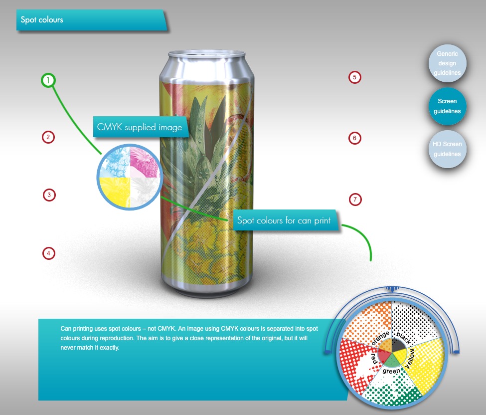
When combining CMYK and Pantone, any effects, transparencies, or gradients can create additional separations. To fix it, flatten your design in Illustrator and ensure everything uses just your chosen Pantone color or CMYK.
With this printing process, this ^ would not matter.
It doesn’t print using CMYK.
Here’s a screenshot from the link above showing the seps for Dry Offset printing.
The design won’t print with the gross dots shown, they are much much smaller. They are enlarged for visualization purposes.