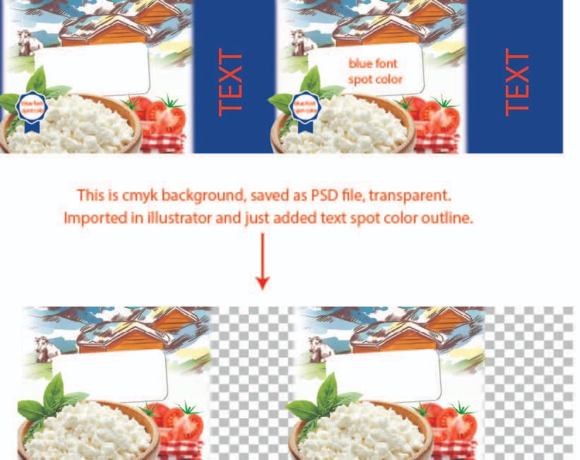
I created a design for printing on a plastic cup. The background was made in Photoshop in CMYK mode (300 ppi), and I added text and a logo in Illustrator using a single Pantone blue color. After exporting the file, it contained CMYK + 1 Pantone color, which I sent to the printing company for review.
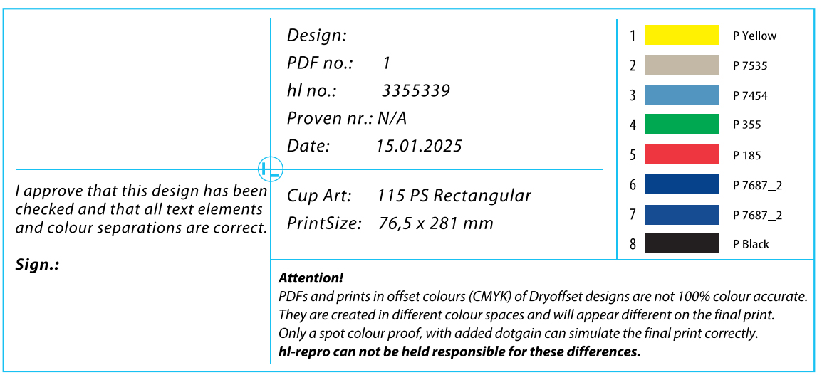
However, they sent me back a proposal with separations for 8 Pantone colors, which significantly increased the cost. I’m not sure why this happened or how to fix it.
Here are my questions:
Could the issue be caused by my file setup (combination of CMYK and Pantone)?
How can I optimize the design to reduce the number of colors?
Should I stick to CMYK only for this type of print?
You probably need to ask the printer why they proposed printing the entire thing in spot colors rather than CMYK. I could speculate, but only they know.
I’m seeking advice, suggestions, or insights from anyone with experience in this area. I understand that I can ask the printing company directly, but I’d also like to learn from others’ experiences to better understand what typically happens during this stage.
It used to be very rare for an imprint company to do CMYK using screens or pads. It’s more common today, especially with direct-to-surface printing, but as Smurf mentioned, the machinery at this particular vendor may not be the specialized machinery needed to interlace CMYK color.
Just because you submit a 4-color+1 file to a print vendor, maybe they can’t print it no matter how much you want them to. One of our schwag vendors uses a 6-color helicoptor press (rotary press). Not for cups, but they can only print in spot. The registration just isn’t there for CMYK.
What do the file submission guidelines say on this printer’s website?
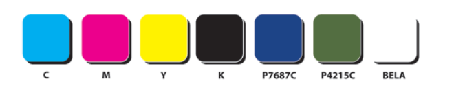
What I’m seeing is a list of seps.
The two blues are probably two blue screens of the same color laid down at different times in the screen stacking order.
If they cannot do direct printing using CMYK spew technology, and are providing spot color seps, the vendor is probably not the correct vendor for the job. Cuz if they could print CMYK, you wouldn’t be having this discussion.
If they don’t have a spec sheet online, ask for one to be sent to you.
It’s part of your job to read those first.
As another for instance, in the shop here where I work, we don’t do CMYK silkscreening. Our spec sheet says, among other things, “Vector…spot color…strokes as shapes (outlined)…fonts converted to outlines…”
Dry offset? That’s a new one for me. It’s difficult to keep up with printing technologies. The website you pointed to is a great resource. Their explanation makes sense about avoiding CMYK halftones/screentints and using spot colors to achieve full, continuous-tone color — at least for printing on cylindrical objects.
But the thing is, you can submit the image art in CMYK.
They have to do the seps though cuz you as a designer would never know the spot colors needed to achieve the color renderings.
I understand that part, but I need to know why there are so many colors. I want to reduce the cost.
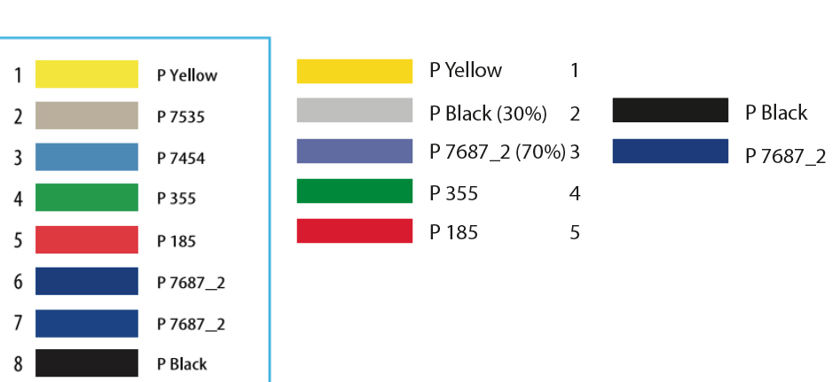
Also, the strange thing is that this design includes a cap, which is, of course, a separate part. The design for the cap is identical; I only used a clipping mask with different dimensions. However, they sent me different colors for the cap.