Hi there,
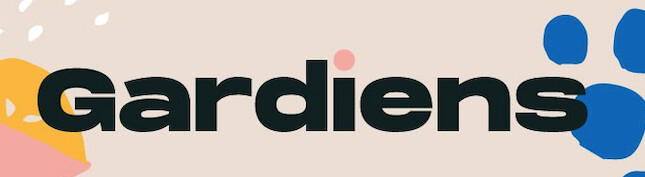
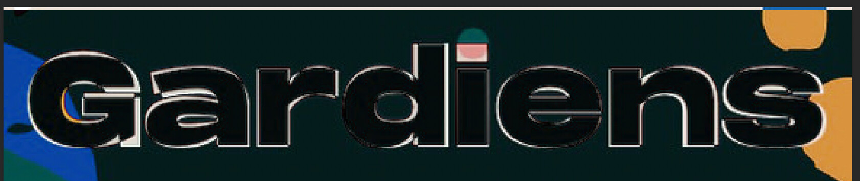
I am trying to ID this font. I realize that the designer may have adjusted some of the letterforms (most likely the circle dot in the i , possibly others). Still, I feel like I am not getting there by using WhatTheFont (see below).
Any ideas?
From WhatTheFont:
Smurf2
February 5, 2021, 4:03am
2
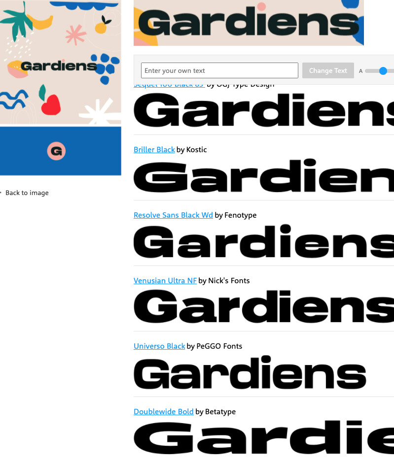
It looks like Sequel - but the a is different …
And each letter has scaling applied.
Hi @Chloe_Peanut_Piano
I’m not finding an exact match anywhere. I’m half thinking someone combined fonts or manipulated them. The “ar” is throwing me off.
So, wild guess… It’s a mix between Dreadnoughtus Bold Italic otf (400) and Zeppelin 42 Bold for the a and r.
Smurf2
February 5, 2021, 4:07am
4
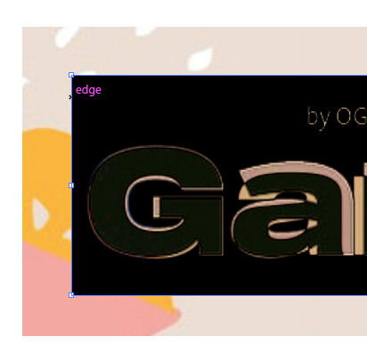
I took a screen grab and set it to difference in Illustrator (could use photoshop)
You can see the G with some scaling almost fits exactly.
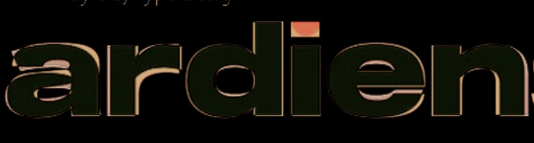
The rest of the letters with some rough scaling look good
Smurf2
February 5, 2021, 11:33am
6
Pretty close!