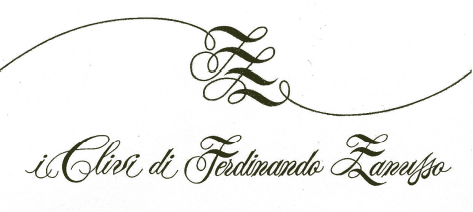
Back with what I imagine is a difficult font ID question.
I was drinking this wine and started looking closely at the label. I am loving the script font along the bottom.
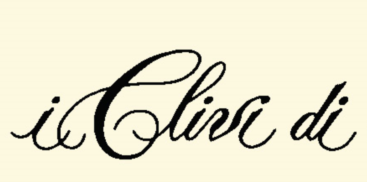
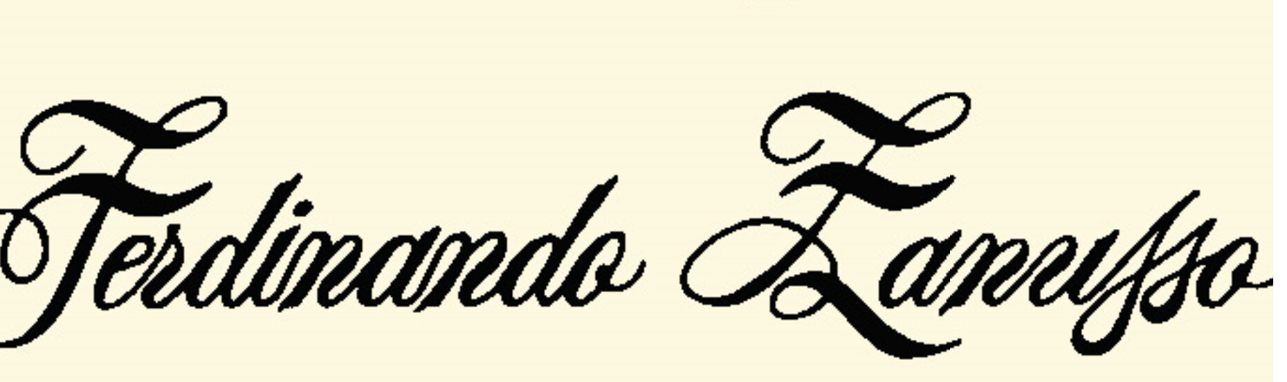
Just look at the double cross bars on the F and Z, and the way the lowercase n’s and a’s look like they’ve had a little too much wine!
Any ideas? I don’t even know where to begin because I don’t use script fonts very much.
I’m going to say this is custom calligraphy for the business.
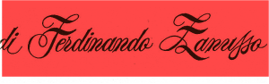
The way the two s’s are entwined for Zanusso and the excessive use of flourishes and slight variations on the other letters. I looked up a bigger version
I don’t get why it’s so hard to see that custom type can be hand drawn. I"m with RKK on this one. I thinks it’s a custom calligraphy piece. And it’s varied enough that you know it is hand crafted (like the wine perhaps?) I’ve seen hand calligraphy almost machine perfect. Just takes practice. But if you want machine perfect, these days, just use a machine.
That mechanical consistency might argue against it being a purely freehand bit of calligraphy, but the word mark could easily be a carefully constructed bit of custom lettering. I could also have been based on an existing typeface with modifications made here and there. It’s hard to say.
My personal tastes don’t tilt in the direction of ornate scripts, but even so, the letters seem too tightly crammed together, which interferes with legibility. I think the monogram above the letter is an interesting composition, though.
To me they don’t look consistent at all. They are all slightly different. A look from a distance and yes, they look similar. But if you look closely they are all slightly different which points to a custom piece of work.
I think you’re right. There are two instances of an an pairing. The connecting stroke is different for each. No font would have multiple an ligatures to choose from. For that matter, whenever there are repeat character, there are small differences between them. It appears to be tight, freehand calligraphy.
Just to clear the air— @RedKittieKat @PrintDriver @Just-B
everyone who thought it was hand-done calligraphy, you were right! I totally stand corrected. I contacted the winemaker in Italy and he told me it was custom calligraphy, done by hand after doing research on old papers, by a fellow named Giulio Testa. Good luck finding more on him though.